Google

Friday, December 25, 2020

Happy Trails part 16--San Elizario Moseying

I wanted to take a moment to say Happy Holidays to all of my readers. This will post on Christmas night (prepared ahead of time of course) so I hope you are all celebrating in a safe and meaningful way with your friends and family. 

Saturday morning I had some free time so I decided to continue my exploration of the El Camino Real de Tierra Adentro by driving to a small town called San Elizario. There is a self-guided walking tour of the town showing some of the historic structures. It's a very small town but they are quite proud of their history and I stopped at just about all of the sites along their route. The first stop had to be for the stamp of course. It's in a small visitor center/museum and also had a small video to watch.


 This layout is based on a sketch from one of my classes that can't be shared. It is the same structure as the 1-2-3 layouts I've shared previously though. I used brown cardstock as a base and the barbed wire paper had the red/white stars on the back. Very quick cuts. I added a few embellishments from my western sticker stash--mostly little button type stickers.

Friday, December 18, 2020

Happy Trails part 15--White Sands (the sand)

The club met at one of the picnic pavilions for our Friday get together. There are also individual picnic tables (shown below) which can be turned to provide shade. They remind me of sailboats a little. Dinner was nice, but it was just fun to talk to all my friends I hadn't seen in quite a while.


This layout is from Club Scrap. I had only purchased the "cut apart" sheets for the picnic theme and had to supplement the designer paper and background pages with items from my stash (which is not a bad way to use up product). The blue/green stripe paper came from the Cool Serenity line that I had used on the first White Sands pages so this became the perfect way to move to the dinner portion of the park. Notice that the original layout on the bottom right calls for 3 vertical photos cut small and angled. But, I had 2 horizontal photos that bridged those 3 spaces and I like that EVEN BETTER! 

After dinner, we joined 2 of the park rangers for a walk along the dunes while they told us all about the park. It was a large group but we all managed to stay together and the walk was quite pleasant. Until we turned around and realized that there was a storm brewing behind us and it was heading straight for us! The rangers gathered us all together and herded us back to the pavilion. The "sand" storm (as I said last week, it's really gypsum) created a great exfoliating facial (has to be some sort of silver lining right?) and while uncomfortable as we walked through it was not truly damaging. Once back at the pavilion we did have time to get our junior rangers sworn in before heading home for the day.


These 2 pages were created using Photo Dies. The left page uses the hexagon from Kit #6, while the right uses Kit #18. I probably need to buy a few more as they have some nice new designs. I like the concept of the page stencils (Lea France and Creative Memories both make those) but I don't have the evenness when cutting and I'm always disappointed in how they turn out. With photo dies, the cuts are perfect every time and because it's a 2-sided die, it cuts the frame and the photo simultaneously. That also leaves the inner mat as another shape and on the left page, I was able to use those to fill the corners. Those were filled with fussy-cut photos and titles and the page was complete!

Friday, December 11, 2020

Happy Trails part 14--White Sands (the sun)

 After leaving Fort Selden, I drove to White Sands National Monument (it was then, it has since been updated to a National Park). We had planned an NPTC picnic there. I arrived with enough time to explore the park on my own a bit. It's important to note that while it is called "sand" it is not the same material you would find on a seaside beach. This is a huge amount of gypsum that has been liberated from the nearby mountains and washed into the plateau. However, it certainly still acts like sand--forming dunes and supporting grasses and wildlife. I didn't try it but people also use it as snow and will toboggan down the dunes (this is an approved use of the park).

This layout is based on a Pinterest layout I saved. I was torn with how to scrapbook these pages and decided that I would think about "sands" as a beach and went through my beach/tropical board for inspiration. The blue and white really seemed to fit nicely with the photos and I was quite happy with the results. I used paper from the "Cool Serenity" line which CM had a few years ago.


After the visitor center, I stopped at a nature trail along a boardwalk. It was hot and sunny but there were a lot of great sights along the walk.


This layout is based on a 1-2-3 sketch by Noreen Smith. I rarely do this but I actually copied her sample EXACTLY. What I added to the layout was the dots down the left side and across the top of the right page. These were made using the new CM Dot Pens. These create different size dots depending on how long you press. I probably should be more tolerant of "white space" on my pages but I just felt that there needed to be something along those edges.


Friday, December 4, 2020

Happy Trails part 13--Fort Selden

 After leaving the Farm and Ranch Museum, I headed to my next stop on the El Camino Real stamp path: Fort Selden. It was built around the time of the Civil War to provide safety and peace in the area. It must have worked because by 1895 it was no longer needed and was abandoned. Only remnants of the buildings remain.


The impetus for this layout is the border at the top of the left page. It was a pin I had saved on Pinterest. The paper is from an older CM line called "Reminisce"--one of my favorite lines. The tones and background designs work for so much of my travels. The letter block in the top left is supposed to say "US"--something I cut from my heritage Paper Loft word sheets. But I decided that a couple of judiciously placed dots would create U. S. and it worked perfectly!

Friday, November 27, 2020

Happy Trails Part 12--Blacksmithing

 The last entry for the Farm and Ranch Museum is the Blacksmith Shop. I also added the photos of the horses I took on my barn tour. 

Add caption


The layout is based on an older 1-2-3 sketch by Noreen Smith (May 2013). The concept is simple--use 4x6 blocks alternating with photos across the bottom and a title at the top. I varied that by making the left bottom all photos (evenly spaced). For the top row on the left, I had a photo paper with the horse face on it and I was able to cut it to 6x4--of course it's in the wrong direction but really--sketches are idea starters, so don't feel like you can't make an adjustment. I added a journal box and again spaced it so that there wasn't too much empty space on either side. The top is another photo paper from a farm/western pad I picked up. I cut it in half and placed the horseshoes across the top. The only thing left to fill was the cardstock fillers on the right. I cut a border sticker in half and layered it across the middle. That tied it all together. 

Friday, November 20, 2020

Happy Trails Part 11--Down on the Farm

After touring the main building I headed outside. There was another building specifically for the dairy industry and I took the opportunity to take a selfie of myself "milking" a cow.


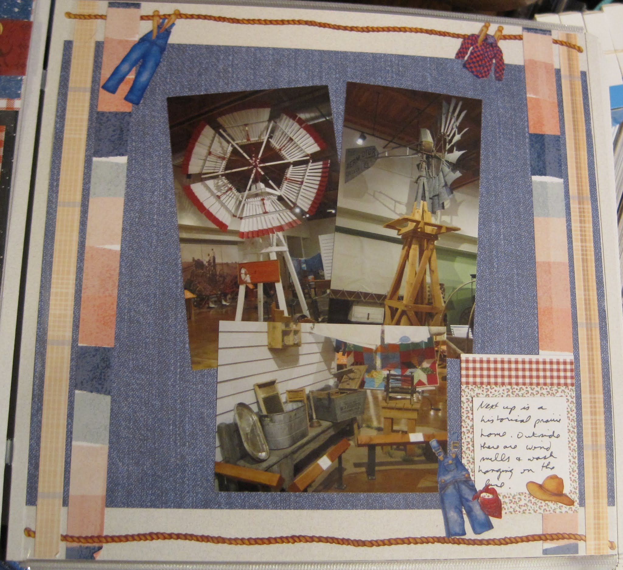
The inspiration for this layout is from a sketch from my online scrapbook class so I can't show you. The theme was to use up the smaller cards/mats that are leftover from Project Life or from some of the mat packs that come with the Creative Memories kits. I did get to use 3 on this one: Top left was a mat from a farming page I bought. The "Dairy Barn" below it is actually a photo trimmed to the right size. On the right page, I used a piece of red gingham paper and added stickers to resemble a mat. Finally, I used a journaling box bottom right.

One of the highlights of visiting is a guided tour (in a golf cart!) of the outdoor exhibits. After the tour though you can walk back and look closer at the animals. Which I of course did!


This layout is from the same class as the first, but a different sketch. In this one, I did use one mat, but because of how I took my photos, I was able to cut them down to the mat size. The background papers are some that I've had for a while and never thought I'd find the right photos for a layout. The bright blue sky and fencing just seemed to pull this together though. I added the ribbon of bandana paper across the middle as an accent to break up the busy pattern. A few button stickers and cow stickers and the page was done quickly!

One more layout of the barnyard. There were so many different sheep, they got their own pages! I'm not completely sure I have them all labeled correctly but I tried!


This layout is based on the monthly 1-2-3 sketch from Noreen Smith which you can see on her blog. I used a piece of paper from the Painted Prairie pack (the special advisor-only pack I mentioned a few weeks ago). When I make the cuts for this page, I do it a little differently. Her first cut says to fold the paper in half and use scissors to cut along the fold. If you, like me, don't make the best free-hand cuts, and you don't mind a remnant fold in the paper, fold in half and then use your trimmer to cut from the long side through the point. You'll still get a 1/2 page triangle, it just has a crease in the middle. I'm ok with that though. 

For the sheep, I used an older CM punch that is a scalloped circle and another micro-flower punch to make the fluffy white components of the lambs. The faces are small ovals cut from black cardstock. The legs are using a Stampin' Up punch called "Word Window". I like that punch for so much more than title bars! The idea came from this Pinterest link. Sometimes it's fun to make objects from punches. Sometimes it's easier to just cut them from the Cricut though!

Friday, November 13, 2020

Happy Trails part 10--Back in the Saddle

 Another display in the museum focused on a local saddle maker who was quite famous for his intricate leather work. His tools were all arranged as if he were coming in to work on a piece. Several saddles were on display as well. One area was set aside for children to practice during supervised classes.


This layout was part of the Club Scrap Western kit. I bought that pack knowing that I had quite a few western theme trips to cover and the paisley background worked perfectly with the intricate saddle designs.

Friday, November 6, 2020

Happy Trails Part 9--At the Store

Continuing through the historic displays, I came to the General Store. I cannot imagine shopping by telling people what you wanted from behind the counter. I'm always impressed with the variety of every-day items that these displays are able to present: everything from kids' toys to food to weapons.


This layout was modeled after a page on my Pinterest Heritage site. The background paper is from a pack I purchased that had the historic theme to it. I added the clock, pram and teddy bear stickers from an old Creative Memories heritage sticker pack. The key and compass (as well as the word "Time") were already printed on the page. So don't forget--wallpaper can be augmented to achieve the look you want!

Friday, October 30, 2020

Happy Trails part 8--There's No Place Like Home

The next display continued with "everyday life" but switched to windmills and farmhouses. The display included both the inside and outside of the house which is rather unique. 


I made this layout during the CM Virtual Crop in June. You can see the sketch here. I used several papers in this layout. The denim blue is from a pack called Outdoor Blues. The plaid tan along the left and right sides are from some 10x12 CM paper (which tells you how old it is) and I don't remember the line. The inner stripes are from Painted Prairie (which seemed appropriate given the theme). The Painted Prairie paper is a special pack of just 6 sheets. CM makes them available to consultants 4 times a year. You can use them as incentives for your customers. Other decorations on this page are from the old "Day at the Farm" sticker pack from CM.


The next layout is more about the inside of the house. I liked the kitchen the best (as I usually do) and loved that this one included the canning jars. That brings back memories of helping my mom can tomatoes every summer.


I scraplifted this layout from an old CM blog post. While that blog page disappeared with the Old CM, I had pinned the image and understood the idea of using the tag punch to make the frill around a canning jar lid. The jar itself is just a rectangle of paper (this one from the old Earthy line) and a contrasting piece as the "label". The rim of the jar was a piece of a roll of decorative tape (the precursor to Washi tape) and I finally used it up! It really looks like a canning lid doesn't it? The gray doily was made using a special punch that will create circles with decorative edges. Two have been made so far--this one and a tulip border. They take 6" squares of paper and turn them into decorative mats. The "Home Cooking" and borders are from the Made with Love pack. Put all together, it's an historic kitchen from post to pictures!

Friday, October 23, 2020

Happy Trails part 7--On the Wagon

The museum moved into more recent history and featured a display of chuckwagon cooking. I used to watch competitions on TV among historic chuckwagons, so this caught my interest. 


This paper pack is S'mores and it worked perfectly to generate the rustic feel. I especially like the starry night paper as a background. I followed the sketch for the CM virtual crop again. The idea behind this layout was to create a border across the top. I did that by layering 3 different papers (the gingham, the blue speckle, and a red bandana paper) and then using the campfire punch to balance the edges. I cut the flames in both orange and yellow to create a more realistic flame. The title is from the S'more's theme pack. The wagon and the cowboy boot and hat on the journaling box are from some very old Day at the Ranch stickers from Creative Memories.


Below is a close-up of some of the vintage cookware on display and another old chuck wagon. 


I used a peekaboo pocket to add the last 2 photos without making a 2-page spread. I have a lot of ground to cover in this museum and wanted to save a little space.

Friday, October 16, 2020

Happy Trails Part 6--the historic home

Moving along the museum path, I encountered more murals and dioramas of everyday life. The recreated home was interesting to me, especially as I had to walk through the front door of the house to continue.


This page was created for one of my scrapbook classes. The theme of that month was to use our stash of photo and decorative mats to create a layout. So I chose 3 of my horizontal photos and 3 mats and arranged them to cover the page. The top left mat was my title, the middle one my journal box and the bottom left my embellishments. On that one I added the sun in the middle. It's a 3D die-cut from an older travel pack and came with pop-dots on the bottom.


As I entered the house, I was treated to the unusual hanging cradle and had to get closer to investigate.


This page is wallpaper. I thought the brown/gold tones matched the photos well. The arrow is a little brighter than I would have liked but it matched the title card from the opposite page, so I left it.

Friday, October 9, 2020

Happy Trails part 5--On the Trail of History

The next layout is still at the Farm and Ranch Museum. This is the display that pertains directly to the El Camino Real de Tierra Adentro. This display features ANOTHER cart used on the road--kind of amazing how many were found! To add to the display, the back wall was painted with a mural of everyday life. 


As I mentioned last week, the left page is the backside of a pocket page (the front holding the museum brochure). The layout is based on a sketch for the June 2020 virtual crop for Creative Memories. You can see the blog post here. While many people turned the 3 elements on the sides to small photos, I knew that I had to downsize the layout because of the size of the left page. So I chose to go with stacked circles (chosen because of the background paper). That left the middle for photos (and I never feel like I HAVE to use a vertical where they put a vertical place holder). The edges are a border maker basketweave. I thought based on the activities in the mural that it would be a good match.

Friday, October 2, 2020

Happy Trails Part 4--The Farm Museum

 My next stop for an El Camino Real stamp was the New Mexico Farm and Ranch Heritage Museum. This is a huge place with lots of interesting displays and we'll take the next month to go through it a bit at a time. Even though only one part deals with the El Camino Real, the rest is rather interesting.


The layout is another challenge from the Creative Memories Virtual Crop. You can see the blog post here. I chose a background paper from the Rustic Manor pack which has a photo of a barn door. I was able to keep the image present even though I added photos and other embellishments. One of the elements of the sketch is the set of mats under the photos. I chose a rather neutral color, but to give a little more definition, I punched the edges with one of the CM Border Maker System punches. It's called "Garland" and is one that leaves a stencil rather than cut shapes (as you saw in last week's page). I had a couple of cow stickers and die cuts and used some brown cardstock to set off the rest of the elements. The one thing that looks out of place is the sticker I wore for admission. I preserved that and wanted to add it to the page. Although the color is off, it does belong there.


I added this photo just to show you why this is a one-page layout for such a large museum. I wanted to include the Museum Guide in one of the Pocket Pages. The back of the pocket became the left page for the next layout. You'll see that next week.

Friday, September 25, 2020

Happy Trails Part 3--Crossing the Border

Friday morning, I continued my tour of the El Camino Real de Tierra Adentro. One of my first stops was just across the border of New Mexico at their Welcome Center. I was able to get a photo of the state welcome sign as well as information on the trail.


This layout is based on a sketch from the Creative Memories Virtual Crop. You can see it in this blog post. I used a piece of paper from the new Automobiles paper as well as some matching embellishments. There are really only 2 photos on this page. I liked that I could make everything fit the shapes to create the layout. The two right boxes are filled with paragraphs about the trail cut from a brochure. The bottom left box is a sticker from the collection mounted on 2 sheets of coordinating cardstock. I rounded the edges of the light tan cardstock to match the sticker. The middle bottom then became my journaling box. The top border is a pair of older cartridges from the CM Border Maker System. The bottom is the very early cartridge called Scallop Stitch. On top is the Rainbow punch. Both are doubled and meet in the middle to create one large border. To me, it looked like wheels.

Friday, September 18, 2020

Happy Trails Part 2: the History Museum

 After landing and checking into the hotel, I met up with one of my club friends and we went to the local museum (because there was a stamp there). We wandered through the displays for a little while. It's a nice enough museum but fairly small. The photo on the bottom right was taken digitally through an interactive wall at the front. It's one of the coolest features of the museum.

For the first layout, I thought I was using a sketch from my monthly class. I sort of did, except instead of opening the June layouts I opened January and so this repeats a sketch I had done previously. Still, the beauty of sketches is that they look different from changes to paper and photos. I had used this sketch for Christmas and it looks completely different! I can't show you the sketch because of the class rules. The papers I chose were some of the last remaining bits of the Creative Memories "Brave" pack. I hope they come out with something similar soon!

The stamp at the museum is from the El Camino Real de Tierra Adentro National Historic Trail (an affiliated part of the National Park Service). This translates loosely as the Royal Road. I'll be sharing more about this trail as I collected quite a few stops along the route. The museum had just one display piece connected with the trail--the rustic cart that would have been used to move goods from town to town. That wasn't the only thing we saw though--the museum has a nice eclectic set of antiques from the area.

This layout is a 1-2-3 sketch that you can see here. The paper I chose was one-sided and her sketches are made to get the most out of double-sided prints. So I chose some additional scraps in coordinating colors and used them to fill in for the 2nd side of the print design. The brown photo mats helped fill any gaps and are a nice contrast to the brochure and photos. The border on the far left page is made with the Creative Memories Border Maker System and the gears cartridge.

After the museum, we went to dinner. Our club has a newsletter called the Stamp Pad which had recently begun reader restaurant reviews in or near National Parks. One of them was for our convention area, and so we decided to give it a try! I agree with the review--great food, authentic atmosphere, and good pricing. I'd go back here anytime.

One of my few layouts that aren't inspired by someone else's. I chose to use paper from the "Made With Love" pack from Creative Memories. The paper had both a restaurant feel with the red gingham and the southwest feel with the bandana print in red and black. Just a couple of photo mats brought everything together. I liked the silverware stickers. It gives that photo a "placemat" feel.

Friday, September 11, 2020

Happy Trails Part 1--NPTC Convention 2015 Album kick-offs

This album was made chronologically--a first for me I think! Most of my large trip albums are completed soon after I arrive home. That's because I like to have them completed for the next convention. When I'm in driving range, I bring my scrapbook albums with me to share. If you've not been to one of the NPTC Conventions, it's a weekend of excitement and friendship. Our next one is in July/August 2021 in Washington DC. Join us! I'll be bringing quite a few completed albums with me.

For this convention, we traveled to El Paso, Texas to visit Chamizal National Memorial. You'll get to see that park, but it will be a while! Here I'm showing off the album kick-off page and the itinerary page.I had to come up with a title for this trip. Jim had not given me one before I left. Perhaps because this was to be a short weekend getaway. But I packed a LOT into it as you'll see in the coming weeks.

My inspiration for the title page came from this Pinterest post. What I got from that was the overall color scheme and the travel shapes. I transitioned that to a Fast to Fabulous page that had a great deal of open space but with a good brown tone print. I added some stickers to the bottom and upper right corner and then cut the title on the Cricut. This is 3 layers of color together and the black is cut strategically to show the yellow and orange papers through. I'm not completely sure I did it all correctly (cutting and layering) but decided to keep the title and not cut a new one. 

My itinerary shows that this was a quick trip--Friday through Monday. But look at how many events per day.

This page was inspired by this layout. At one time I did have a journal box/mat like the inspiration page. However, I must have used it because it wasn't in my stash that I could see. So I used the CM Custom Cutting System rectangles to cut the red cardstock and map paper for the base of the die-cut. The car and driver were both cuts on the Cricut, as was the Texas shape title box. I put long border stickers with a western theme on the left and right pages. I guess I thought that my itinerary would not take much space. But then I started journaling at the top and just barely got it all on the page!

Friday, September 4, 2020

First to Stamp!

In June, the National Park Travelers Club was notified that a new stamp had been made and placed in Wrightsville, York County. That's near my house! So in early July, I decided I would take a drive to locate the stamp and made a stop on my way home from work. I was the VERY FIRST PERSON to use the stamper. I even helped the folks to set the date wheel. Unfortunately, the ink pad was quite wet and it took a while to get a decent impression, I doubt the docent really understood why I wanted my photo taken of me stamping but she complied. The home is part of the Captain John Smith Chesapeake National Historic Trail--a water-based trail that commemorates Captain Smith's explorations in the early 1600s. I'll need to return eventually as the site was open,  but no tours were scheduled until the next day.


This is the left page of a 2-page spread. The base of which is a layout I made at a Paper Loft class during one of the Lancaster Scrapbook Conventions. It was the July 4th weekend and the combination of the red and blue papers gave it not only a patriotic touch but also had a nice historic rustic look that worked on this page. The following page is about our dinner cooking on the fire pit so I didn't photograph that half of the layout. I like having pre-made pages ready to go. It can make for fast page completion. Notice that there are 2 vertical 4x6 photo mats. I don't always allow that to determine how I layout the photos. I just consider them part of the background and use it as I would any other component.

Friday, August 28, 2020

On a Mission part 3: Mission Concepcion

We've reached 200 blog entries today! I hope you are enjoying these entries as much as I do. 

My last mission to visit was Mission Concepcion which has a bit of a different shape to its buildings. There is a lot of ground left but not much else.


For this layout, I cut a piece of paper in half and used it to wallpaper the left side of the page. This is because the paper is actually for Arizona and I had to cut away that portion. 😀 I matted the photos with some vibrant orange to give a little life to the page (as much as I like that paper, it's a little drab--and so are the stones of the actual church).

Friday, August 21, 2020

On a Mission part 2--San Jose

I next drove to the San Jose Mission which is the main visitor center for the parks. This is also the largest and best-preserved site of all the missions. In hindsight, I should have started here because the rangers would have been able to tell me about the staffing times at the other missions. While here I took a ranger walk with a group of random visitors. You can do a self-guided tour, and some of the families who chose to do that were reprimanded by our ranger for not being respectful of the grounds (the children, with the apparent consent of the parents, were climbing out of the window openings in the housing section.) So please--if you visit any of our great National Park units, treat them as if they were your own house.

The first pair of layouts started with the right page (as so many of mine do). This is one of the fast-to-fabulous pages. I've found that orange and brown tones work well with the southwest architecture and so I chose to incorporate this page. It helped that my pictures were oriented correctly as these older pages have mats built-in for photos. I trimmed one photo down to 4x4 and used the rest of the mat space as a journaling box. To make the left page match, I chose some scraps of orange and yellow paper to mat photos and the unigrid. I also used the yellow paper and the Medallion border maker cartridge to make the corner border.

Our tour took us through the various parts of the compound which included the church but also the daily life areas such as homes, baking ovens, and the gates of the compound. The interior photo of the church is actually a post card. I rarely photograph inside active churches.

The left page above is the reverse of the F2F from the first layouts shown. I simply had to lay the photos in place and the page was done. On the right, I chose to stack the 3 remaining horizontal photos. That left a 6x12 spot on the right of the page which I filled with scrap orange paper. The journal box matches the F2F front-side page and I found a coordinating mat to frame the last vertical photo.

Friday, August 14, 2020

On a Mission part 1--Espada and San Juan

While in San Antonio, I wanted to visit all of the missions. Jim had no interest so I set off in the morning and drove to the most southern of the missions--Mission Espada. I was earlier than the park opened so I had a chance to look around the outside. I waited for the posted hours for the visitor center to open, but no one arrived so I chose to drive over to the aqueduct that was nearby. Based on the same principles the Romans used, this aqueduct carried water to the settlement--water was important for the survival of the area. 

The layout is based on a sketch from my year-long scrapbook class (so I can't share it). It was actually a single page sketch, and I doubled it. I liked the way the triangles met and formed a shape reminiscent of the front of the missions. The paper is a mixture of an orange print and a piece from the Memoirs and Memories pack that was a little industrial. But the colors matched the color of the mission walls so you can't really see the gears and rivets until you look closely. I added a few stickers from a very old Yellow Design Lines packet. The squares sort of resemble a cross.

Below, you can see the aqueduct up close as well as the next visit I made--Mission San Juan. This site is unmanned so I gave myself a tour by reading all the signs and then moved on. More missions next week!

The left page is another sketch from our April class (so again, I can't show you). I used one block to have a journaling square rather than another photo. I had to manufacture some letters, but I thought the "Agua" title turned out well. 

On the right, I didn't use any inspiration. I had pulled paper packs with oranges and yellows when I started on the mission pages knowing those work well with Southwestern theme pages. I had one ombre yellow page which I turned sideways and then added the sun borders (CM Border Maker Cartridge). The middle sticker is the Alamo, but without the title, it rather looks like a church so I thought it decorated the page nicely. To pull a little more yellow into the middle, I added the Yellow Rose of Texas.

Friday, August 7, 2020

Meanwhile, back at the ranch.....

We next drove to the LBJ ranch which is still a working ranch. We did the auto loop through the ranch and THEN found out there is an entrance fee to pay at the Ranger Station. We didn't know our timing so we didn't pre-purchase tours of the house. I think I'd like to do that if we ever get back. We did get to see the animals as well as his Air Force One plane. At the Ranger Station we discovered that this park abuts a state park dedicated to preserving farm life of the early 20th century (before electricity and running water). If you have an extra hour or two you should explore it!

I debated showing this as 2 individual pages but decided that it was just as easy to talk about the differences in one paragraph. The left paper is a simple wallpaper. When I realized I had cow photo paper, I HAD to use it. The windmill is a VERY old CM die-cut. 

The right page is a sketch from one of my classes, so I cannot show you the base. I struggled to put the map of the ranch on this page. Look closely--do you see it? Nope. I finally realized it added nothing to the story so I left it out. I do have some military stickers and had an Air Force title sticker. I thought adding the giant "1" sticker as well as that blue plane die-cut put the whole layout in context.

Friday, July 31, 2020

Back in Time--LBJ's Boyhood Home

It's time to return to our chronological pages! As you may have forgotten, the last post in the chronological albums was 8 months ago and featured Manassas in October 2014. It wasn't until May of 2015 that I had any additional park photos to share. Jim and I had taken a trip to Texas as I was speaking at a Surgical Technology Conference. We added a few days of sightseeing before the conference and we traveled first to the LBJ National Historic Site. This is a collection of sites and the first stop after the visitor center was the Boyhood Home.


What you see above is an 8 1/2 x 11 pocket page. I had trouble getting the brochure onto the layout and so decided to use the pocket to give me some extra room. I used a piece of patterned paper as the background, using something similar to what would go on the next page to have some consistency. If you see this book in person you'll see that you can just see the edge of the following page along the side.

We toured the home with a ranger--just Jim and me on the tour. It's a very primitive house full of lovely vintage pieces. These are my favorite types of structures to visit. I love the old kitchen stoves and the hand-operated gears. Not that I don't like modern conveniences. I just find the setting homey.

The photo on the top of the right page is a combination to create the panorama. No sketch or inspiration page this time--I just went through my supplies and tried to arrange things in a way that would highlight the photos.

Friday, July 24, 2020

50-states Album Part 32--Wyoming

This is the last page in my 50-states album. As I visit additional states or find photos of the trip, I will post more pages. I've been to 39 states and have shown you about 32 layouts. Next week we'll go back to my chronological albums and trip albums.

Wyoming was a state we passed through on the Great Western Loop in the summer of 2017. We flew into Denver, rented a car, and drove to South Dakota. We had GREAT fun going to Fort Laramie (tip--do not follow your GPS unless you like driving on dirt roads!) We also got to visit Devil's Tower (go ahead with the Close Encounters theme in your head now). Wyoming is a wild place and you really should visit. We enjoyed our time there and have lots of memories to look back on and laugh.


This layout is based on this sketch. Clearly, I used only 1/2 of the page. I owned a sticker of barbed wire, wood-grained paper and the appropriate card stock so I could really do this one justice. The cowboy/cowgirl and horse were cut on the Cricut. I had actually used them once before in a different album but I thought them a perfect fit to a story about Jim and I traveling out west. The state shape of Wyoming is not that interesting so I jazzed up the state name by finding a font that looked like a rope. You can look at DaFont.com if you want to find some really different free fonts for cutting or writing. This time I used a pen in the Cricut--not something I do a lot of but it made the rope look real to me. I had to trim each letter by hand but I think that made it work on the page better.

Friday, July 17, 2020

50-states Album Part 31: Wisconsin

I've only been to Wisconsin once. In the summer of 2012 I drove from Pennsylvania to Wisconsin for a National Park Traveler's convention. It took me 2 days to drive out because I stopped at several other locations along the way. On the return trip I stopped at the Osh Kosh air show--one of the largest in the country. Even that was not enough to get my husband to travel with me to Wisconsin!

I never really had an inspirational layout for this page. I started with a die-cut image of a mouse wearing a Packer's cheesehead. But as I looked through my stash, I found that I had this piece of Wisconsin themed paper and that's all I needed! Truly the easiest of the 50 pages to put together. (Not that I didn't have similar pages for other states, I just resisted using them--Wisconsin was the hardest to locate a themed page to copy.) Other than the photos, all I contributed to the page was the diecut of the state in Packer Yellow and a couple of Packer stickers (also leftover from scrapping this trip).

Friday, July 10, 2020

50-states album part 30: West Virginia

West Virginia has always been a transit state for me--a way to get to Virginia and points south. There are only a few trips to West Virginia that I remember. Of those 3 trips, there is only one photo of me with a landmark and that's this trip to Harper's Ferry. The landmark is called Jefferson Rock because it is supposedly where Thomas Jefferson stood to survey the area (when it was still part of Virginia).

The layout is based on this page. I liked the subdued colors and the burlap feel of the original. But I'm not one to use a heavy fabric like that on a page. I found a sheet of paper from the Creative Memories Textiles "Cloth" pack which worked well and then a strip of a wood grain paper across the bottom. The tag used as a journaling box is a real kraft tag. The title and the state shape were cut on the Cricut. I wanted to add a touch about one of my other visits--the Beckley Mine Museum--so I used a cut I made previously (check out the Pennsylvania page) to give a little more "identity" to the state. The banners at the top were made of scrap paper. And I was glad to use up some very old flower stickers to complete the look.

Friday, July 3, 2020

50-states part 29: Washington DC

How appropriate that the post for the weekend of Independence Day features our Nation's capital! There have been so many trips to DC that it was hard to find just a couple of photos to highlight. I ended up choosing one of my visits to the National Mall when I got to have a book signed by my favorite author--Diana Gabaldon. The other image is from the monument on the Mall that means the most to me--the WWII monument (honoring my grandfather).

The idea for the layout came from this page. The background paper with the faint image of the US in gingham is a sheet from Creative Memories "Star-Spangled" paper pack (a retired line). It was actually a remnant from another project but that was perfect because I could add the red and blue borders. The top border is one I had made YEARS ago. I either found an idea sheet or blog post and copied it with what I had available. The strip across the middle is vellum which helps soften the dark navy blue of the paper. I planned to use that for some Cherry Tree visits but hadn't used it by the time I got to this page. So I used the cherry tree elements to carry through onto the journal box. Pink is a nice match for the bright red and also tames the dark blue. Quite patriotic on multiple levels.

Friday, June 26, 2020

50 States Part 28--Washington State

Jim and I have been to Seattle twice each. But only once together! This page focuses on both of my trips. The photo of us at Boeing is actually a green screen photo but when you tour you cannot take a camera so it's the only way to get a photo of the massive plane construction complex. In downtown Seattle, I took a selfie with the Space Needle and I think it was a great addition to the page. Lastly, on the left is Hurricane Ridge in Olympic National Park. It's a massive park and I enjoyed my stay but I'll have to go back to see more!

This layout was based on an idea I saw posted on Facebook. This page uses all the same elements but by adding the mountains behind the city border, it makes it "Washington" even more! This page could have skewed patriotic but I think the bottom border keeps it in a vacation feel instead. The top border uses the CM Border Maker Cartridge system. The 2 bottom borders are free-standing border punches. Layering punches is a great way to change up the feel of the border. I left enough space at the bottom of the city border to add the title.

Friday, June 19, 2020

50 States Album part 27--Virginia

Virginia, as anyone who has driven the entire length of I-81 knows, is a VERY long state! We've made quite a few trips over the years, especially when my uncles lived near Charlottesville. This page features one of my solo trips to the beach where I stopped in Richmond for some touring to break up the trip to North Carolina. That's the Maggie L. Walker NPS unit. The other photo is from Mabry's Mill which is along the Blue Ridge parkway. I highly recommend a stop at the restaurant near here and if you can get the blackberry cobbler--do so!
My inspiration for this layout came from this page. The cut-out of the state was one of my trickier bits of fussy cutting. I did have the Cricut cut the outline shape in blue. I mounted that on white and fussy-cut around leaving a small border, then mounted that on red and did the same thing.

I found it amusing to place a sticker of "We the People" just like the original (which hardly ever happens) but then augmented with some civil war and colonial stickers I had on hand to demonstrate the age of the state. The small informational piece on Maggie Walker is from the Eastern National scrapbook kit. I had cut a framed piece out previously for Clara Barton so this was an easy way to add more detail on a rather obscure historical figure.

Friday, June 12, 2020

50 States Album Part 26--Texas

This was a trip from May 2015 when I went to a surgical technology conference in San Antonio. We also took some time to do additional sightseeing and we drove to the LBJ ranch and the state capitol in Austin.

The inspiration for this layout is from this page. The giant Texas image is perfect to me because EVERYTHING is bigger in Texas! The state name is cut on the Cricut. The background paper is a piece of paper from the Paper Loft. The remaining stickers are from a package of Texas stickers from my stash. The stars are punched from some leftover paper and cardstock.

Friday, June 5, 2020

50-states album part 25--Tennessee

We've had a couple of good trips to Tennessee. This one was the road trip to Mississippi for the NPTC convention. We sort of went backward--we drove to the bottom of the Great Smokies and drove through the park going north, exiting by Pigeon Forge. Then we had to head south again to Mississippi. Still, the park was a lot of fun, even if I about killed myself hiking up Clingman's dome! 😊

This is a fairly simple page, though it was modeled on this page. It helps that Tennessee is a LONG state and so it spreads across the middle nicely. The background paper is just an old piece of CM with pale stripes. The title and state shape I cut on the Cricut. The stickers across the state are from a Junior Ranger sticker album I received as a gift. The journal box is from a sticker pack I bought featuring the park. I had already scrapbooked this trip (see this post) so I was glad to be able to use up more of the stash.

Friday, May 29, 2020

50 States Album part 24--South Dakota

Another layout based on our summer 2017 "Great Western Loop" trip for the National Park Travelers Club convention. These were just 2 of the parks in South Dakota. We also went to the Minuteman Missile complex, Wind Cave and Jewel Cave. But these 2 do say "South Dakota" the most I think. My favorite mental image was in the Badlands and Jim was so intrigued by the structures we had to stop the car so he could go out and touch the rocks to see what it was all about.

The inspiration for this page started with this idea. No, it doesn't really resemble that page. What I took from the initial layout was the rope idea. I started looking for a rope theme and found a paper similar to this one (but a little curvier). Since I was looking for a rope across the page, I cut off a single strand. Since I had ruined the paper I decided to cut out more strands and then started playing with them until I figured out the rope border was really all I needed. The state shape became a mat this time. The Mount Rushmore die-cut in the upper left is a Cricut cut from a cartridge I own called Destinations. The title under our photo at Mount Rushmore is from a sticker pack someone gave me.

Friday, May 22, 2020

50 States Album part 23--South Carolina

Most of my forays into South Carolina were trips to go somewhere else (mostly Atlanta). But one trip was to a conference in Charleston and we took time on our last day to go and see Fort Sumter. This is the first park I distinctly remember picking up a National Parks Passport, looking at it, and then setting it down without buying it. Since we haven't been back in over 10 years, I wish I had gotten my first stamp then! It was February and we were out on the water so it was quite chilly--hence the winter coat!

I struggled with what layout to use. I ended up deciding to base it on one of my ideas for a Civil War theme page (appropriately enough--for Fort Sumter). The brick corners were scraps as is the middle section (it's from the Timeworn Texture pack from Creative Memories). I think the sticker grouping in the bottom right was all I needed for the Civil War theme. The state cut-out in the upper left was a free cut that I found. I liked that it incorporated the shape of the state and the state flag all in one simple cut. The state name was a simple Text Font from Cricut. I've about given up on using sticker letters--I hate having to manufacture letters from leftovers.

Friday, May 15, 2020

50-States Album part 22: Rhode Island

Rhode Island was part of our 2018 National Park Travelers Club convention. While the host park was in Massachusetts, the distance to the other New England states is small enough that we had a bus trip that included several Rhode Island sites and was still back to New Bedford by dinnertime. We saw not only the Roger Williams NM but the state capitol and Tuoro Synagogue--one of the oldest temples in the US.

This layout is based on a blog post from Creative Memories. While the original post was clearly the Golden Gate Bridge, the paper can be used for any suspension bridge. I turned the laser-cut die-cut bridge over so the red wasn't the prominent feature. It helped that we went to Newport as the bridge is a feature of that city. Otherwise, I would have struggled with a theme for the page.
On the upper left is an image of the state I cut on the Cricut. It was a nice change having a striped state and the state flower included. The state name was sort of an accident. The font I chose to cut (also on the Cricut) was very narrow and tore into shreds when I tried to remove it. But looking at the "negative" space I realized with little effort, I could turn THAT into the title!

Friday, May 8, 2020

50-states Album part 21--Home Sweet Home: Pennsylvania

I knew Pennsylvania would be a tricky state to do for me since it is less a "destination". But I've lived all over the state so I wanted to include as much of my history as I could. I ended up including photos of 3 of the houses I've lived in as well as a couple of other notable spots like where I went to school.

The color palette had to be yellow and black of course since I'm a fan of all the Pittsburgh teams. The letters for "HOME" were cut on the Cricut. A look at the "top" level shows my first home and my current home. You can see that there's more underneath and you can see a star in Erie (one of the places I went to school).

Opening the first two flaps you can see highlights of where I visit. Primanti Bros. restaurant is always a favorite stop when in Pittsburgh. On the right is me with the Drexel Dragon on the day I dropped off my dissertation for my doctorate.

In the middle view, you can read more of the journaling and you can see more cities. I found small icons to represent the various locations. The steel mill for Pittsburgh was a good find for me. The pine trees in the Poconos area are a Creative Memories punch.

Lifting the journal box you can see the expanded view of the state and the first home Jim and I bought together in 1994.
The overall idea for this page came from this layout. I like what I've made. I do wish that I could have included more but I think it would have made the state too cluttered. Given all the flaps, it's one of the heaviest pages in the album now.