Google

Friday, May 26, 2023

A Poet's House

My next stop in Dayton is the Dunbar House. This house is run by the NPS but has nothing to do with the Wright Brothers or aviation (well, he did go to school with Orville and Wilbur but that's as close as it comes). He is known as one of the first African-American poets and is highly regarded for his ability to understand the lived experience of African-Americans and express them in prose. The tour starts in the visitor center but quickly traverses the distance to the house next door. One of the most striking features of the house is the use of wallpaper EVERYWHERE--even on the ceilings. 


This layout is based on a 1-2-3 sketch from Noreen Smith. I taught the class where we put a bunch of these together. Let me know if you want to join us for the next one! The background is just Spargo CM pages. The paper is a sheet from the Literary Romance pack--appropriate since he's a poet, right? I thought the floral side matched the wallpaper of the parlor and the wood side gave it an "anchor" for the pages. The stickers are from a pack I bought years ago at a Current outlet center. Not sure Current even sells scrapbook items any longer but these definitely worked with the era of this house.

The tour continued into the dining room. We could peek into the pantry from the dining room but we got a better view from the kitchen. There are areas where you cannot walk so that they can preserve the original floors so getting the right angles is tricky. Notice there is more wallpaper here!


This layout is based on a sketch I saved to Pinterest. I wanted to use up scraps from my Earthy papers (and yet there are still MORE in the package!) All of those are 1" x 11" strips and then the ends are covered with a punched border. I think the black paper really sets off the edges. It also sort of matches one of the wallpapers in the photos! I did use a few embellishments from the Earthy line to finish up the page.

Friday, May 19, 2023

...Must come down...

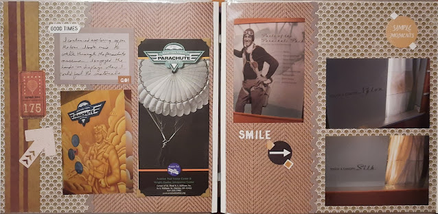
Attached to the visitor center in Dayton is a museum devoted to parachutes. I liked the tactile part where you could compare nylon and silk chute materials. 


I based this layout on an older Virtual Crop challenge that I saved. I didn't need to focus on Covid like the blog suggested, I just followed the sketch--though I did flip it upside down and left to right. The background paper includes a sheet of a fabric textile--while neither nylon nor silk, I thought it went well with the fabric concept and matched the tone of the photos/brochures. A few embellishments from my stash rounded out the page.

Inside the exhibits are a variety of informative panels and samples of parachute packing tools. The most important thing is to have a properly packed chute if you want to get to the ground in one piece. They included ejector seats as part of the display as they are attached to parachutes as well.


I made this layout as part of a class. It was a great layout for a lot of horizontal photos. I used papers from an Australia-themed pack as well as Travelog from a few years ago. I filled in a couple of the blank spaces with mats. The bottom left is an envelope, I just chose not to add anything to the inside. The mat in the upper right is probably a formation found in Australia but the color worked with the photo next to it so without proper context, it's just another journal mat!

Friday, May 12, 2023

Printers, Grocers, Cycle repair---Oh yes, and they flew too.

 After our formal tour was over, I had a chance to walk through the rest of the spaces in downtown Dayton. Before they flew, the brothers had many careers including owning a grocery store, a print shop, and a cycle shop (creation and repair). All of these premises are recreated. I think the grocery store was my favorite. 


This layout was made as part of a class I took so I cannot show the sketch. I'm using up some Vintage Chic paper from old CM here. I typically would use these colors for mid-century modern but it spoke to me and I think it turned out quite nicely. Blue and orange are complementary colors but purple also works with those tones though not a "triadic" team if you look at the color wheel. Not a lot of embellishments here--just a few tags and titles. But the print on the background is a bit bold so it doesn't need much embellishing.

Next stop--print shop. You know that it's second only to medical history as a place where I'll spend some time in a museum. I think it's because my father had a print shop when I was growing up and so it's very nostalgic for me. 


This layout was a 1-2-3 class that I taught for my scrapbook customers. We can get 8 pages done in less than 2 hours (not including the time it takes to pick the right paper). These papers came from, oddly enough, the Keep the Faith tonal papers. I was looking for something with a brown base but also wanted a contrast on the reverse side. Tonal packs can be used for anything so don't let the "faith" stop you from putting the paper to good use!

The last focus for the brothers is their cycle shop. The original shop is with their home at Henry Ford's museum so this is another recreation. Because it was rebuilt they could move it closer to the original home site so the distance between the 2 is much shorter. 


This layout is also from a class (same as the first layout). I chose an old Croptoberfest pack from 2017 (ironically--the same year I took these photos! How appropriate!) I was short a few photos so on the right page I substituted a large square mat and a journal box. I've had that journal box for a while now--it is from the Archivers line from many years ago. I do love that line but I have just a few pieces left. I augmented the stickers from the Croptoberfest pack with things that looked like gears and a small ephemera piece of a historic bicycle. 

Saturday, May 6, 2023

National Scrapbook Day bonus post! Morristown Grand Opening

 Happy National Scrapbook Day everyone! I'm posting today because I am playing along with one of the Lasting Memories challenges for May. I am currently working on a trip to Morristown in 2018, and you'll hear more about that in a few months. For now, this is the ribbon cutting and a few photos of the newest museum space called the Discovery History Center.


This layout is based on a sketch I saved from Creative Memories. I saved it because Noreen Smith created it! 😀 I used Creative Memories Americana paper for the background and a few of the borders. This was an older kit from 2017 and I only have a few pieces left, but what a great way to use up my scraps! I added a few pieces from Paper Loft's Euphoria papers as well. The stars are from a VERY old scrap pad I had and had to be fussy cut before I paper pieced them together. 

To participate in the Lasting Memories Challenge I needed to use a row from their tic-tac-toe board so I chose the bottom row.


There are more than 2 pattern papers but I think that's OK 😀 The circle became my journal space and I added a punched border in pale ivory to the bottom patterned paper. I hope you enjoy it!

Friday, May 5, 2023

The Flat Hat Award

In October 2017, I traveled to Dayton Ohio to present the NPTC Flat Hat Award to Joe Raterman. We had a small group of club members attend plus some co-workers and friends of the recipient. We were able to use the upstairs lounge of the visitor center but the ceremony was also live-streamed on the club's Facebook page. 

This layout is based on one of Noreen Smith's 1-2-3 layouts. I made the layout BEFORE I realized that I would need to add an 8 1/2 x 11 pocket page in between. It ended up working out but I wish the 2 pages could be seen side-by-side. The paper is from the Gemtones collection that was part of a secret box. That kit worked very well for the heritage-type layouts on this trip.

After the ceremony, Joe took us on a tour including the bike shop and the area where the Wright Birthplace was. Yes, it's gone. Not destroyed or anything--Henry Ford took it and the top layer of soil for his own museum in Michigan. Somehow I find that rude but at least it is still preserved. The house where the Wright brothers lived as adults is still in Dayton though I didn't get there on this trip.


If you compare the top and bottom photos you will see a large white square on each page. The idea behind the layout is to align photos with that paper so that it looks like all one sheet of paper. This is why I do not trim my photos until I decide on the sketch I'm working with. I don't want to have to mat things to get back to 4x6 sizes.