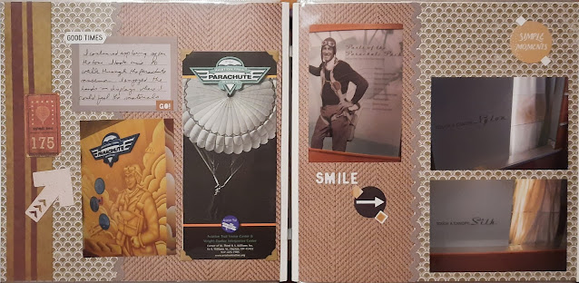
Attached to the visitor center in Dayton is a museum devoted to parachutes. I liked the tactile part where you could compare nylon and silk chute materials.
I based this layout on an older Virtual Crop challenge that I saved. I didn't need to focus on Covid like the blog suggested, I just followed the sketch--though I did flip it upside down and left to right. The background paper includes a sheet of a fabric textile--while neither nylon nor silk, I thought it went well with the fabric concept and matched the tone of the photos/brochures. A few embellishments from my stash rounded out the page.
Inside the exhibits are a variety of informative panels and samples of parachute packing tools. The most important thing is to have a properly packed chute if you want to get to the ground in one piece. They included ejector seats as part of the display as they are attached to parachutes as well.
I made this layout as part of a class. It was a great layout for a lot of horizontal photos. I used papers from an Australia-themed pack as well as Travelog from a few years ago. I filled in a couple of the blank spaces with mats. The bottom left is an envelope, I just chose not to add anything to the inside. The mat in the upper right is probably a formation found in Australia but the color worked with the photo next to it so without proper context, it's just another journal mat!


No comments:
Post a Comment