Google

Friday, May 27, 2022

Summer Road Trip Part 5--More of Moore's Creek

The rest of my day at Moore's Creek included more "manly" pursuits. First I got to watch the blacksmith and his apprentice working at a forge. Everything had a Scottish flair to it from their kilts to the sgian dubh (pronounced Skee-n, Doo). The latter is a small knife tucked into the sock. You can see it below with the red fringe hanging over the sock.


I made this layout as part of the Creative Life Scrapbooking July 21 pajama party. I was using plaid paper from a Christmas stash but it certainly worked with the tartan theme of the reenactors well. I don't know why my borders are facing different directions on the 2 pages. I think that might have been a late-night gaff. The purple flowers are from a VERY old CM border kit. I think it was a gift for National Scrapbook Day in the early 2000s. I thought that they resembled the thistle (Scotland's national flower") and I liked the accent they gave to the page.

There were plenty of explosions as they did musket firing and cannon firing demonstrations. They take quite a while to describe the steps and perform them for us. I'm sure in a real fight the process goes MUCH faster. But I like the pageantry of the demonstrations. The reenactors love their roles and it shows.


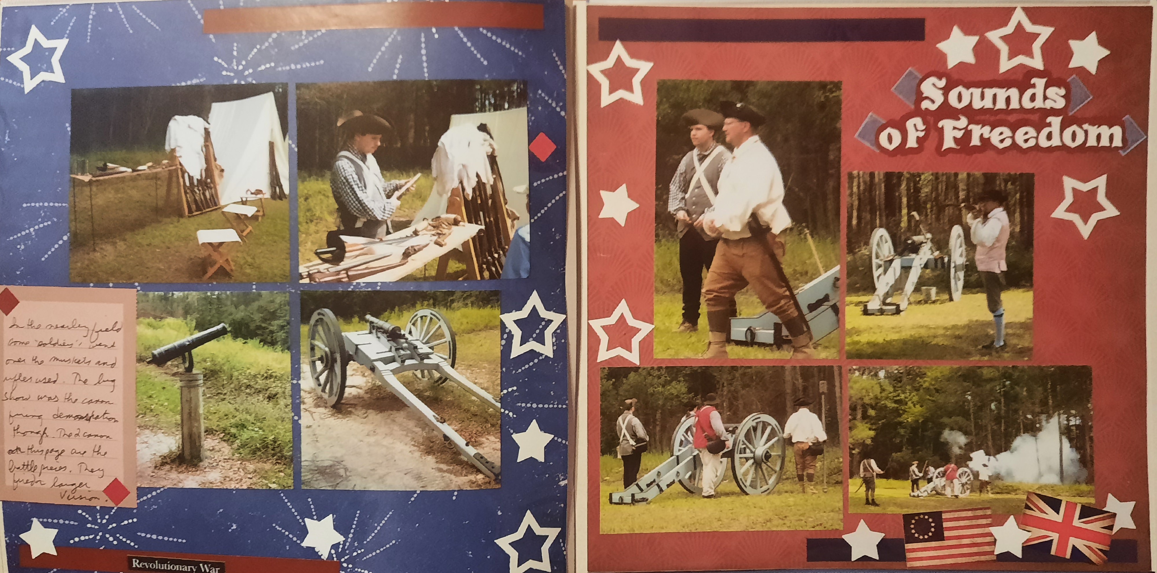
I made the right-hand page during my July MotherLOAD class. We were given the word "Freedom" as inspiration for our page. I thought about it a while and decided that "Sounds of Freedom" (which I hear more frequently as it relates to modern warfare) was an apt title for the page. I cut the title on the Cricut and decorated the page simply with white stars. The punch creates 2 at a time--the frame and the smaller inside stars. To counteract the red background I used some older CM designer stickers. The sheets come in sets of blue (strips, squares, etc.). As I completed the album I realized that there were additional gun photos to include so I created the left side as a companion piece. I thought the blue background with fireworks was appropriate to the topic. I had red stickers similar to the blue ones and that balanced the 2 pages. I used the same punch to position the stars similar to the red page. I even had room for journaling!

One of the last events of my day was to listen to the piper play. He gave us some traditional songs as well as music from Outlander (based on one of my favorite novels). I'm glad I got to go to the living history. It's a great way to expand your ideas of the park as well as life in the 18th century. This was the last page of my album for the first half of the trip. Next stop--Guilford Courthouse!


This page is from the CM Virtual crop in July 2021. You can see the sketch here. I continued to use up the plaid paper from the Christmas pack. I incorporated more red here since there was a bit of red in the photos. I didn't want it to look Christmas-y so I added the black and white and not much green. I thought that the flower with musical notes on it worked well. It's a little more pink than red, but I kept it. 

Friday, May 20, 2022

Summer Road Trip Part 4--Moore's Creek

Near the end of the first week, I took some time to return to Moore's Creek National Battlefield. They were having a special event, a Living History Weekend, and I wanted to see what they had planned. I parked near the visitor center and walked the first part of the battlefield trail to get to the encampment. 


The left photo was created for the Summer MotherLOAD class. The daily prompt asked if we were "city" or "country". I chose "Country" and used that prompt to spur this page of the fields entering the walking trail. The papers came from Spring Medley. I was working in a hotel room on layouts for the last week of August so my options were a bit limited. I believe I took this collection because the tones matched some of the seaside papers I had also pulled. Just goes to show you, don't pick the collection because of the name, use the papers to guide the layout! (Well, so long as they match the photos).

The right page was one of the August Classes also from Noreen Smith. I liked that I could use some non-CM scraps for this page. the background is supposed to be mint, I think. But it gives a nice "green" base for the rest of the page. The orange is a remnant of a Club Scrap paper. The pattern is supposed to be "wheat" but I think that the rest of the garden works well with that as the focus. The border on the right is from a farm pack of stickers. There are a few random vegetable stickers that I think are from the CM "Locally Grown" pack.

The next layout may look familiar to you. I created it last summer when I was a guest designer for the Lasting Memories blog. My blog entry can be reviewed here.


Between the Guest Designer work and the Summer MotherLOAD challenges, I was doing a lot of my pages out of order. That's not how I typically work so it was interesting to try to fit all the bits and pieces together when I was ready to complete the album.


In addition to the games and entertainment on display, there was a lot of information on foods and cooking in the 18th century. Some of that I know from watching A Taste of History on PBS, but it was nice to see it all up close. I didn't eat any of the food, but the re-enactors did eat their lunch from the stew being made over the fire pit.


This layout was from one of the Creative Life pajama parties. The concept was to make the tiered squares, cut them in half, and layer with a border. Since there was dining, I chose a new punch with plates and silverware. The papers are from the very old Earthy palette. I think they matched the tone of the period well. The clusters of diamonds were cut from one of the papers. The half-circle was a large sticker that filled the empty space nicely.

Friday, May 13, 2022

Summer Road Trip Part 3--Lighthouse in the Dark

I made it to the beach in Atlantic City and spent several wonderful days with my in-laws. Luckily, our trip fell during a full moon and in the summer Cape Lookout holds special night climbs since there is extra "illumination". So my husband Jim and I signed up. We drove to Harker's Island where we caught a ferry to the lighthouse. We walked to the beach for some moon photos and then returned to the lighthouse. Rangers were stationed at the bottom of the entrance to talk about the lighthouse and the job of the keepers. 


This layout is all my own idea! I knew that I wanted to use the Graphic 45 By the Sea collection as I still had quite a bit in my stash. I looked at the pieces and started planning how I could arrange them to highlight our visit. I did a bit of paper tearing and some fussy cutting and came up with the layout you see. I entered this in a Scrapbook.com challenge on their forums and won the monthly prize of more Graphic 45 items. Since I know I have a ton of lighthouses to show later, it won't be a problem using them up!


The event included the opportunity to climb the lighthouse. I was not sure that I would be able to do it, but I had talked to a ranger the day before at the Beaufort visitor center and she assured me that I would be OK. I just would want to pace myself and stop periodically. I did that and am happy to say that I MADE IT! Jim and I took a few photos from the top but since it was completely dark out it is hard to make out much detail.


I made this layout as part of a Summer "MotherLOAD" class (LayOut A Day). We were to create a page based on a photo prompt from the leader which had a lot of tall trees in it. I thought about it and decided that the trees reminded me of the lighthouse and so I put this page together. I had a scrap of brick paper so I used that to anchor the right-side photos. Because Cape Lookout is painted in black and white I thought the mosaic background would be a good base. The red elements are from a travel pack from CM a few years ago. I feel lucky to have found that quote for the middle. Not only does it capture the event with my husband but it has the up and down arrows reflecting our climb!

Friday, May 6, 2022

Summer Road Trip part 2--Petersburg

After Tredegar, I did make an additional stop for a stamp and toured the Henricus Historical Park. The stamp was for the John Smith Chesapeake Trail and it's a tangential connection at best. There are MANY pages of that visit and I didn't want to overload the blog. Similarly, the evening before Petersburg included a stop at the Blandsburg cemetery next to the park where I learned about Victorian Era grave decorations. It was a fascinating talk and if you see it offered, take the tour. But there are tons of photos of gravestones too and I thought the blog would be better without them. If I ever run out of ideas to post (HA!) maybe I'll return to those pages.  Let's turn instead to the next stop on my trip--a return to Petersburg.

I started my Petersburg visit with a return to the visitor center and then walked the Mortar Loop trail. This was the Confederate line with a variety of cannons.


For this layout, I wanted to use the canon/field paper on the left because it matched my visit. the secret is that this is really a page meant for Gettysburg. I taped the Petersburg sign over the label though because that is the only thing that really makes it a Gettysburg page. The journal box is a card from the Eastern National scrapbook pack. The right page has 2 more stickers from that pack on the small journal box. Nothing fancy on the right--just wallpaper with an old CM brown page. I was hoping the compass watermark looked a bit like canon wheels.

Along the trail, I got to see the "Dictator" (well, not the one actually used in the siege, but a similar one from that era). I was impressed with the size of the mortar! My next stop was out at City Point to see Grant's Headquarters. I toured the home and then went to see a ranger talk on the use of the telegraph. There are 2 rivers nearby and the views were lovely. But I had to head down to the beach so I didn't stay too long.


I'm not completely sure where the idea for this layout came from. It isn't a 1-2-3 based on the amount of paper used, and it's not a familiar sketch. So perhaps I had my own idea! It happens sometimes. What I can tell you is that the base is a 12x12 sheet of brown cut in half and used to anchor the bottom of both pages. I used a rather old piece of CM paper that had a printed border on one side. however, it wasn't 12" in both directions (this was the "perfect fit" paper for the CM pages that were not QUITE 12x12). I cut it "across the grain" and created the 2 border strips. The blue tones were a nice contrast to the browns. I punched 2 borders with the grass punch to fill in the bottom. Very little embellishment on these pages--just 2 stickers that came from a Scrapbook Customs sticker pack. I have lots of these as they are the same for every park and I bought at least 2 dozen packs!