Google

Friday, October 30, 2020

Happy Trails part 8--There's No Place Like Home

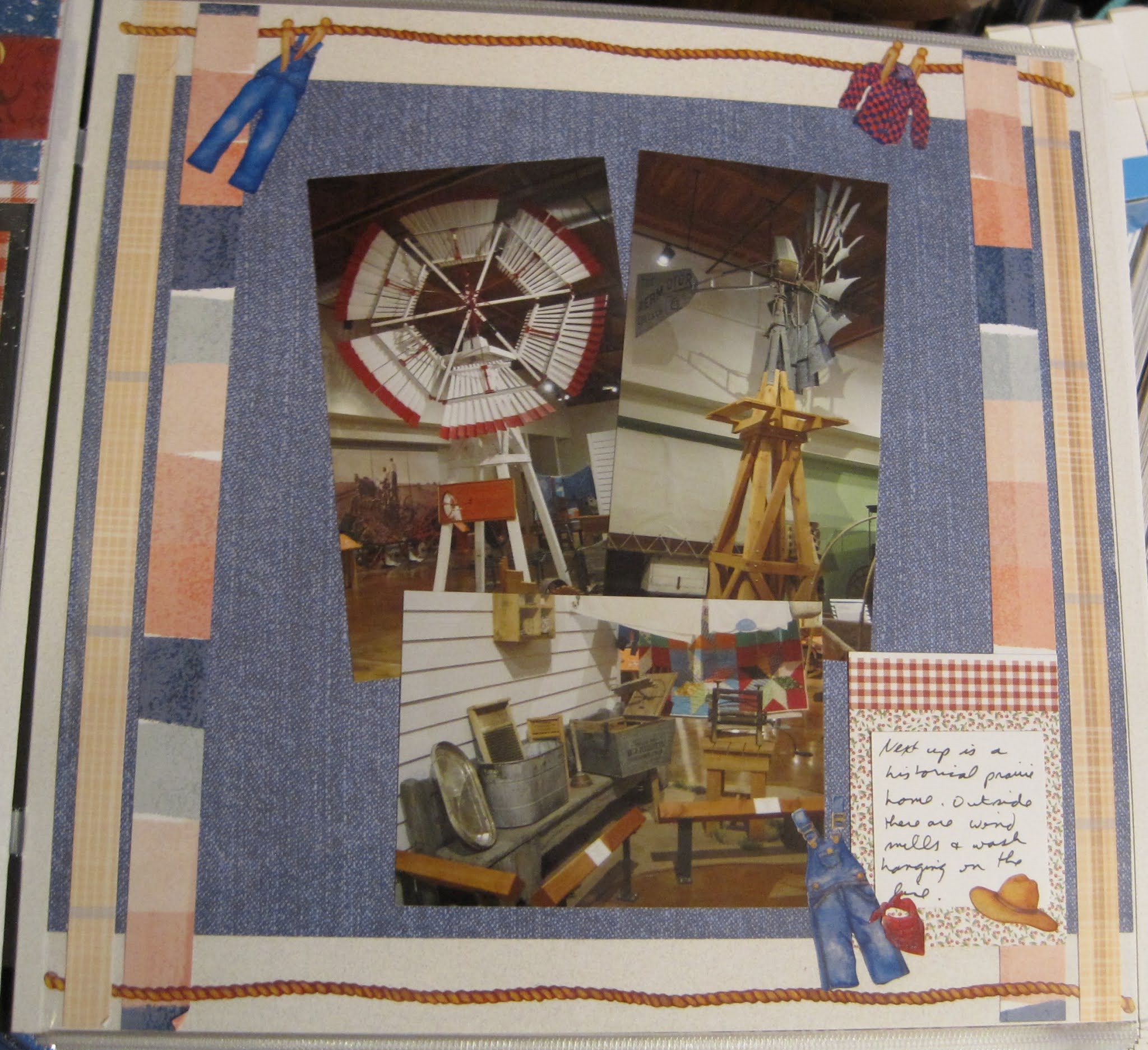
The next display continued with "everyday life" but switched to windmills and farmhouses. The display included both the inside and outside of the house which is rather unique. 


I made this layout during the CM Virtual Crop in June. You can see the sketch here. I used several papers in this layout. The denim blue is from a pack called Outdoor Blues. The plaid tan along the left and right sides are from some 10x12 CM paper (which tells you how old it is) and I don't remember the line. The inner stripes are from Painted Prairie (which seemed appropriate given the theme). The Painted Prairie paper is a special pack of just 6 sheets. CM makes them available to consultants 4 times a year. You can use them as incentives for your customers. Other decorations on this page are from the old "Day at the Farm" sticker pack from CM.


The next layout is more about the inside of the house. I liked the kitchen the best (as I usually do) and loved that this one included the canning jars. That brings back memories of helping my mom can tomatoes every summer.


I scraplifted this layout from an old CM blog post. While that blog page disappeared with the Old CM, I had pinned the image and understood the idea of using the tag punch to make the frill around a canning jar lid. The jar itself is just a rectangle of paper (this one from the old Earthy line) and a contrasting piece as the "label". The rim of the jar was a piece of a roll of decorative tape (the precursor to Washi tape) and I finally used it up! It really looks like a canning lid doesn't it? The gray doily was made using a special punch that will create circles with decorative edges. Two have been made so far--this one and a tulip border. They take 6" squares of paper and turn them into decorative mats. The "Home Cooking" and borders are from the Made with Love pack. Put all together, it's an historic kitchen from post to pictures!

Friday, October 23, 2020

Happy Trails part 7--On the Wagon

The museum moved into more recent history and featured a display of chuckwagon cooking. I used to watch competitions on TV among historic chuckwagons, so this caught my interest. 


This paper pack is S'mores and it worked perfectly to generate the rustic feel. I especially like the starry night paper as a background. I followed the sketch for the CM virtual crop again. The idea behind this layout was to create a border across the top. I did that by layering 3 different papers (the gingham, the blue speckle, and a red bandana paper) and then using the campfire punch to balance the edges. I cut the flames in both orange and yellow to create a more realistic flame. The title is from the S'more's theme pack. The wagon and the cowboy boot and hat on the journaling box are from some very old Day at the Ranch stickers from Creative Memories.


Below is a close-up of some of the vintage cookware on display and another old chuck wagon. 


I used a peekaboo pocket to add the last 2 photos without making a 2-page spread. I have a lot of ground to cover in this museum and wanted to save a little space.

Friday, October 16, 2020

Happy Trails Part 6--the historic home

Moving along the museum path, I encountered more murals and dioramas of everyday life. The recreated home was interesting to me, especially as I had to walk through the front door of the house to continue.


This page was created for one of my scrapbook classes. The theme of that month was to use our stash of photo and decorative mats to create a layout. So I chose 3 of my horizontal photos and 3 mats and arranged them to cover the page. The top left mat was my title, the middle one my journal box and the bottom left my embellishments. On that one I added the sun in the middle. It's a 3D die-cut from an older travel pack and came with pop-dots on the bottom.


As I entered the house, I was treated to the unusual hanging cradle and had to get closer to investigate.


This page is wallpaper. I thought the brown/gold tones matched the photos well. The arrow is a little brighter than I would have liked but it matched the title card from the opposite page, so I left it.

Friday, October 9, 2020

Happy Trails part 5--On the Trail of History

The next layout is still at the Farm and Ranch Museum. This is the display that pertains directly to the El Camino Real de Tierra Adentro. This display features ANOTHER cart used on the road--kind of amazing how many were found! To add to the display, the back wall was painted with a mural of everyday life. 


As I mentioned last week, the left page is the backside of a pocket page (the front holding the museum brochure). The layout is based on a sketch for the June 2020 virtual crop for Creative Memories. You can see the blog post here. While many people turned the 3 elements on the sides to small photos, I knew that I had to downsize the layout because of the size of the left page. So I chose to go with stacked circles (chosen because of the background paper). That left the middle for photos (and I never feel like I HAVE to use a vertical where they put a vertical place holder). The edges are a border maker basketweave. I thought based on the activities in the mural that it would be a good match.

Friday, October 2, 2020

Happy Trails Part 4--The Farm Museum

 My next stop for an El Camino Real stamp was the New Mexico Farm and Ranch Heritage Museum. This is a huge place with lots of interesting displays and we'll take the next month to go through it a bit at a time. Even though only one part deals with the El Camino Real, the rest is rather interesting.


The layout is another challenge from the Creative Memories Virtual Crop. You can see the blog post here. I chose a background paper from the Rustic Manor pack which has a photo of a barn door. I was able to keep the image present even though I added photos and other embellishments. One of the elements of the sketch is the set of mats under the photos. I chose a rather neutral color, but to give a little more definition, I punched the edges with one of the CM Border Maker System punches. It's called "Garland" and is one that leaves a stencil rather than cut shapes (as you saw in last week's page). I had a couple of cow stickers and die cuts and used some brown cardstock to set off the rest of the elements. The one thing that looks out of place is the sticker I wore for admission. I preserved that and wanted to add it to the page. Although the color is off, it does belong there.


I added this photo just to show you why this is a one-page layout for such a large museum. I wanted to include the Museum Guide in one of the Pocket Pages. The back of the pocket became the left page for the next layout. You'll see that next week.