Google

Showing posts with label Moores Creek National Battlefield. Show all posts

Friday, May 16, 2025

Don't Forget the Women

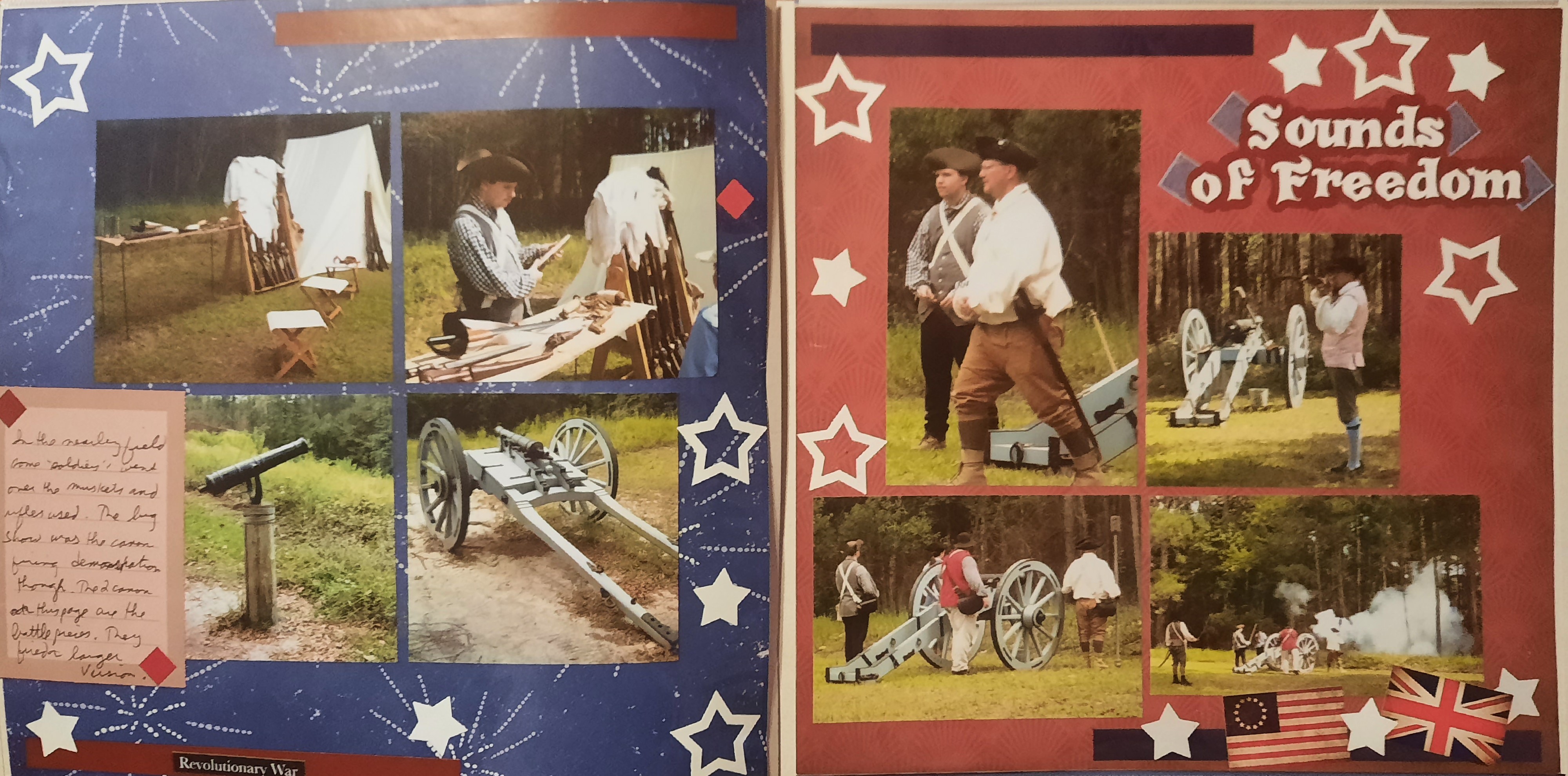
This is the last entry for Moore's Creek, but more entries are coming about my drive home from the beach in July 2021. Along the tour route are a variety of memorials, many of which I hadn't seen on my last trip, as I had to cut my tour short. Today, I lingered and took in the various statues. The ones that stood out to me included those for the women of the Cape Fear area and the Patriot Monument. The monument to Mary Slocum is probably not a true story (about having a premonition and riding through the night to save her husband). But the sentiment of a statue for women is unique, and I appreciate the effort. They also serve, those who stand and wait.

The Patriot Monument, also called the Grady Monument, is a sandstone obelisk placed on the battlefield in 1857 in honor of the first North Carolinian to give his life on a contested battlefield for American Independence, John Grady. The monument with the thistle is for the loyalists. Though they fought for Britain, their presence here steered the sentiment that led to the passage of the Halifax Resolves—North Carolina's vote for Independence.


My first note here is to thank my mom for the paper. I was scrapping at her house, and as I had a minimal amount of decorative paper packs with me, I rooted through her stash for something suitable for this page. I chose a piece of paper from the Bold and Slate pack, an Advisor-only paper pack (my customers earn those through purchasing products, and she had earned this set). I liked this paper because of the handwriting design on one side. The journal box is from a very old pack from CM called Archivers. I layered it on a darker mat to differentiate it from that handwriting paper.

To create the design, I turned to one of Noreen Smith's 1-2-3 layouts (December 2016). In the original sketch, the right side had 3 horizontal photos, but it was simple enough to turn that 90 degrees to allow for more of my vertical photos. As I take more pictures with my cell phone, I have more vertical photos. Do you have that same problem? If so, keep a copy of this sketch as it's the perfect way to highlight them. The paper and 6 photos will cover the cardstock, so you can use any color that you want to use up.

Tuesday, May 13, 2025

Highlander vs. Highlander

Today, we return to my visit to Moore's Creek on my journey home from the beach. I walked the 3/4 mile loop, listening to the audio tour. They highlighted the canon (there were 2 small ones integral to the battle) and the swamp. But the major battle was at the bridge. And if you've read Diana Gabaldon's Outlander series, you will recognize that this is where Jamie and Ian (Highlander Scots) fought for the American Colonials, facing their Scottish compatriots fighting for the British. Of course, I was enchanted by this location and took several photos. 


This layout is based on one of Cheryl Even's sketches. I originally started with 2 white bases (a rarity for me), but as I built the right-side page, I realized there would be too much bright white showing. I traded the cardstock for gray patterned paper from the Passport to Adventure kit. You'll also recognize the green strips from that pack, as they are part of the scrap from the prior blog post. A few other scraps of paper provided more variety in the layout. I am rather proud of myself for using the small passport frame. On one journal card was an image resembling the passport stamps that Eastern National provides. I punched that out and added it to the photo window, then covered the "tickets" sprouting from that frame with the National Park sticker. And voila--the embodiment of the National Parks Passport! The Adventure sticker and the 2 stickers on the left page are from one of the Scrapbook Custom sticker sheets. There is always a sheet specific to the park and then a generic one you can use for any park (as I've done here).

Friday, May 9, 2025

Some More of Moore's Creek

I'm continuing my July 2021 beach trip. Or should I say concluding it? I made my way back home after a fun week at the beach (with no National Park sites). We had vacationed in Oak Island, NC, and driving to Moore's Creek was not far. I've been here a few times, so it was mostly a re-stamp exercise, but I spent an hour walking around the trail. You'll see those photos next week. To start, here's the sign and my sign selfie!


I based this layout on a sketch I saved on Pinterest. I used the Creative Memories collection called Passport to Adventure. It's still available if you want to recreate this layout (and if you do, please post a photo or link in the comments below!) I liked the green paper as I thought those arrows could be imagined as trees in the sign's background. I used the compass punch and the stickers from the pack to create the border along the left. I found many of the little postage stamp embellishments that matched the layout and clustered them around the main focal points.

Friday, May 27, 2022

Summer Road Trip Part 5--More of Moore's Creek

The rest of my day at Moore's Creek included more "manly" pursuits. First I got to watch the blacksmith and his apprentice working at a forge. Everything had a Scottish flair to it from their kilts to the sgian dubh (pronounced Skee-n, Doo). The latter is a small knife tucked into the sock. You can see it below with the red fringe hanging over the sock.


I made this layout as part of the Creative Life Scrapbooking July 21 pajama party. I was using plaid paper from a Christmas stash but it certainly worked with the tartan theme of the reenactors well. I don't know why my borders are facing different directions on the 2 pages. I think that might have been a late-night gaff. The purple flowers are from a VERY old CM border kit. I think it was a gift for National Scrapbook Day in the early 2000s. I thought that they resembled the thistle (Scotland's national flower") and I liked the accent they gave to the page.

There were plenty of explosions as they did musket firing and cannon firing demonstrations. They take quite a while to describe the steps and perform them for us. I'm sure in a real fight the process goes MUCH faster. But I like the pageantry of the demonstrations. The reenactors love their roles and it shows.


I made the right-hand page during my July MotherLOAD class. We were given the word "Freedom" as inspiration for our page. I thought about it a while and decided that "Sounds of Freedom" (which I hear more frequently as it relates to modern warfare) was an apt title for the page. I cut the title on the Cricut and decorated the page simply with white stars. The punch creates 2 at a time--the frame and the smaller inside stars. To counteract the red background I used some older CM designer stickers. The sheets come in sets of blue (strips, squares, etc.). As I completed the album I realized that there were additional gun photos to include so I created the left side as a companion piece. I thought the blue background with fireworks was appropriate to the topic. I had red stickers similar to the blue ones and that balanced the 2 pages. I used the same punch to position the stars similar to the red page. I even had room for journaling!

One of the last events of my day was to listen to the piper play. He gave us some traditional songs as well as music from Outlander (based on one of my favorite novels). I'm glad I got to go to the living history. It's a great way to expand your ideas of the park as well as life in the 18th century. This was the last page of my album for the first half of the trip. Next stop--Guilford Courthouse!


This page is from the CM Virtual crop in July 2021. You can see the sketch here. I continued to use up the plaid paper from the Christmas pack. I incorporated more red here since there was a bit of red in the photos. I didn't want it to look Christmas-y so I added the black and white and not much green. I thought that the flower with musical notes on it worked well. It's a little more pink than red, but I kept it. 

Friday, May 20, 2022

Summer Road Trip Part 4--Moore's Creek

Near the end of the first week, I took some time to return to Moore's Creek National Battlefield. They were having a special event, a Living History Weekend, and I wanted to see what they had planned. I parked near the visitor center and walked the first part of the battlefield trail to get to the encampment. 


The left photo was created for the Summer MotherLOAD class. The daily prompt asked if we were "city" or "country". I chose "Country" and used that prompt to spur this page of the fields entering the walking trail. The papers came from Spring Medley. I was working in a hotel room on layouts for the last week of August so my options were a bit limited. I believe I took this collection because the tones matched some of the seaside papers I had also pulled. Just goes to show you, don't pick the collection because of the name, use the papers to guide the layout! (Well, so long as they match the photos).

The right page was one of the August Classes also from Noreen Smith. I liked that I could use some non-CM scraps for this page. the background is supposed to be mint, I think. But it gives a nice "green" base for the rest of the page. The orange is a remnant of a Club Scrap paper. The pattern is supposed to be "wheat" but I think that the rest of the garden works well with that as the focus. The border on the right is from a farm pack of stickers. There are a few random vegetable stickers that I think are from the CM "Locally Grown" pack.

The next layout may look familiar to you. I created it last summer when I was a guest designer for the Lasting Memories blog. My blog entry can be reviewed here.


Between the Guest Designer work and the Summer MotherLOAD challenges, I was doing a lot of my pages out of order. That's not how I typically work so it was interesting to try to fit all the bits and pieces together when I was ready to complete the album.


In addition to the games and entertainment on display, there was a lot of information on foods and cooking in the 18th century. Some of that I know from watching A Taste of History on PBS, but it was nice to see it all up close. I didn't eat any of the food, but the re-enactors did eat their lunch from the stew being made over the fire pit.


This layout was from one of the Creative Life pajama parties. The concept was to make the tiered squares, cut them in half, and layer with a border. Since there was dining, I chose a new punch with plates and silverware. The papers are from the very old Earthy palette. I think they matched the tone of the period well. The clusters of diamonds were cut from one of the papers. The half-circle was a large sticker that filled the empty space nicely.

Sunday, July 11, 2021

Life is Good in the 18th Century

 Hello and welcome to a special edition of my blog. This month I'll be serving as a Guest Designer for Lasting Memories. That blog posts a weekly challenge and then encourages others to play along with drawings at the end of each month. This month's challenges are all Title challenges. This week the challenge was to use the phrase "Life is Good".

I looked through my photos and decided that I would focus on a living history display at Moore's Creek Battlefield, NC. I had stopped here during a 2016 beach trip with Jim's family and enjoyed spending the day looking at the way people dressed, cooked, worked and lived. Many more pages to be added later!


Once I figured out the last half of the title and chose the photos, my next step was the arrangement. I found the journal box. It's from the CM Enchanted line (quite a few years old). I liked the way it had a feel of nature as well as a touch of red to match the people in my photos. I tried to match the green of the journal box with the photo mats. It's a close match but not exactly the same. I wanted a dark background to make the green pop and found 2 older pieces of brown paper. This is from an older travel collection in what CM would have called "Jewel Tones". The title was cut from the Cricut with green letters and backgrounds for balance (love the new Offset feature in Cricut Design Space).

After trimming the photos and arranging them I chose the ones that would get a mat (one short of course). For the unmatted photo, I found another journal box in the same Enchanted line. I fussy cut that small border from it and that balanced the last photo. The round circle on the bottom right is from a pack of laser-cut embellishments. It's green on the other side but not quite a match for the layout. The dark gray/black worked just as well given the frame in the journal box. I added 2 18th century stickers from my Eastern National scrapbook kit.

Picking up on the dark gray/black circle and frame led me to the Infinity Chain border maker cartridge on the bottom left. That is one 12" strip cut in half. The 6" piece is horizontally on the bottom of the page. Then I cut the other side into individual links and mounted them vertically on top. Final embellishments were more fussy cut leaves and branches from another journal box.

I'm creating these layouts while on vacation so I have a portion of my usual stash. It's really making me use up what I have--embellishments, papers, even scraps. Probably a good thing so that I get more room for new products!

Friday, May 3, 2019

King George and Broadswords

Before we get into this week's post, I wanted to remind you that May 4th (the first Saturday in May) is National Scrapbook Day! It's always a good excuse to sit in the scraproom and create! Enjoy!

While at the beach with the inlaws, I chose a day to see Moore's Creek National Battlefield. This is a Revolutionary War battlefield (a little different from all the civil war sites I had been seeing). This battle is also a key element in a novel by Diana Gabaldon and so I was keen to see it in person. The drive from our beach house was 2 hours but for me well worth the drive!

Once again I began on the right page. The 2 historic canon from the battle were one of the highlights of my visit and though the wall paper I used was really for civil war, the short barrel made it ideal to highlight this time period. I probably should have matted the photos as they seem to be getting lost on the page though. On the left is an old piece of CM paper from the "Discover and Delight" line. I liked the grittiness of the background and sort of thought the dots along the top could be cannonballs :)

Another key feature of the park is the bridge on the left page below. The Americans removed many of the timbers and greased those that were left to prevent the British from crossing the creek.

This layout is from a class I am taking with Noreen Smith (Organized and Creative Mom). I cannot post the sketch, because of the rules of the class but it is one of her classic 1-2-3 layouts. The class theme is Scrap Your Stash, and for January we were encouraged to use up journal cards and decorative mats. The background paper is from Paper Loft. The top left mat card is from the CM Archivers line. The rest of the cards are so old it's a mystery where they are from! (I do know that the History title is from the EN scrapbook kit. I thought layering it on the circle a nice touch). I like that on the right page I used the postcard to stand in for 2 photo elements of the sketch. What will be interesting is that I used this same sketch 3 or 4 times on different park pages and you'll see it again and get a chance to compare them next week.