Google

Showing posts with label Blue Ridge Parkway. Show all posts

Friday, June 24, 2022

Summer Road Trip part 9--The Mill part of Mabry's Mill

The village at Mabry's mill contains a variety of structures. It reminded me a lot of the cluster of cabins at the Great Smoky Mountains. The mill can still function though it was not running at the time of my visit. I was impressed with the variety of machinery the water could power. When I think of a mill I generally think of grinding corn or wheat. However, this was also used to saw and inside is an impressive array of tools and jigs.


This layout is based on a sketch that I cannot find to show you. But you'll see that it's a fairly simple design. Since I had so many photos in a horizontal layout and could trim the rest to 4x4, I could run 2 layered borders through the middle. The layers include an older piece of textured fabric at the back, a middle strip of Reminisce paper, and a border maker cartridge of gears. Given the details of the photos, that was the easiest part to choose.

Another collection of historic structures included a sorghum mill (which was used to get something sweet because refined sugar was less available). I also found some wagons and plows "casually" spread around the clearing. 


This layout was made for my November class. The papers used were not CM. The white print in the middle is actually from the same tablet as the prints used in my comfort food layout last week. But the orange and green tones helped convey the rustic feel I was looking for. The embellishments were from the Homestead pack. One trick I used on this page is to take a slightly larger embellishment like a tree or large collection of leaves and cut it into multiple smaller sections. then you can use those to layer around your objects.

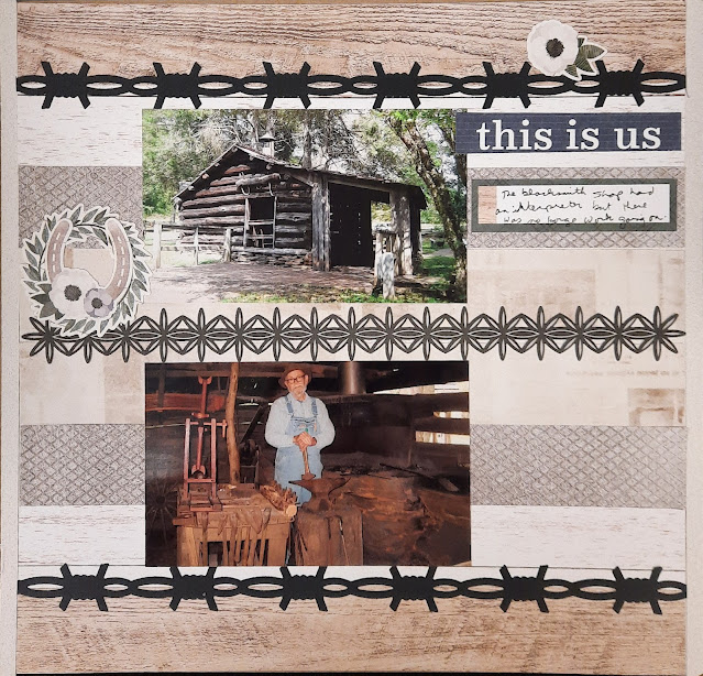
The last layout is of the Blacksmith Shop. There was a reenactor on duty but the forge had not been fired. Still, you can see the wide variety of items that a blacksmith had to be able to make.


I once again turned to the Homestead pack for this layout. There are scraps of a few other heritage packs as well. The sketch I based this layout on is from the CM Virtual Crop posted for a Black Friday Challenge. It wasn't posted on the blog, just on the Facebook group. The sketch has a variety of 12" strips of paper to make the background and then some borders to highlight the photos. I chose a laser-cut border for the middle and then added 2 of the barbed-wire border maker cartridge strips in black cardstock. It gave a nice contrast to the lighter papers. The title came from a mat card in the pack. (It's also my favorite TV Show!)

Friday, June 17, 2022

Summer Road Trip part 8--Why is the Ridge so Blue? (POST #300!)

 That's right! This is my 300th blog post! I thank all of you for joining me in my weekly look at my travels.

After leaving Guilford Courthouse I started heading north/northwest. My next stop took me to the Blue Ridge Parkway. I won't have time to see all of it, but I wanted to do more than accidentally drive along some of it on the way to the Great Smokies! (That story didn't make it into the blog, but we did have an interesting ride in the dark!) I got to see Mabry's Mill village and the Music Center. Somehow I didn't take photos of the Music Center so all I have is the entry sign.


The right page may look familiar to you. It was designed as part of my Guest Designer role from Lasting Memories last summer. You can review that post here. As I started putting pages in the album, I needed the left page for the unigrid and the park signs. I based that layout on a Club Scrap post featuring their National Parks pages. I had some of their paper left so I was able to recreate it fairly closely.

While at Mabry's Mill, I stopped for lunch. I had a "comfort food" meal of meatloaf and mashed potatoes (I even took a photo). I capped it off with a blackberry cobbler (blackberries are my FAVORITE fruit). Honestly, I forgot to photograph my dessert so I pulled a photo of the internet to complete my layout!


I made this layout during my Summer MotherLOAD class. The prompt of the day was Chocolate or Strawberry. I chose "berry" as a more generic term but did include a lot of pinks on the page. I broke out a tablet of cooking-themed papers that I had bought at a scrapbook yard sale. I bought it because my niece had just been accepted to a culinary program at the Vo-Tech school. The pad has some paper that is just colored prints so I was able to mix and match them. The design of the layout was based on a CM sketch from April 2018 that I had saved.

I had time to tour the village. This historic home charmed me. You'll see more of the village next week, but for now, check out the antique checkers set using corn cobs and cut branches! Nostalgic, but do I really want to go back and live in primitive conditions? Probably not!


This layout is based on one of my Scrap Your Stash monthly sketches from September 2021. I used the Home stead collection from Creative Memories. It had a nice shabby chic look to it that went well with this homestead. The bottom border is one of the laser die-cut borders. I love the intricate detail they add to a page!

Sunday, July 18, 2021

Love this View

 Hello and welcome to a special edition of my blog. This month I'll be serving as a Guest Designer for Lasting Memories. That blog posts a weekly challenge and then encourages others to play along with drawings at the end of each month. This month's challenges are all Title challenges. This week the challenge was to use the phrase "Love This View"

This layout features 2 photos I took as I started exploring the Blue Ridge Parkway. On my way, I passed this overlook called "Lover's Leap". Well, who could pass up a stop there? It was a beautiful day and the view of the valley, as well as the farther mountains, was spectacular. I entered the Blue Ridge Parkway and headed to Mabry's Mill. We'll explore this quaint village a bit more later, but this is my favorite photo that I took of the eponymous Mill.


Considering this is a mountain layout, it may surprise you to hear that this is the CM paper and embellishments from "Vitamin Sea". I wanted the blues and greens and was able to find a bunch of embellishments that were generic enough to create my clusters. The bottom border is perfect to carry out the theme of "view" and I was happy to see they weren't colored in like sunglasses. I cut small slits into the border between each pair of glasses so that I could bend them slightly and form the curve. It matches the curve of the title across the top. (The title was cut on the Cricut and I chose a font that would be puffy like clouds). All I needed then was the journal box which had the matching glasses in it and I was done! It took about an hour to make from start to finish.

Friday, June 19, 2020

50 States Album part 27--Virginia

Virginia, as anyone who has driven the entire length of I-81 knows, is a VERY long state! We've made quite a few trips over the years, especially when my uncles lived near Charlottesville. This page features one of my solo trips to the beach where I stopped in Richmond for some touring to break up the trip to North Carolina. That's the Maggie L. Walker NPS unit. The other photo is from Mabry's Mill which is along the Blue Ridge parkway. I highly recommend a stop at the restaurant near here and if you can get the blackberry cobbler--do so!
My inspiration for this layout came from this page. The cut-out of the state was one of my trickier bits of fussy cutting. I did have the Cricut cut the outline shape in blue. I mounted that on white and fussy-cut around leaving a small border, then mounted that on red and did the same thing.

I found it amusing to place a sticker of "We the People" just like the original (which hardly ever happens) but then augmented with some civil war and colonial stickers I had on hand to demonstrate the age of the state. The small informational piece on Maggie Walker is from the Eastern National scrapbook kit. I had cut a framed piece out previously for Clara Barton so this was an easy way to add more detail on a rather obscure historical figure.