Google

Showing posts with label Olympic National Park. Show all posts

Friday, November 26, 2021

A Tiny Bit of Olympic National Park

I hope you all had a great Thanksgiving! I want to thank you for following my blog and my journeys through the National Park System.

The display for Olympic National Park featured the concept of "Tiny Houses". The builders are recommending a structure like this as a visitor center to help preserve the environment. The outside of the house included local trees and plants as well as a small garden. Going through the display did bring back wonderful memories of my trip there.


This layout is based on one of my class sketches from February. I used a background from the Woodland Whimsy collection and a dark strip for the banner from the S'Mores collection. I was able to use up a bit more of my Olympic Park stickers as well as a few random nature stickers from my collection. I love these pages when they come together quickly.

Friday, July 9, 2021

On the Trail

Near the Quinault ranger station (which was closed during my visit) was a nature trail--two actually. One takes you to the Kestner homestead and the other is a nature trail. But if you go to the Kestner Homestead you can take part of the nature trail back, so I did both! The Kestner homestead only had outdoor exhibits of historic farm life. I'm not sure if they ever open the house but I don't think so as there wasn't a path to get to it easily.


This layout is a set of pages from a camping class I took with Paper Loft. I thought that the lantern decorations went well with the old-time farm look. Had I used this for camping there would have been more sayings and stickers put on the page but I left it undecorated purposefully.


My final layout for Olympic National Park features the trees seen along the nature trail. Many of them were marked with signs. Their height is impressive and difficult to demonstrate in photos. I thought the hanging moss a romantic touch to the vista as well.


You can tell I was getting to the end of a long scrapping session as the final pages didn't have as much work on them. These pages were purchased from Scrapbook.com, but are from the Scrapbook Customs line. I have purchased quite a few national park sets so you'll see more of these in the future. The only thing I had to add was a mat under one photo to keep it from blending in too much. 

Friday, July 2, 2021

Big Trees

As hinted at previously, this part of the world is responsible for most of the world records for big trees. One of the biggest is the Quinault Big Cedar. It truly is massive and I'm not sure my photos gave a grand scale of how big it is. But I could stand up inside the opening at the base if I could get into it! The path up was a bit more rigorous than I had hoped for but it was well worth the effort. Truly my fear was falling on the way back down because it is a rather steep trail.


I continued my work with the CM Virtual crop. This is my take on Sketch #2. You'll notice I don't do all the sketches in order. I don't always have time to start the crop in the workweek so by the time I get to Saturday I have a build-up of sketches to choose from. I like that as I can match the photos to the sketch without "forcing" it too often. I used paper from the S'Mores pack--a newer pack from CM but one that I loved. I had only a partial 2nd page of the boot prints, so I filled in the gap on the left with one of the tall trees from the Eastern National Scrapbook kit. While I'm fairly sure that die cut is supposed to be redwood or sequoia, it gave a little authenticity to this layout. The CM tree border maker cartridge is an old one, but the perfect addition to the layout. The green helps break up the brown tones.


Two other "Big" trees to highlight are the large Sitka Spruce and the Big Leaf Maple. If you look on the right page you'll see that I tried to give a perspective of that maple leaf by photographing it next to my foot. These trees are plentiful in the area and my rental was awash in giant leaves.


Sketch #4 was the basis for this layout. This time I got to use the brand new Hello Autumn collection. The photo of the maple leaf really set off the design. I love the paper in this pack that is a jumble of autumn leaves. It's not quite textured paper that looks like another photograph but the colors are quite vibrant. 

Friday, June 25, 2021

The Quinault Auto Loop

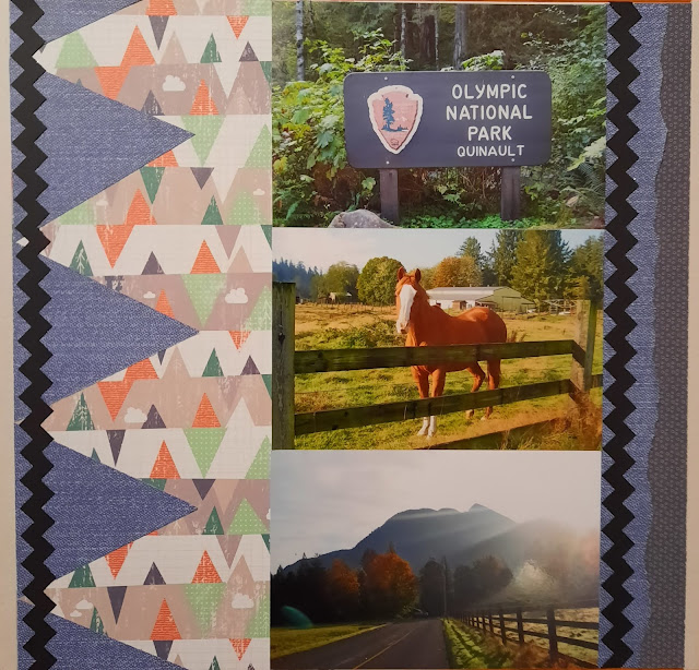
 On Sunday morning I started visiting the Quinault portion of the park in earnest. An auto-loop road started near my hotel so after I checked out, I drove toward the park entrance. On the way, I saw a beautiful sunrise and stopped at the side of the road to take photos. It wasn't very busy along the road. My "friend" came over to the rail near me as I was taking photos and so I snapped one of the horse as well. I think he wanted food but I didn't have anything for him, unfortunately.


While I did create this page during the CM Virtual crop as I had been doing in the last several instances, the inspiration page was much older. For the April 2018 crop, I didn't get all the pages completed so I just saved the sketch. This is my take on the triangles. I used a zig-zag border maker cartridge for the 2 long black strips. The background page with the vertical triangles is from Woodland Whimsy. The blue denim paper is from an old blue-themed paper pack from CM. The journaling is on the next page.


My journey took me across a wooden bridge. Again, since I was nearly the only one exploring, I could stop and take photos. I stopped at one of the nature trail stops for the waterfall photo. It was so peaceful I felt I could stay there for hours. But I had more exploring to do as you'll see next week.


Back to the October 2020 virtual crop, this page is based on Sketch #5. I used some scraps from several packs here including a travel pack. The black buffalo plaid is from the Scenic Route pack. But the rest of the accents and the woodsy paper came from the Explorer pack (which was nearly completed by this time). I used the Custom Cutting System to make the circles. For the green dot paper, it is the inside and outside track of the same circle. Thus I get 3 rings with 2 papers. You can see a bit of the denim paper on this page too which helps tie the left and right pages together.

Friday, June 18, 2021

Inside the lodge

The outside of the lodge was amazing. And then you step inside and it's like going back in time! This lodge has a rustic yet sophisticated feel to it. The bedrooms have old-fashioned claw-foot tubs and the lobby is meant to serve as the communal living room. There was a fire in the fireplace and some extremely comfortable leather chairs. I will definitely return for a longer visit.


This layout is from challenge #6 in the CM Virtual Crop from October 2020. I combined elements from 3 different Creative Memories packs. But the best part of the layout (in my opinion) is the border I used where the 2 background elements meet. This is a branch border punch. I chose it because it had a nature theme to it but also because the branches reminded me of the animal head hanging above the fireplace (and in my sticker). The dark brown cardstock draws the eye to the border. 

I chose to substitute one of the 6x4 photos for a large journaling box. Because I did that, I had to find filler for the bottom left and upper right corners. I chose to fill in with sticker clusters. The bottom left is a signpost I created myself from several sticker pieces. I mounted it on lighter paper so it wouldn't get lost in all the brown of the background paper.

Friday, June 11, 2021

Lodge Front and Back

I made it to my hotel--the Lake Quinault Lodge. It's a historic hotel right on the edge of the National Park boundaries. This is the front of the lodge and the photo below is behind the lodge. I was most impressed with the redwoods near the entrance.


I based this layout on a sketch in the October CM Virtual Crop. I used paper from the Explore pack including some small paper borders from a cut-apart sheet. I liked the woodgrain background because of the tree photos.


In the morning I was up early and was able to go down to the lakeside behind the lodge and grab a few photos. The birds were cooperating with me and I got a few choice shots.


This is sketch #3 from the same CM Virtual Crop. There are a variety of paper and sticker packs here. I group my supplies by theme so I could just browse through my "nature and camping" folder for pieces that would work.  I used a lot of blue tones for the lake feel. The rounded piece is a circle that I cut punched around the edges. I used the Cloud border maker punch without the straight guide. I just free-punched all around the edge. By turning the punch upside-down I was able to match up the edges for a smooth look. 

Friday, June 4, 2021

Water Water Everywhere

 After leaving Hurricane Ridge, I started driving around the park heading to my hotel for the evening. I stopped at 2 additional locations. Though neither of the stamping centers were open, I was able to see more of the diverse landscape of this unusual park. On the left is Crescent lake and on the right is the beach near Kalaloch. Both were along route 101 as I was driving and well worth the stop.


This layout is really 2 individual pages and yet they are connected by colors. I started with the left page and chose the elements based on a challenge in one of my yearly scrapbooking classes. We were given a chart and had to choose 2 different papers (one from each of 2 lists), a technique to incorporate, an add-on, and a word style. I chose: Paper 1: overall washed/textured look (this is the background blue), Paper 2:cardstock (for the mats), 3) technique: fussy cut (I fussy cut the wavy border along the bottom); 4) add-on: journal card; and 5)word style: Die cut words (the "perfect spot" and "spectacular view are from Paper Loft word sheets). Many times when I see those lists it is daunting to find things that relate but this one came together fairly quickly.

I then chose similar tones to have the beach photos match (same family for the background paper, same cardstock mats and same word die cuts). What you probably didn't even notice is that both papers were from a time when Creative Memories had pages that were slightly under 12x12 (for whatever reason they were 12" x 11.5"). They made "perfect fit paper" (of which these papers are examples) but it is sometimes hard to use them on our newer true 12" pages. So I cut strips from the same paper family and filled in the "gutters" along the outer edges. If you look closely you might see where they fit.

Friday, May 28, 2021

A Hurricane in the Mountains?

My next stop in Olympic National Park was to drive to Hurricane Ridge. I'm not sure why it's such an accomplishment to drive up--I can think of 2 or 3 worse drives I've done in national parks. But since they had a certificate, I was willing to buy it! The ridge provides a magnificent view of the mountains and is definitely worth a visit.


The layout is broken up a little by including the certificate, but the left page that you see above and the right page that is below are from a sketch from my 2019 Scrap Your Stash class. For that reason, I cannot show the sketch but you can see how I used more of the Adventure paper pack to stretch across the layout. I used patterned paper as a background. Choosing a small print works similarly to cardstock or base pages but with less weight than cardstock.


The view was quite amazing and the air quality was pretty good so I could see many of the peaks described on the infographic signs along the patio.


Using the 8 1/2 x 11 certificate holder gave me a little more real estate for photos. I matted 2 more scenic views on matching scrap paper and added a border sticker. One crop that I went to had a table full of scrapbook supplies someone donated and I found a sheet of stickers specifically for Olympic National Park! I held onto them until I made these pages. The large mountain border is from that sheet and was the perfect addition to the layout.


And yet, even with the 2 extra spots on the back, I still had MORE scenic photos! These didn't exactly match for me to create a panorama but on the other hand--they went well enough next to each other to try.


My other favorite way of adding photos is to use the CM Peekaboo pockets. And that's what you see above. By attaching it to the page, I can get 2 more photos to "Flip" open. And it really did help with the panorama look I was going for.

Friday, May 21, 2021

The Beaumont Cabin

 Just behind the visitor center is a historic cabin. While you cannot go inside, you can get a peek in the windows. I was able to get a few shots of the interior through the glass. Some shots were too blurry or had reflections of the windows but you can see quite a bit here.


For this layout, I used a pre-made set of pages from a class I took with Paper Loft. I had mounted the mats for the photos but with a little effort, I got everything to fit the way I wanted it to. My favorite trick (and one I've used a couple of times since) is to cut a 6x4 photo in half. The 2 small photos on the left with the history of the cabin and the image of the occupant were all one photo. By cutting it I feel I got a bit more emphasis on each piece. I think I originally imagined I would use this page for a personal camping trip. I was happy to see that it had more uses though! I know I've had the layout in my stash for several years!


Friday, May 14, 2021

The Old Tree

Continuing with my visit to the Port Angeles Visitor center, I was taken with a cross-section of a very large, very old tree. It was my first taste of how massive trees get in this area. You can see the full shot on the left page and then close-ups of the various arrows indicating historical events such as Columbus' landing in America.


For these photos, I turned to the June 2020 1-2-3 sketch from Noreen Smith (Organized and Creative Mom). I used more of the Adventure pack. Again, with all the brown in the photos, I wanted some green as the base color. The park sign on the top left is fussy-cut from the Eastern National 8 1/2 x 11 papers. I'm not sure where the tree journaling box came from (though I suspect Paper Loft). A handful of stickers finalized the page. The log stickers on the left fill up a gap where I had cut the photo before deciding on the layout. I've sort of stopped cutting photos until I decide on what sketch I'm following. Sometimes I'll leave a photo larger even though I had planned to cut it down.


Friday, May 7, 2021

Not THOSE Olympics!

 It's time to hear about my trip to the Olympic Peninsula in October of 2015. I had been to Seattle for an HPN conference and then drove my way around this MASSIVE park. I started with the main visitor center in Port Angeles and this week (and next week) will focus on sights here. Olympic encompasses a variety of zones from seacoast to rain forest to high mountains. I got a taste of it all but I definitely need a return trip. I think I could easily spend a couple of weeks here!


The impetus for this layout was a Summer Camp scrap class I was taking in August 2020. The topic was to use "Negative Space" meaning use the absence of paper to frame photos. Though unusual, it was a nice way to use up a scrap of paper with a big hole in it! The paper is part of a Creative Memories nature line (I think Adventure) and the green was a nice background for the brown of the "cabin". A variety of stickers helped anchor the elements to the page. Notice, it's just one photo! But the unigrid and the postcard fill in for other main elements.

Friday, June 26, 2020

50 States Part 28--Washington State

Jim and I have been to Seattle twice each. But only once together! This page focuses on both of my trips. The photo of us at Boeing is actually a green screen photo but when you tour you cannot take a camera so it's the only way to get a photo of the massive plane construction complex. In downtown Seattle, I took a selfie with the Space Needle and I think it was a great addition to the page. Lastly, on the left is Hurricane Ridge in Olympic National Park. It's a massive park and I enjoyed my stay but I'll have to go back to see more!

This layout was based on an idea I saw posted on Facebook. This page uses all the same elements but by adding the mountains behind the city border, it makes it "Washington" even more! This page could have skewed patriotic but I think the bottom border keeps it in a vacation feel instead. The top border uses the CM Border Maker Cartridge system. The 2 bottom borders are free-standing border punches. Layering punches is a great way to change up the feel of the border. I left enough space at the bottom of the city border to add the title.