Google

Monday, November 12, 2018

Bonus post, but no layouts!

I've shared this technique with a couple of people and everyone thinks I should share it more widely, so I decided to throw in an extra post for the week. This is one step in organizing your memories. One thing I do is keep a calendar on the kitchen wall and as events happen, I jot a note on the calendar--vacations, parties, school events, anything that I'll want to remember. But that's just half of it, you also need to keep the bits and pieces that go with those events.

 You've probably noticed that I keep a lot of "ephemera" or memorabilia or, as I call it, scrapbook fodder! How to keep it all straight? I use plastic bins (see example below).

You'll want to get the transparent ones as I'll describe in a bit. So, beginning on January 1st I dedicate one box to the year (and so far I can get an entire year's worth of stuff in one box). As the year progresses, I toss everything in that box--ticket stubs, postcards, even Christmas cards that I want to save. At the end of the year, I put the final items in the box and then top it with the calendar! Because the calendar is on top (and I'm using transparent boxes) I can see at a glance which year is in each box (and I'm about 5 years behind so that's important).

So that's it! Fairly easy and inexpensive but worth the little bit of extra effort!

Friday, November 9, 2018

Centennial Part 7--Next stop!

Our second trolley stop was the Edgar Allan Poe site. Though a little closer to the Independence visitor center, it's still a longer walk and worked into this schedule nicely. Again we divided into subgroups to not overwhelm the site.
I associate Poe with all things spooky, so I chose this graveyard page to be the background for the site. The "Next Stop" was designed perfectly (red and black) but actually comes from a train layout page!

I actually visited with the rangers in lieu of touring so that I could ensure everyone saw the movie and took the tour. One of the rangers on duty had given me a tour at my previous visit, a fact that I proved to him by finding a photo of him in my phone! After our tour we stopped for lunch. The trolley dropped us off between Pat's and Geno's--classic Philly Cheesesteak rivalry.

So this layout is the other "halves" of the scrapbook kits I previously used. Remember the President's Dinner page with the "Q"? The left page here is the other side of that layout. I thought the background looked like wallpaper/paneling and matched the theme of the house.

On the right is the other half of the picnic page. The item in the bun WAS a hot dog, but since I needed to write about cheesesteaks, I carefully took it apart, chopped up the hot dog paper into chunks and layered them back in with the "mustard" color serving as cheese. I'm rather proud of myself for that move!

Friday, November 2, 2018

Centennial Part 6--Trolley tour to Germantown White House

Sunday we planned a day-long trolley tour of 4 locations that are a little more difficult to get to within the park. The Germantown White House (also called the Deshler-Morris House) is several miles from the visitor center and requires a lengthy bus ride to visit the house. I did that once, and realized as we were planning the week that a chartered bus would be the best way to see it all. Due to space at the various houses we were only allowed 35 people on the trolley.

This page is the kick-off to this part of the trip and so I'm highlighting the photo of our trolley and the photos I took inside. I had to merge them by hand and somehow they are both a little angled, but I think you can see everyone. The border on the left is one I had in my stash. I created the arrows and signs with a very old cutting machine called a Slice. It works in the same way a Cricut does but was a little more effort to place the blade in the right spot. I'm glad I have a Cricut now! The red, white and blue theme is very patriotic and I was trying to weave that theme through various parts of the album.

We arrived a little early so had time to wander the street a bit before the rangers opened the house. We still had to split into 2 groups so my half remained behind to view the lobby and stamp while the other group toured the house (which was actually next door).

I was still working on the virtual crop, and this layout fulfilled challenge number 4. The border was made by using 2 older "design lines" (essentially 12" long sticker strips in various colors). The medallions were taken from the Creative Memories patriotic tablet. This had two pages of die cuts in the front and the semicircles were part of those die cuts. I like that it looks like I cut them in half but I didn't have to! The mats were made with paper from a different patriotic tablet I had. The paper is 8 1/2" x 11" and matting is a great way to use up the smaller sized paper. The stickers are from an older CM Reminisce line and I thought they matched the antique elegance of the house.

Our group was then allowed to head toward the house. The back door is locked so we had to wait outside on the porch a bit until the rangers could let us in. There are many period pieces and quite a few actual Washington artifacts inside.

The left page was scraplifted from this border. I only had the 3 colors shown so I had to improvise a little. I was happy to use up some older flower stickers. On the right is another F2F page from the Travelers line. The light floral pattern was perfect to highlight the antique feel of the room. I love all the delft work in there!

I can't resist a good historic kitchen. I think I would like to time travel back and spend a day working in that environment. Probably the excitement would wear off quickly though!


This page reverts to wallpaper technique. I had a great paper with beans and wasn't sure how else to use it. I think it's one of those dishes that would have been made in the 18th century so it worked for me. I did want to mat the photos to get them to pop from the page and chose a deep brown.

Friday, October 26, 2018

Centennial Part 5--The Convention

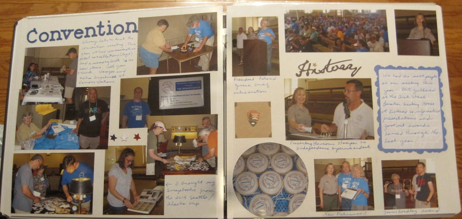
On Saturday we held our convention. Most of my morning was spent setting up the venue with our new banners and getting things out of the cars. We held the meeting at the Arch Street Quaker Meeting House which is an historic venue. Translate that to "no air conditioning". It was a hot day and we only had fans to cool ourselves, but it was still a great meeting.

Above shows that I inserted a portrait sleeve to add the Convention Stamp Pad. We're using this as our program now, and you'll see below why it didn't fit on the page. That is mounted on the black cardstock that comes with the sleeve which left the back available for more photos and memorabilia.


When you work with dark colored paper you have 2 choices for journaling--you can either use a separate block of paper, or you can write directly on the page with a gel marker. I recommend either white or silver though gold works well too if you are writing about a special event.

For the 2-page layout below, I was playing along with the Creative Memories Virtual Crop (Here is the challenge blog page.) They wanted to focus on photos and challenged us to use more than 12 photos on a 2-page layout. This is what that might look like! (It's actually 14 photos!)

The first thing to do when trying to put multiple photos on a page, is to start cropping! When you look at a photo you'll notice that there is probably a bit of extraneous stuff along the edges--ceilings, too much sky or grass, or even people you aren't focusing on.  Feel free to trim them off! (May I suggest the CM personal trimmer?) I also cropped a photo of a plate of cookies into a circle. It keeps the shape of the item and reduces the size of the photo. You'll notice I didn't mat any photos. If you review the blog page, that certainly isn't required but a lot of it depends on how small you make your photos. I layered photos which also helped place more photos on the paper. If you've cropped the edges but you have subjects of unequal height (like the middle photo on the left), you can probably cover that area of the photo with another.

If you are planning on putting multiple photos on a page, you can also print your photos smaller which decreases your need to crop. Whatever you do, leave some room for journaling. The mass of photos won't make much sense if you don't tell who is in the photo or why it was important to you! And don't forget that now you can use the Creative Memories Peekaboo sleeves which are an easy way to add photos on top of the photos on your page.

After the meeting ended, the president's dinner began at the Dave and Buster's nearby. We celebrated not only the 100th birthday of the National Park Service, but the 80th birthday of one of our members!

This layout is another example of splitting a kit. The left page is one of a set of 2 I purchased as a premade layout. I have no Idea what the "Q" was supposed to represent, but I left it on the page as decoration! There were just a few photos of the participants and I was able to layer them to show most of the room. On the right is a 1-page layout I made at one of the scrapbook conventions. It demonstrated the use of Washi tape. The candles are all made of colored washi tape with gems for candle flames (Yeah, I don't like using gems but hey, I paid for the class so I'm going to use the page). The middle of the page is a 10" square which has a border of the Washi tape. The flower was also made by folding tape on itself and layering to create a flower shape. The center is another gemstone which hides some of the folding.

Lastly, after dinner we got to spend some time in the arcade. Jim and I each have our own preferences for games. He is more shoot-em-up and I go for arcade games like skee ball or video dancing.

This was a fairly simple layout. I have 1 photo mat and a corner triangle to pull in the blue to the page (also used blue pen for journaling). The lower left corner are just a handful of small bits cut from various papers I have on hand. Did I mention it's "SCRAP" booking? ☺

Friday, October 19, 2018

Centennial part 4--Friday night picnic

After touring the Brearley House, we all drove over to Washington Crossing State park. Yep, the Jersey side where Washington and his troops landed for that fateful surprise attack. This state park contains another Crossroads of the American Revolution stamp and we saw the film at the visitor center, picked up the stamp and then gathered for the picnic.

The left page uses a sticker that I'd been holding onto for a LONG time. I mean, when ELSE am I going to use a Washington Crossing the Delaware sticker?!? I mounted that on a piece of blue cardstock that I tore with a rough edge ruler (this double wave tearing tool is very similar to what I used but has more rough edges). To add to the water theme I used a leftover piece from a strip where I cut out a bunch of triangles to make banners. I also had a journal box with water rushing over rocks.

For the right side, I used 1/2 of a layout kit that I made during one of my monthly trips to Enchanted Memories. Most people don't think of splitting up pages, but in this album I actually did that a couple of times. You'll see the left side of the layout in a few weeks. I just didn't want to use the left (hot dog) page with the intro being all about the Washington Crossing.

After we ate, one of the members arranged some group games and everyone had a lot of fun.


This is a layout I created at a Paper Loft class during one of the Lancaster Creating Keepsakes conventions. The classes are great because they focus on highlighting the photos, not the paper. The Fun and Games title was created through some older CM letters. The mixed colors not only worked well with the paper, but brought out the energy of the contests. This is another good example of not worrying about the photo mats already placed on the page. You can see that NOTHING fits within the original (cream) boxes. My favorite use was cropping the long photos so that they fit within 2 of the mats on the right page. Those mats become great journaling boxes. You could even layer stickers in that space. I think the paper on these pages is busy enough that stickers weren't needed though.

Friday, October 12, 2018

Centennial Part 3--The Brearley House

On Friday, we arranged a tour of the Brearley House in Lawrenceville, NJ. It is not normally open on Fridays, but they were happy to arrange 3 separate tours to accommodate all of the members who wanted to go. There are some stamps there that are hard to obtain, so this was a very popular opportunity. Although we had people sign up for the 3 different start times, few actually showed at their appointed hour. But between those showing up early for one and late for another, the tours were still the right size!

This layout was created during a virtual crop from Creative Memories. To get people ready, there was a "preview" sketch challenge on Friday night that you can see here. For once, I followed the sketch almost exactly! I chose an older piece of CM with red tones to match the brick work. Then I accented with yellow to match the other predominant color in the paper. I ended up going back after the challenge and replacing the original sticker letters (much manipulated due to shortages of the required letters) with Cricut cut ones. If anything looks slightly ripped, it's from where the original sticker letters were. But that just matches the antique feeling of the page! 😀

I took the tour with the first group so that I was prepared to help the subsequent groups along. There are a number of time-period correct antiques in the home, though not necessarily from the original family holdings. It's amazing how some parts of the house are still in great shape hundreds of years later, including the floors.


The left page uses an idea I saw to create flames. The story is about a  burning log on the wood floor. The flames are actually red and yellow paper cut with the Creative Memories Border Maker system using the grass cartridge (now discontinued). I also found a piece of paper with a design that sort of reminded me of flames, so I fussy cut 2 of them out to fill the corners. The right page was copied off an idea sheet I have in my stash (I want to say it was a page formula, but I'm not positive). I did get the idea somewhere. I just supplemented with what I had in my stash.

As the rest of the tour groups formed I could jump in and out to take photos inside and outside. Have to love the orderly line of club members waiting on their stamps!

I think I created this on my own, not a sketch or idea sheet, but I honestly can't remember (and I only created it about 18 months ago). I went fairly simple using the pale blue to match everyone's t-shirts and then contrasting with yellow (another favorite color combo). The embellishments are few but helps to create an X on the page for flow. The bear head is a VERY old paper piecing kit that I had. I just like the way he's peeking over the paper.

Friday, October 5, 2018

Centennial Part 2--Boat House Row

This post marks my 100th post! (Now that includes a couple of recipes and my intent to change directions, but still, not a bad start!)

This week I focus on the photos I took during a photography class. My first evening in Philly I joined a tour to learn how best to use my camera. I turned out to be the only participant! So the guide and I walked through the Boat House Row area as well as the hills surrounding the area and he taught me settings, composition, and lighting considerations. If you have an interest in scrapbooking, improving your camera skills may improve your pages. I think it has improved mine!

The 5 layouts in this post are ALL fast-to-fabulous pages. On the left page above, the F2F page is covered with wallpaper. If you remember last week's post, the front of that page is the Traveler series and the back just didn't mesh with what I was working on here. I used pieces from the Tangerine, Plum and Then Some line (discontinued) and matching elements from the Vintage paper pack (also discontinued) which matched very closely. Because the pages are pre-decorated, they were done in minutes. Note that on the right page above, I put 2 photos in the horizontal box and used the other for journaling. You don't HAVE to use the page in any particular way. Don't feel constrained.

In the photos above we had walked up the hill to Lemon House and as we walked back down the Museum of Art came into view. I didn't really like the skyline photos he had me shoot but I'm glad the museum was included. You can see this is a sunset walk and that became important for learning how the gold light in the afternoon could be used to highlight elements of the photos.

As above, I used one of the photo boxes for a journal box. Because I still had room, I added a die cut of a camera (above as well but 2 very different vintages of die cuts). As nice as F2F pages are, sometimes it's nice to add a little embellishment. In fact, if I ever re-visit these pages I may add a border across the top of the pages for more visual interest.


What I like about the layout below is that I got to show how the class improved my photos. Because I used a digital camera the guide would let me take a photo and then show me how to stand or change settings and improve it. It's all about what I wanted to shoot. A good example are the waterfall photos below. Left was what I shot. Right was the improvements.


The orange tones worked well with the setting sun photos . And as it got darker, the plums matched the deepening shadows as well. It's good to keep an open mind. I had these pages pegged for heritage photos (like touring old homes) in my head.

Because we are near the water, we got to play a bit with reflection as well. With luck, several rowing teams were practicing and I was able to get them in the photo to provide depth.

The journal boxes above are tags from the Vintage collection. There wasn't much to journal so it was nice to have a small area to fill.

The last pages again show the range of options I found on my camera. To honor this, I found 2 borders that talked about camera settings and added them to the bottom. The colors were a decent match for the pages even though they came from a different line.