Google

Showing posts with label Independence National Historical Park. Show all posts

Friday, June 23, 2023

Special Photos, Special Food

I wanted to show the Custers one of my favorite places, and it turns out they had never been to the Portrait Gallery in the Second National Bank building. The miniatures (bottom of left page) are some of my favorite pieces). We also listened to a Ranger talk about the statues and the Peale paintings.


This layout is based on the October 2022 sketch from a CM Virtual Crop. I liked the gold tone of the frames in the portraits so I used the Silver and Gold collection from CM--very versatile. You can use it for New Year's, Weddings, Anniversaries, or historic photos! I chose 2 rows of border stickers for the dividing line between the cardstock and the paper. The title "Old Photographs" worked so well here, though it was part of a heritage pack from Paper Loft. I had a few fleur de lis stickers that I scattered around as well. Probably could have managed those better, but the pages are done!

After our tour, we met up for dinner at City Tavern. Not only is it part of the NPS but Sierra had recently been in a baking competition where one of the judges was Chef Staib who runs the restaurant. I thought it only fair that she judge his food! We all enjoyed our meals.


This layout is based on a pin I saved on Pinterest. Now that I know more about Kiwi Lane, I likely would not have saved this sketch. Kiwi Lane products require you to trace and cut out your papers. I find that repulsive when there are so many better tools available. I used the CM 12" Decorative Trimmer to make the wavy segments in the middle of the page. The papers are from the Tonal Collections. Each quarter CM launches a set of 3 tonal paper packs with coordinating stickers. It is a great way to either add paper to a coordinating kit or to make pages without true "Themes". 

Friday, June 16, 2023

Benjamin Franklin with the Family

My next stop at a National Park site took me down the road to Philadelphia. Now that I live close, and my niece is looking at a college here, it has become a convenient meeting spot for the family. Lisa and Jason dropped Sierra (the niece) off at the college to visit with a friend. Meanwhile, we sipped coffee and then I took them to some of my favorite sites in the National Park Service. First up--the Ben Franklin Museum. Because it was Veteran's Day, there are no fees so we could roam the museum as we liked.


This layout is based on an Even More Scrapping sketch. I chose some fall-themed papers, though the brown tones match the historical components nicely. The green tags were sitting on my desk so they were added more for convenience than decoration ☺. I did not have a lot of embellishments for this one but I did add one of the Scrapbook Customs' "National Park Adventure" title stickers. That one is on each package of park-themed stickers and I have a great many packs of stickers!

Our next stop was to the Franklin Print shop where we watched the ranger creating a printed page (many more were hanging up to dry). While I've seen this process many times, it is always a nice diversion. And given the chill of the day, it was nice to be indoors!


This layout is based on one I saved on Pinterest. I used 2 papers from my Heritage collection. I thought the newsprint was a perfect page but since I had only one piece I needed to cut it up into four 3" strips. I cut the other paper in half and sandwiched it between the newsprint. To cover the seams, I added several pairs of border strips from the extras I had in the Tonal collections from CM. The title is from a family tree cut-apart pack from Paper Loft. I'm sure it was to be used on a page with wills or family bibles but it was PERFECT for these historic newspapers!

Friday, August 6, 2021

Home Town Crowd

Of course, Philadelphia had to be highlighted--the flower show is on their home turf! In fact, there is a ranger presence here from INDE which you'll see later. Independence National Historical Park encompasses not just the Liberty Bell, but also Independence Hall, Thaddeus Kosciuszko, and Edgar Allan Poe houses. While Poe will be highlighted at the end, only the Liberty Bell is used to represent the park. Still, the use of red, white, and blue flowers to create the bell was attractive. 


I was finally able to use a sketch from the Scrap Your Stash class in October 2019 (about 18 months before I completed this layout!). Though I cannot show you the sketch, I can say that I followed it faithfully though I turned it 90-degrees to accommodate my photos. There are a lot of different pieces here, but luckily they all had the same tones so they worked together well. The background page gave me the "blue" (I don't recall what pack that came from). The red plaid in the middle is from an 8 1/2 x 11 Americana tablet that I bought when I first started scrapbooking. Nice to be able to use it up! The border is from a pack I bought from Our Memories For Life--a spin-off of the old CM company by one of the original founders. I don't have much of their materials because it is honestly difficult to navigate their ordering page, but these borders were a great find. The Liberty Bell photo sticker came from a pack purchased at the INDE visitor center. The cartoon-like sticker and the other random elements came from an older CM Fourth of July kit. It sounds like a lot, but in the end they all pulled together for a fairly straightforward layout.

Friday, October 25, 2019

It's been a while since I went to Philadelphia!

Wow, it seemed at the beginning of my blog that every other post was about Philadelphia. Now it's a rare treat! This was my annual trip with my students though.

This page is one of the Fast to Fabulous pages from a travel collection of CM. I used this once before for the same sort of photos taken during the NPTC Centennial Convention. Since that's in a different album I figured I could do this again. I added a page from a 6x6 tablet featuring the Declaration of Independence--it's one of the things they print here daily. The journal box is from the CM Archivers line. I augmented it with a sticker from the EN scrapbook kit. Sorry it's blurry!

Friday, April 12, 2019

Philly Philly

Once more to the City of Brotherly Love! On this trip my only foray into NPS territory was my lunch at City Tavern. But I was able to obtain several pieces of memorabilia to commemorate my visit. If you come to see the album you'll learn about Dr. Physick and his home which is a historic site of an 18th century physician.

This layout is one side of a purchased kit from Club Scrap (scroll down to layouts 5 and 6). I bought the kit because I knew that I would have some gastropub photos, but when I realized this was a non-photo layout, I thought it would be perfect. On the bottom left are 2 coasters (never used) that came with the kit. It's not really what I would have put there, but of all the non-paper pieces sent with the kit, they were the least objectionable. It took me about 3 hours to put all the layouts together so the other 7 are ready for my next adventure!

Friday, March 8, 2019

Centennial part 24--The Final Entry

Wow! It's been a 6-month journey showing the week I spent in and around Philadelphia for our NPTC convention during the NPS Centennial. Thanks for joining me and enjoy the last few layouts!

After Elfreth's Alley I returned to the Independence Visitor Center for the evening picnic (which was also a club meetup event). I did enough walking that day to complete a 5K race! (In 8 hours, but who's counting?)

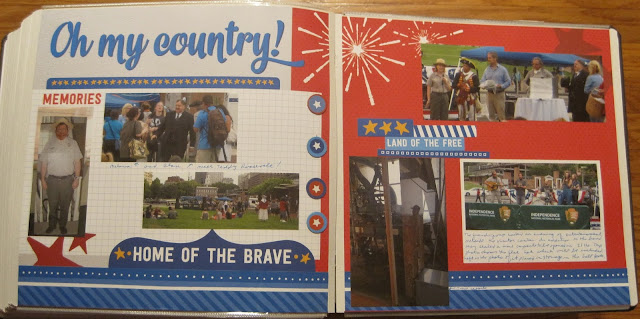
The club members and I pulled out chairs and blankets and settled on the lawn area just outside the visitor center. The re-enactors were around and now included Teddy Roosevelt, Ben Franklin, and a few others. There was music and food and the components for a time capsule.


This layout is another kit that I purchased from Our Memories For Life, so most of the work was pre-designed. I placed some of the stars and the photos. Easy!

One highlight of the event was the free ice cream.

One more of the pre-purchased kits. I had bought a series for the summer and frankly was worried I would never get a chance to use it as I don't have kids and there are few opportunities to photograph a trip to the ice cream stand. Again, an easy layout and as I was close to the end of the book, a welcome way to finish.

We posed for a group photo with our new banners and I thought this was a great way to end the book.

The last page is simply blue gingham wallpaper (for the picnic feel) and a trimmed large group photo. The title stickers at the top you've seen before. As I'm getting close to the end of the pack I did have to modify them a bit to get all the letters I wanted, but I love that green leafy background for this layout. And that was all there was to it! (I even managed to lay them in a straight line this time).

Next week we'll return to 2013 and my ongoing National Park Adventures.

Friday, February 22, 2019

Centennial part 22--Christ Church

The ranger walk ended at the historic Christ Church. I chose to go inside and listened to one of the tour guides for a bit but mostly looked around on my own.
This layout is scraplifted from this layout. It's an older Noreen Smith layout using the CM Reminisce papers. I turned it into a 2-page layout by stretching out the corner components. The left sheet of paper has the oval decoration pre-printed at the top. I added a "blessings" sticker (since it's a church) and created a 4-point oval. I ended up finding a similar item in my Cricut files and was able to turn it into a journal box. The remaining photos were matted with paper from the kit to give a little contrast around the page.


Friday, February 15, 2019

Centennial part 21--the Ranger Walk

Finally it was time for the Ranger Walk. I met the ranger and a few other people in the Signer's Garden but we quickly moved down to Carpenter's Hall. We didn't go inside (most likely because it isn't part of the NPS), just sat and listened to the ranger a bit. It wasn't a formally planned walk and since the people with me hadn't seen much of Franklin's Court, we walked over there.

This layout is from Paper Loft and is one I made at a scrapbook convention in Lancaster. The paper is called Happenstance (I think). It had just enough of a vintage feel to work with these historic places. Since the class included placing the photo mats, I just used them as part of the background putting a sticker or larger photo over several mats to make the layout work.

We toured a house that Franklin owned but sublet, his book binding office and of course the print shop. Though I'd seen much of this before, it was still a nice visit.


For the left page I used a wallpaper that is all old postcards. I thought that with the book and post office images it was a good fit. The right side page is a fast to fabulous from the Adventure pack by CM. I had been SAVING this for these photos specifically as it is all about set type. The letter embellishments are from Club Scrap and there really isn't any reason that the letters are spaced around like that other than I needed some page fillers. :) Those embellishments have been "chalked" around the edges. This means I dragged an ink pad lightly over the cut edges. This is a good thing to do when your embellishment and the paper it rests on are of similar or matching tones. You get a touch of definition but nothing too overt. I have some old CM chalk (of course) but there are many companies that sell something similar.

Friday, February 8, 2019

Centennial part 20--Military Hall

My next stop was just down the street from the portrait gallery. This small museum highlights the history of the US military, though more specifically the navy and marines.

I bought this kit, though  I cannot remember the name of the company that produced it. I liked that there were some nautical themes so that it worked for the navy/marines component of this museum. The anchor and the ship's wheel/rocket mats use the "polaroid" style mats that came with the kit. Another is used for a photo on the top of the right page. Several other photos got a white mat to help them pop from the background though a few didn't need the help. Because it was a pre-designed kit it went together fairly quickly but I was still able to modify it to work with my photos and needs.

Friday, February 1, 2019

Centennial Part 19--The Portrait Gallery

After lunch I started to wander around the Independence sites. I wanted to take a ranger tour in the afternoon and then return to the visitor center for a picnic. Until the ranger talk started I walked over to the Second National Bank which is now a portrait gallery. There is an entire gallery of Peale portraits, but so much more!

This layout was scraplifted from this layout. I spent quite a bit of time putting small strips of scraps together to underlie the right central box, and then ended up covering up almost all of it with the journal box at the top. Well, I did get rid of some scraps this way!

Friday, January 25, 2019

Centennial part 18--an 18th century lunch

After the plaque dedication we walked over to City Tavern for a group lunch. You can always count on City Tavern for a good meal when visiting Philadelphia!

This layout was created when I went to a Paper Loft class at the Lancaster Scrapbook Convention. The paper is called Persnickety and though this kit isn't sold on the site there are some really nice kits available that are similar. The letters for City Tavern on the lower right page were cut on the Cricut. There is a free font that has the curly cues on the letters and I thought that matched the location perfectly.

Friday, January 18, 2019

Centennial Part 17--the Centennial arrives!

Thursday was a very exciting day for our club. We had raised funds to purchase and donate a Mather Plaque to Independence National Historical Park. They arranged for the media to cover the grand unveiling. It was a fabulous moment for our club.

This layout is one that I made at a class at Enchanted Memories in Hershey. Both pages were supposed to have the banners arranged vertically, but I had trouble moving the photo mats without ripping the paper so I ended up just turning the page on its side. I cut the letters for "Founders Day" on the cricut using some silver paper. I shadowed the left page letters in black so that they stood out on the patterned paper.

After the unveiling we took a LOT of photos. The park arranged for some historical reenactors to walk around and talk about the period when the NPS was founded.


The borders for these pages were made with an older cartridge for the CM Border Maker system. I punched 3 rows of each color and wove them together. The dots were from a regular hole punch like you would use for school (which turns out to be very tedious to use frequently). The left page has a die cut created by another club member. We made sets of borders and die cuts for the picnic, but there were few people actually interested. The other die cut is  from a Creative Memories patriotic tablet from a few years ago. The remaining stars were punched from an older CM punch as well as from the the border maker system (they might be the reverse side of the borders I made for the Franklin Museum visit).

Friday, December 7, 2018

Centennial Part 11--Franklin Museum

Monday morning I headed to the city again. I was to pick up a passenger to ride with me to several events and her hotel was close to the visitor center. I arrived early and toured the Franklin Museum and associated sites. The updated area is very interactive and I had fun being a kid for a while.

Although this is a wallpaper technique, there is a bit of a twist. Using the Creative Memories Border Maker System, I punched the middles of each side of a piece of paper. This leaves a large box in each corner which I then filled with appropriate stickers and other embellishments. Yes, the same sticker was used in 3 of the 8 corners, but it's so minor I bet you didn't notice it until I pointed it out. There are many different cartridges available for this system, so you can use the technique for a variety of events. The stars here are great for patriotic and military themes, but you could also use it for an evening of camping. It works best if the paper is left solid. Using the jumbo jet cartridge, for example, would be a little trickier as the planes are meant to be detached from the page.

Friday, November 30, 2018

Centennial Part 10--A rainy walk

After the stop at Declaration house and a stop  for a drink at Dunkin Donuts across the street (probably how Jefferson could stay up late writing), I headed to the Independence Visitor Center. One of the scheduled ranger walks was to give an overview of some lesser known buildings and I thought it would be a good way to cap off the evening......On the left you'll see that I stopped outside the visitor center for a shot of our new plaque. The club raised funds to create and mount this plaque to the first NPS Superintendent. At one time all the parks had them but many are lost and some of the newer parks never received a plaque.

On the right is our walk that started out fine but within a block was stopped by a horrendous thunderstorm! Our intrepid guide was protected with a raincoat but the rest of us were not so lucky. We hunkered under the front of the Liberty Bell building and our guide finished her descriptions without the walk. It was rather enjoyable after all! We had someone take a group photo of us as "drowned rats" and I saw a rainbow on the drive back to the hotel so that created the essence of the page.

The layout on the left is a Fast to Fabulous page. The photos were in the "wrong" direction, but to me that just creates space for journaling!

The right side layout isn't fancy, but I wanted a large journaling box to tell the story. I kept the page colors from the left to create harmony--purple matting for the photos, a purple border at the top, and a purple journal box. I added some VERY old silver cloud stickers that with a few raindrops look like thunderclouds. I can't decide which way is "up" on the clouds. Should the darker stripe be on the top or bottom for thunderclouds? Comment below with your thoughts!

Friday, November 23, 2018

Centennial part 9--I Declare!

At the end of the trolley tour it was noted that Declaration House was still open and several of us journeyed down the street to take a tour. This is the home where Jefferson wrote the document and has a few rooms dedicated to how it looked when he lived here.

I don't often do wallpaper with 8 1/2 x 11 paper (in fact I think I've only done it once before during the DC convention), but I thought it would work here. This cardstock is a copy of the Declaration of Independence so I thought it was a great time to use it since I had only a couple of small photos of the house and plaques. This had to be a 1-page layout because the end trolley photo is on the left side. The title at the top is from some letter stickers found in a travel kit. Can you tell I created the second "A" in Declaration from an upside down "u"? I think it works. I really wish I was better at placing square letter stickers in a straight line. I just move too fast sometimes.

Inside we climbed the staircase to view his rooms. The mural on the left below is actually 2 stories tall!  The right photo is an enlargement of his draft with edits all over the place. This is also about 2 stories tall.

I based the left page on this Pinned Image. I then used a F2F page for the right but added some details to make them similar enough for a match. On the left it's an orange base, then 2 slightly smaller squares of coordinating paper. You can see the 3rd square matches the pattern on the right page perfectly. I love the journaling across strips of cardstock. On the right since the paper already matched I just wanted to add a border that mirrored the left page. The blue plaid is from the strip I cut to make the mat on the left. Instead of buttons I chose a plain tab. This would have been a good place for a small title if I needed one but I thought it fine to leave it plain.

Friday, November 16, 2018

Centennial Part 8--End of the line

After lunch we headed to the last 2 stops. First is a small, very old church called Gloria Dei. It is one of the oldest active churches in the US! We didn't get a stamp here, though sometimes it is possible. Instead we obtained the stamp later at the Independence Visitor Center.

I'm not sure why, but I seem to favor yellow pages when I scrapbook about churches. When creating this layout I knew that I wanted to separate the dog reference from the church as it's sort of an add-on humorous bit. I chose a 1/2 page cardstock with a decorative border and then used a full page of the same color on the left page. That became a great background for the photos. I just accented with a few candle stickers. It leaves the informational markers and the dog sign as clear "extras". I thought the dog sticker with paw prints a nice touch!

Our final stop is the smallest unit of the National Park Service. Thaddeus Kosciuszko was a Polish immigrant who fought in the Revolutionary War as one of the Engineers. He is a hero in his own country as well and their descendents are responsible for ensuring his home is maintained in tribute.

This is a very simple layout. I based my color choice on the last sticker on a page of Revolutionary War embellishments. By focusing on the yellowish coat, I chose paper and used a new border maker to create decorative edges. I matted one photo to bring the page together though I probably should have added more mustard yellow touches. The yellowish journal box on the right helps a bit. I only had 3 stars left for the left border. Adding them to the right would have looked a little more symmetrical.

The last thing we did before the trip was over was to get a group photo. Or as many as were still around. A few people had already wandered away before we could get the photo taken.

This paper serves as a great base for the larger group photo. I did trim the 8x10 down to 5x10 by cutting away the excess road and sky (as I mentioned when putting multiple photos on the convention page). The remainder fit perfectly between the pre-decorated page elements, and I think was a good end to the trip.

Friday, November 9, 2018

Centennial Part 7--Next stop!

Our second trolley stop was the Edgar Allan Poe site. Though a little closer to the Independence visitor center, it's still a longer walk and worked into this schedule nicely. Again we divided into subgroups to not overwhelm the site.
I associate Poe with all things spooky, so I chose this graveyard page to be the background for the site. The "Next Stop" was designed perfectly (red and black) but actually comes from a train layout page!

I actually visited with the rangers in lieu of touring so that I could ensure everyone saw the movie and took the tour. One of the rangers on duty had given me a tour at my previous visit, a fact that I proved to him by finding a photo of him in my phone! After our tour we stopped for lunch. The trolley dropped us off between Pat's and Geno's--classic Philly Cheesesteak rivalry.

So this layout is the other "halves" of the scrapbook kits I previously used. Remember the President's Dinner page with the "Q"? The left page here is the other side of that layout. I thought the background looked like wallpaper/paneling and matched the theme of the house.

On the right is the other half of the picnic page. The item in the bun WAS a hot dog, but since I needed to write about cheesesteaks, I carefully took it apart, chopped up the hot dog paper into chunks and layered them back in with the "mustard" color serving as cheese. I'm rather proud of myself for that move!

Friday, November 2, 2018

Centennial Part 6--Trolley tour to Germantown White House

Sunday we planned a day-long trolley tour of 4 locations that are a little more difficult to get to within the park. The Germantown White House (also called the Deshler-Morris House) is several miles from the visitor center and requires a lengthy bus ride to visit the house. I did that once, and realized as we were planning the week that a chartered bus would be the best way to see it all. Due to space at the various houses we were only allowed 35 people on the trolley.

This page is the kick-off to this part of the trip and so I'm highlighting the photo of our trolley and the photos I took inside. I had to merge them by hand and somehow they are both a little angled, but I think you can see everyone. The border on the left is one I had in my stash. I created the arrows and signs with a very old cutting machine called a Slice. It works in the same way a Cricut does but was a little more effort to place the blade in the right spot. I'm glad I have a Cricut now! The red, white and blue theme is very patriotic and I was trying to weave that theme through various parts of the album.

We arrived a little early so had time to wander the street a bit before the rangers opened the house. We still had to split into 2 groups so my half remained behind to view the lobby and stamp while the other group toured the house (which was actually next door).

I was still working on the virtual crop, and this layout fulfilled challenge number 4. The border was made by using 2 older "design lines" (essentially 12" long sticker strips in various colors). The medallions were taken from the Creative Memories patriotic tablet. This had two pages of die cuts in the front and the semicircles were part of those die cuts. I like that it looks like I cut them in half but I didn't have to! The mats were made with paper from a different patriotic tablet I had. The paper is 8 1/2" x 11" and matting is a great way to use up the smaller sized paper. The stickers are from an older CM Reminisce line and I thought they matched the antique elegance of the house.

Our group was then allowed to head toward the house. The back door is locked so we had to wait outside on the porch a bit until the rangers could let us in. There are many period pieces and quite a few actual Washington artifacts inside.

The left page was scraplifted from this border. I only had the 3 colors shown so I had to improvise a little. I was happy to use up some older flower stickers. On the right is another F2F page from the Travelers line. The light floral pattern was perfect to highlight the antique feel of the room. I love all the delft work in there!

I can't resist a good historic kitchen. I think I would like to time travel back and spend a day working in that environment. Probably the excitement would wear off quickly though!


This page reverts to wallpaper technique. I had a great paper with beans and wasn't sure how else to use it. I think it's one of those dishes that would have been made in the 18th century so it worked for me. I did want to mat the photos to get them to pop from the page and chose a deep brown.

Friday, October 26, 2018

Centennial Part 5--The Convention

On Saturday we held our convention. Most of my morning was spent setting up the venue with our new banners and getting things out of the cars. We held the meeting at the Arch Street Quaker Meeting House which is an historic venue. Translate that to "no air conditioning". It was a hot day and we only had fans to cool ourselves, but it was still a great meeting.

Above shows that I inserted a portrait sleeve to add the Convention Stamp Pad. We're using this as our program now, and you'll see below why it didn't fit on the page. That is mounted on the black cardstock that comes with the sleeve which left the back available for more photos and memorabilia.


When you work with dark colored paper you have 2 choices for journaling--you can either use a separate block of paper, or you can write directly on the page with a gel marker. I recommend either white or silver though gold works well too if you are writing about a special event.

For the 2-page layout below, I was playing along with the Creative Memories Virtual Crop (Here is the challenge blog page.) They wanted to focus on photos and challenged us to use more than 12 photos on a 2-page layout. This is what that might look like! (It's actually 14 photos!)

The first thing to do when trying to put multiple photos on a page, is to start cropping! When you look at a photo you'll notice that there is probably a bit of extraneous stuff along the edges--ceilings, too much sky or grass, or even people you aren't focusing on.  Feel free to trim them off! (May I suggest the CM personal trimmer?) I also cropped a photo of a plate of cookies into a circle. It keeps the shape of the item and reduces the size of the photo. You'll notice I didn't mat any photos. If you review the blog page, that certainly isn't required but a lot of it depends on how small you make your photos. I layered photos which also helped place more photos on the paper. If you've cropped the edges but you have subjects of unequal height (like the middle photo on the left), you can probably cover that area of the photo with another.

If you are planning on putting multiple photos on a page, you can also print your photos smaller which decreases your need to crop. Whatever you do, leave some room for journaling. The mass of photos won't make much sense if you don't tell who is in the photo or why it was important to you! And don't forget that now you can use the Creative Memories Peekaboo sleeves which are an easy way to add photos on top of the photos on your page.

After the meeting ended, the president's dinner began at the Dave and Buster's nearby. We celebrated not only the 100th birthday of the National Park Service, but the 80th birthday of one of our members!

This layout is another example of splitting a kit. The left page is one of a set of 2 I purchased as a premade layout. I have no Idea what the "Q" was supposed to represent, but I left it on the page as decoration! There were just a few photos of the participants and I was able to layer them to show most of the room. On the right is a 1-page layout I made at one of the scrapbook conventions. It demonstrated the use of Washi tape. The candles are all made of colored washi tape with gems for candle flames (Yeah, I don't like using gems but hey, I paid for the class so I'm going to use the page). The middle of the page is a 10" square which has a border of the Washi tape. The flower was also made by folding tape on itself and layering to create a flower shape. The center is another gemstone which hides some of the folding.

Lastly, after dinner we got to spend some time in the arcade. Jim and I each have our own preferences for games. He is more shoot-em-up and I go for arcade games like skee ball or video dancing.

This was a fairly simple layout. I have 1 photo mat and a corner triangle to pull in the blue to the page (also used blue pen for journaling). The lower left corner are just a handful of small bits cut from various papers I have on hand. Did I mention it's "SCRAP" booking? ☺

Friday, September 28, 2018

Centennial part 1--A Whole Week in Philly!

I will be taking a short break from my chronological album as I have photographed and posted everything I've finished. So to buy some time I decided to present the album I created for the 2016 NPS Centennial Convention. This was held in Philadelphia and surrounding areas and we spent a week there so that our end date was the actual centennial.
 This page was scraplifted from this pin. what amazed me most was that I actually owned several of the stickers that are on the original. That almost NEVER happens! 😀 This was not very difficult to put together. The large letters on top are from an old Creative Memories pack of Large Monogram stickers. Not made currently but great for titles like this. The buckles were rather simple and you can use this technique for suitcases or Santa belts. You make the under strap first at whatever width you like. Then make a square of gold slightly larger than the strip. For example, if you made a 1 1/2" belt you will want approximately 1 3/4" buckle. Next make a square in the same size as the belt and layer on top of the gold square. This is what makes it look like a woven strap. If you feel especially artistic you can draw in a prong for more realism.

The luggage itself is a rounded rectangle. The handle is made by cutting out an appropriate sized circle and tucking it under the case.


The first page is of course the itinerary. This time I listed all of the activities one could attend, not just the ones that are in the album. I highlighted the centennial in red and then added a few Philadelphia stickers to finish the page.

On the right is an 8 1/2 x 11 portrait sleeve. The real reason this is here is that as I was working on the album I realized that I hadn't made a space for the unigrid and I really wanted to include it. I also needed more room on my visit to the US Mint which is the layout below. To fill out the rest of the page I added Washi tape to the top and bottom for a simple border and then added a die cut of the Liberty Bell that I've had in my stash for a while.

So the first thing I did upon arriving in Philadelphia was visit the Mint. I know it isn't an NPS site, but the page ended up including some random walks through the city and the Ben Franklin Memorial, which IS part of the NPS as an Affiliated Site. I also grabbed a shot of Independence Hall as I walked by. Another photo is of the Penns Landing bridge which is near where I parked.

As I said, the left page is the portrait sleeve and ended up being a great place to store my tour brochure from the Mint as well as a postcard. The brochure is mounted with paper photo corners. I thought the red helped set it off a little bit. The right page is part of a Fast to Fabulous set which was called Uncharted. It's a little bit of vintage and travel combined. The page has a built-in border and then a small print. All I had to do was mat the photos. There are 2 more stickers from the Philadelphia pack and their borders match the photo matting somewhat. All I needed was a journal box and it was done!