Google

Friday, December 28, 2018

Centennial Part 14--Hot as an oven

Tuesday morning the club met a little west of Philadelphia at Hopewell Furnace. This park commemorates the era of plantation houses and iron manufacturing prevalent in the area. The park staff are very nice and help our club quite a bit. They even had some special stampers out for us! We watched the movie as a group and then took a ranger walk through the park.

This is a single page following the end of the Maurice River cruise. It turned into a mini kick-off page for this part of the trip and I decided to do an introduction with a "then and now" theme. The top photo is a postcard of the original site from the early days (late 19th century) and the bottom photo is present day. That left little room for the unigrid, so I decided to go ahead and mount it sideways. I've done that before when the image is viewed better in that direction, but this time it was a matter of convenience. Still, its purpose is mostly to be able to take it out and review the maps and information at a later date, and it certainly will serve that purpose.

We started out with quite a few people on the tour, but many drifted away as the ranger moved us from building to building. By the time we reached the foundry, there were just a handful left.

This paper reverts to wallpaper technique. I used a plaid pattern as I was trying to evoke a "homestead" sort of feel. Impressively the title "Ranger Walk" made of letter stickers did not require modification of the letters! The corner designs were something new I was trying with a Cricut machine. I had not gotten the hang of sizing them appropriately for the page so they are a little small, but nice page fillers. I'm most proud of my journal box that incorporates a cast iron stove along the edge of the sticker. Hopewell Furnace is famous for producing early stoves in that design.

I wanted to finish the entry with some photos of the buildings. My favorite is the water wheel that drives the bellows.

This layout is scraplifted from Club Scrap's Homestead collection (see layouts 1 and 2). Now I don't own ALL of the parts of this collection, but I could use the background pages and the orange stripes. The most important part for me was the wheel image on the paper and the "then and now" theme from the left orange bar "Yesterday Today Tomorrow". I had a different journal box that matched the style of the kit and also found the banner segment on the right hand page from a different collection, but I think the colors matched up fine.

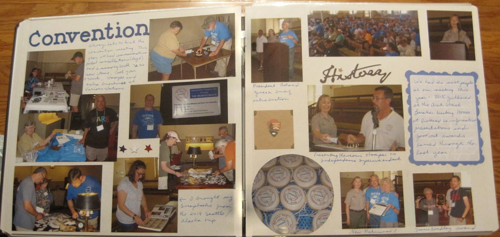
I also had photos of club members throughout the site and I chose to highlight them on the last layout pages. After touring we all went to lunch at a restaurant near Valley Forge (which is not far away) and the right page features that. It's a preview to next week's pages!

This is a true SCRAP page. The light brown NPS logo paper was originally 8 1/2 x 11, and I had used it on another layout. I cut the remainder into 2 blocks and used them to back some photos and bring the 2 pages together. I took another 8 1/2 x 11 page that featured the stamps and passport and cut the page to make a right sided border. The part I cut out (the passport book) decorates the left page nicely. A couple of stickers and a camera journal box pulled the page together. As eclectic as the components are, it really works as a layout for me.

Friday, December 21, 2018

Centennial part 13--Rolling Down the River

After the debacle of Great Egg Harbor, I showered and in a much better frame of mind, headed over to our evening cruise of the Maurice (pronounced "Morris") river. Our cruise covered a good portion of the river while our captain narrated. They also provide a "spotter" to see all the eagles and osprey along the route.

This layout is scraplifted from a Close to My Heart layout that I found. Though I didn't have the paper from the CTMH kit, I pulled some matching tones together and I think it fit the layout perfectly! I really had to look around for eagle stickers and even ended up buying a cricut image collection to get the eagle on the left of the second page.

We gathered once again for a group photo as we returned to the dock.

Hopefully you can see the pattern on this paper. It is an ombre effect of green/blue swells across the page. This fit my title perfectly so all I had to do was trim the 8x10 photo to fit the page. I'm liking that I can add large photos of groups so you can see the individuals better. Keep an eye on Shutterfly as they often provide 2 free as an option.

Friday, December 14, 2018

Centennial Part 12--Egg-cellent Adventure?

Oh my. This is one of those experiences where the scrapbook just doesn't do it justice. If you can read the rather lengthy journal box on the page you'll see that this was my LEAST favorite park and activity of the entire convention. I'm sure I'll look back and laugh someday. Still not there yet....

This layout is scraplifted from a Club Scrap layout (see layouts 5&6). I had purchased some of the paper on clearance and was able to modify the layout based on what I had on hand. The dark green is actually vellum torn with my CM tearing tool. I think it could easily be mountains or rivers so it works well here. The upper right corner features some old stickers in my stash that had a lake/river theme. I matted them on the dark blue that I used on the horizontal borders for a little more pop.

Friday, December 7, 2018

Centennial Part 11--Franklin Museum

Monday morning I headed to the city again. I was to pick up a passenger to ride with me to several events and her hotel was close to the visitor center. I arrived early and toured the Franklin Museum and associated sites. The updated area is very interactive and I had fun being a kid for a while.

Although this is a wallpaper technique, there is a bit of a twist. Using the Creative Memories Border Maker System, I punched the middles of each side of a piece of paper. This leaves a large box in each corner which I then filled with appropriate stickers and other embellishments. Yes, the same sticker was used in 3 of the 8 corners, but it's so minor I bet you didn't notice it until I pointed it out. There are many different cartridges available for this system, so you can use the technique for a variety of events. The stars here are great for patriotic and military themes, but you could also use it for an evening of camping. It works best if the paper is left solid. Using the jumbo jet cartridge, for example, would be a little trickier as the planes are meant to be detached from the page.

Friday, November 30, 2018

Centennial Part 10--A rainy walk

After the stop at Declaration house and a stop  for a drink at Dunkin Donuts across the street (probably how Jefferson could stay up late writing), I headed to the Independence Visitor Center. One of the scheduled ranger walks was to give an overview of some lesser known buildings and I thought it would be a good way to cap off the evening......On the left you'll see that I stopped outside the visitor center for a shot of our new plaque. The club raised funds to create and mount this plaque to the first NPS Superintendent. At one time all the parks had them but many are lost and some of the newer parks never received a plaque.

On the right is our walk that started out fine but within a block was stopped by a horrendous thunderstorm! Our intrepid guide was protected with a raincoat but the rest of us were not so lucky. We hunkered under the front of the Liberty Bell building and our guide finished her descriptions without the walk. It was rather enjoyable after all! We had someone take a group photo of us as "drowned rats" and I saw a rainbow on the drive back to the hotel so that created the essence of the page.

The layout on the left is a Fast to Fabulous page. The photos were in the "wrong" direction, but to me that just creates space for journaling!

The right side layout isn't fancy, but I wanted a large journaling box to tell the story. I kept the page colors from the left to create harmony--purple matting for the photos, a purple border at the top, and a purple journal box. I added some VERY old silver cloud stickers that with a few raindrops look like thunderclouds. I can't decide which way is "up" on the clouds. Should the darker stripe be on the top or bottom for thunderclouds? Comment below with your thoughts!

Friday, November 23, 2018

Centennial part 9--I Declare!

At the end of the trolley tour it was noted that Declaration House was still open and several of us journeyed down the street to take a tour. This is the home where Jefferson wrote the document and has a few rooms dedicated to how it looked when he lived here.

I don't often do wallpaper with 8 1/2 x 11 paper (in fact I think I've only done it once before during the DC convention), but I thought it would work here. This cardstock is a copy of the Declaration of Independence so I thought it was a great time to use it since I had only a couple of small photos of the house and plaques. This had to be a 1-page layout because the end trolley photo is on the left side. The title at the top is from some letter stickers found in a travel kit. Can you tell I created the second "A" in Declaration from an upside down "u"? I think it works. I really wish I was better at placing square letter stickers in a straight line. I just move too fast sometimes.

Inside we climbed the staircase to view his rooms. The mural on the left below is actually 2 stories tall!  The right photo is an enlargement of his draft with edits all over the place. This is also about 2 stories tall.

I based the left page on this Pinned Image. I then used a F2F page for the right but added some details to make them similar enough for a match. On the left it's an orange base, then 2 slightly smaller squares of coordinating paper. You can see the 3rd square matches the pattern on the right page perfectly. I love the journaling across strips of cardstock. On the right since the paper already matched I just wanted to add a border that mirrored the left page. The blue plaid is from the strip I cut to make the mat on the left. Instead of buttons I chose a plain tab. This would have been a good place for a small title if I needed one but I thought it fine to leave it plain.

Friday, November 16, 2018

Centennial Part 8--End of the line

After lunch we headed to the last 2 stops. First is a small, very old church called Gloria Dei. It is one of the oldest active churches in the US! We didn't get a stamp here, though sometimes it is possible. Instead we obtained the stamp later at the Independence Visitor Center.

I'm not sure why, but I seem to favor yellow pages when I scrapbook about churches. When creating this layout I knew that I wanted to separate the dog reference from the church as it's sort of an add-on humorous bit. I chose a 1/2 page cardstock with a decorative border and then used a full page of the same color on the left page. That became a great background for the photos. I just accented with a few candle stickers. It leaves the informational markers and the dog sign as clear "extras". I thought the dog sticker with paw prints a nice touch!

Our final stop is the smallest unit of the National Park Service. Thaddeus Kosciuszko was a Polish immigrant who fought in the Revolutionary War as one of the Engineers. He is a hero in his own country as well and their descendents are responsible for ensuring his home is maintained in tribute.

This is a very simple layout. I based my color choice on the last sticker on a page of Revolutionary War embellishments. By focusing on the yellowish coat, I chose paper and used a new border maker to create decorative edges. I matted one photo to bring the page together though I probably should have added more mustard yellow touches. The yellowish journal box on the right helps a bit. I only had 3 stars left for the left border. Adding them to the right would have looked a little more symmetrical.

The last thing we did before the trip was over was to get a group photo. Or as many as were still around. A few people had already wandered away before we could get the photo taken.

This paper serves as a great base for the larger group photo. I did trim the 8x10 down to 5x10 by cutting away the excess road and sky (as I mentioned when putting multiple photos on the convention page). The remainder fit perfectly between the pre-decorated page elements, and I think was a good end to the trip.

Monday, November 12, 2018

Bonus post, but no layouts!

I've shared this technique with a couple of people and everyone thinks I should share it more widely, so I decided to throw in an extra post for the week. This is one step in organizing your memories. One thing I do is keep a calendar on the kitchen wall and as events happen, I jot a note on the calendar--vacations, parties, school events, anything that I'll want to remember. But that's just half of it, you also need to keep the bits and pieces that go with those events.

 You've probably noticed that I keep a lot of "ephemera" or memorabilia or, as I call it, scrapbook fodder! How to keep it all straight? I use plastic bins (see example below).

You'll want to get the transparent ones as I'll describe in a bit. So, beginning on January 1st I dedicate one box to the year (and so far I can get an entire year's worth of stuff in one box). As the year progresses, I toss everything in that box--ticket stubs, postcards, even Christmas cards that I want to save. At the end of the year, I put the final items in the box and then top it with the calendar! Because the calendar is on top (and I'm using transparent boxes) I can see at a glance which year is in each box (and I'm about 5 years behind so that's important).

So that's it! Fairly easy and inexpensive but worth the little bit of extra effort!

Friday, November 9, 2018

Centennial Part 7--Next stop!

Our second trolley stop was the Edgar Allan Poe site. Though a little closer to the Independence visitor center, it's still a longer walk and worked into this schedule nicely. Again we divided into subgroups to not overwhelm the site.
I associate Poe with all things spooky, so I chose this graveyard page to be the background for the site. The "Next Stop" was designed perfectly (red and black) but actually comes from a train layout page!

I actually visited with the rangers in lieu of touring so that I could ensure everyone saw the movie and took the tour. One of the rangers on duty had given me a tour at my previous visit, a fact that I proved to him by finding a photo of him in my phone! After our tour we stopped for lunch. The trolley dropped us off between Pat's and Geno's--classic Philly Cheesesteak rivalry.

So this layout is the other "halves" of the scrapbook kits I previously used. Remember the President's Dinner page with the "Q"? The left page here is the other side of that layout. I thought the background looked like wallpaper/paneling and matched the theme of the house.

On the right is the other half of the picnic page. The item in the bun WAS a hot dog, but since I needed to write about cheesesteaks, I carefully took it apart, chopped up the hot dog paper into chunks and layered them back in with the "mustard" color serving as cheese. I'm rather proud of myself for that move!

Friday, November 2, 2018

Centennial Part 6--Trolley tour to Germantown White House

Sunday we planned a day-long trolley tour of 4 locations that are a little more difficult to get to within the park. The Germantown White House (also called the Deshler-Morris House) is several miles from the visitor center and requires a lengthy bus ride to visit the house. I did that once, and realized as we were planning the week that a chartered bus would be the best way to see it all. Due to space at the various houses we were only allowed 35 people on the trolley.

This page is the kick-off to this part of the trip and so I'm highlighting the photo of our trolley and the photos I took inside. I had to merge them by hand and somehow they are both a little angled, but I think you can see everyone. The border on the left is one I had in my stash. I created the arrows and signs with a very old cutting machine called a Slice. It works in the same way a Cricut does but was a little more effort to place the blade in the right spot. I'm glad I have a Cricut now! The red, white and blue theme is very patriotic and I was trying to weave that theme through various parts of the album.

We arrived a little early so had time to wander the street a bit before the rangers opened the house. We still had to split into 2 groups so my half remained behind to view the lobby and stamp while the other group toured the house (which was actually next door).

I was still working on the virtual crop, and this layout fulfilled challenge number 4. The border was made by using 2 older "design lines" (essentially 12" long sticker strips in various colors). The medallions were taken from the Creative Memories patriotic tablet. This had two pages of die cuts in the front and the semicircles were part of those die cuts. I like that it looks like I cut them in half but I didn't have to! The mats were made with paper from a different patriotic tablet I had. The paper is 8 1/2" x 11" and matting is a great way to use up the smaller sized paper. The stickers are from an older CM Reminisce line and I thought they matched the antique elegance of the house.

Our group was then allowed to head toward the house. The back door is locked so we had to wait outside on the porch a bit until the rangers could let us in. There are many period pieces and quite a few actual Washington artifacts inside.

The left page was scraplifted from this border. I only had the 3 colors shown so I had to improvise a little. I was happy to use up some older flower stickers. On the right is another F2F page from the Travelers line. The light floral pattern was perfect to highlight the antique feel of the room. I love all the delft work in there!

I can't resist a good historic kitchen. I think I would like to time travel back and spend a day working in that environment. Probably the excitement would wear off quickly though!


This page reverts to wallpaper technique. I had a great paper with beans and wasn't sure how else to use it. I think it's one of those dishes that would have been made in the 18th century so it worked for me. I did want to mat the photos to get them to pop from the page and chose a deep brown.

Friday, October 26, 2018

Centennial Part 5--The Convention

On Saturday we held our convention. Most of my morning was spent setting up the venue with our new banners and getting things out of the cars. We held the meeting at the Arch Street Quaker Meeting House which is an historic venue. Translate that to "no air conditioning". It was a hot day and we only had fans to cool ourselves, but it was still a great meeting.

Above shows that I inserted a portrait sleeve to add the Convention Stamp Pad. We're using this as our program now, and you'll see below why it didn't fit on the page. That is mounted on the black cardstock that comes with the sleeve which left the back available for more photos and memorabilia.


When you work with dark colored paper you have 2 choices for journaling--you can either use a separate block of paper, or you can write directly on the page with a gel marker. I recommend either white or silver though gold works well too if you are writing about a special event.

For the 2-page layout below, I was playing along with the Creative Memories Virtual Crop (Here is the challenge blog page.) They wanted to focus on photos and challenged us to use more than 12 photos on a 2-page layout. This is what that might look like! (It's actually 14 photos!)

The first thing to do when trying to put multiple photos on a page, is to start cropping! When you look at a photo you'll notice that there is probably a bit of extraneous stuff along the edges--ceilings, too much sky or grass, or even people you aren't focusing on.  Feel free to trim them off! (May I suggest the CM personal trimmer?) I also cropped a photo of a plate of cookies into a circle. It keeps the shape of the item and reduces the size of the photo. You'll notice I didn't mat any photos. If you review the blog page, that certainly isn't required but a lot of it depends on how small you make your photos. I layered photos which also helped place more photos on the paper. If you've cropped the edges but you have subjects of unequal height (like the middle photo on the left), you can probably cover that area of the photo with another.

If you are planning on putting multiple photos on a page, you can also print your photos smaller which decreases your need to crop. Whatever you do, leave some room for journaling. The mass of photos won't make much sense if you don't tell who is in the photo or why it was important to you! And don't forget that now you can use the Creative Memories Peekaboo sleeves which are an easy way to add photos on top of the photos on your page.

After the meeting ended, the president's dinner began at the Dave and Buster's nearby. We celebrated not only the 100th birthday of the National Park Service, but the 80th birthday of one of our members!

This layout is another example of splitting a kit. The left page is one of a set of 2 I purchased as a premade layout. I have no Idea what the "Q" was supposed to represent, but I left it on the page as decoration! There were just a few photos of the participants and I was able to layer them to show most of the room. On the right is a 1-page layout I made at one of the scrapbook conventions. It demonstrated the use of Washi tape. The candles are all made of colored washi tape with gems for candle flames (Yeah, I don't like using gems but hey, I paid for the class so I'm going to use the page). The middle of the page is a 10" square which has a border of the Washi tape. The flower was also made by folding tape on itself and layering to create a flower shape. The center is another gemstone which hides some of the folding.

Lastly, after dinner we got to spend some time in the arcade. Jim and I each have our own preferences for games. He is more shoot-em-up and I go for arcade games like skee ball or video dancing.

This was a fairly simple layout. I have 1 photo mat and a corner triangle to pull in the blue to the page (also used blue pen for journaling). The lower left corner are just a handful of small bits cut from various papers I have on hand. Did I mention it's "SCRAP" booking? ☺

Friday, October 19, 2018

Centennial part 4--Friday night picnic

After touring the Brearley House, we all drove over to Washington Crossing State park. Yep, the Jersey side where Washington and his troops landed for that fateful surprise attack. This state park contains another Crossroads of the American Revolution stamp and we saw the film at the visitor center, picked up the stamp and then gathered for the picnic.

The left page uses a sticker that I'd been holding onto for a LONG time. I mean, when ELSE am I going to use a Washington Crossing the Delaware sticker?!? I mounted that on a piece of blue cardstock that I tore with a rough edge ruler (this double wave tearing tool is very similar to what I used but has more rough edges). To add to the water theme I used a leftover piece from a strip where I cut out a bunch of triangles to make banners. I also had a journal box with water rushing over rocks.

For the right side, I used 1/2 of a layout kit that I made during one of my monthly trips to Enchanted Memories. Most people don't think of splitting up pages, but in this album I actually did that a couple of times. You'll see the left side of the layout in a few weeks. I just didn't want to use the left (hot dog) page with the intro being all about the Washington Crossing.

After we ate, one of the members arranged some group games and everyone had a lot of fun.


This is a layout I created at a Paper Loft class during one of the Lancaster Creating Keepsakes conventions. The classes are great because they focus on highlighting the photos, not the paper. The Fun and Games title was created through some older CM letters. The mixed colors not only worked well with the paper, but brought out the energy of the contests. This is another good example of not worrying about the photo mats already placed on the page. You can see that NOTHING fits within the original (cream) boxes. My favorite use was cropping the long photos so that they fit within 2 of the mats on the right page. Those mats become great journaling boxes. You could even layer stickers in that space. I think the paper on these pages is busy enough that stickers weren't needed though.

Friday, October 12, 2018

Centennial Part 3--The Brearley House

On Friday, we arranged a tour of the Brearley House in Lawrenceville, NJ. It is not normally open on Fridays, but they were happy to arrange 3 separate tours to accommodate all of the members who wanted to go. There are some stamps there that are hard to obtain, so this was a very popular opportunity. Although we had people sign up for the 3 different start times, few actually showed at their appointed hour. But between those showing up early for one and late for another, the tours were still the right size!

This layout was created during a virtual crop from Creative Memories. To get people ready, there was a "preview" sketch challenge on Friday night that you can see here. For once, I followed the sketch almost exactly! I chose an older piece of CM with red tones to match the brick work. Then I accented with yellow to match the other predominant color in the paper. I ended up going back after the challenge and replacing the original sticker letters (much manipulated due to shortages of the required letters) with Cricut cut ones. If anything looks slightly ripped, it's from where the original sticker letters were. But that just matches the antique feeling of the page! 😀

I took the tour with the first group so that I was prepared to help the subsequent groups along. There are a number of time-period correct antiques in the home, though not necessarily from the original family holdings. It's amazing how some parts of the house are still in great shape hundreds of years later, including the floors.


The left page uses an idea I saw to create flames. The story is about a  burning log on the wood floor. The flames are actually red and yellow paper cut with the Creative Memories Border Maker system using the grass cartridge (now discontinued). I also found a piece of paper with a design that sort of reminded me of flames, so I fussy cut 2 of them out to fill the corners. The right page was copied off an idea sheet I have in my stash (I want to say it was a page formula, but I'm not positive). I did get the idea somewhere. I just supplemented with what I had in my stash.

As the rest of the tour groups formed I could jump in and out to take photos inside and outside. Have to love the orderly line of club members waiting on their stamps!

I think I created this on my own, not a sketch or idea sheet, but I honestly can't remember (and I only created it about 18 months ago). I went fairly simple using the pale blue to match everyone's t-shirts and then contrasting with yellow (another favorite color combo). The embellishments are few but helps to create an X on the page for flow. The bear head is a VERY old paper piecing kit that I had. I just like the way he's peeking over the paper.

Friday, October 5, 2018

Centennial Part 2--Boat House Row

This post marks my 100th post! (Now that includes a couple of recipes and my intent to change directions, but still, not a bad start!)

This week I focus on the photos I took during a photography class. My first evening in Philly I joined a tour to learn how best to use my camera. I turned out to be the only participant! So the guide and I walked through the Boat House Row area as well as the hills surrounding the area and he taught me settings, composition, and lighting considerations. If you have an interest in scrapbooking, improving your camera skills may improve your pages. I think it has improved mine!

The 5 layouts in this post are ALL fast-to-fabulous pages. On the left page above, the F2F page is covered with wallpaper. If you remember last week's post, the front of that page is the Traveler series and the back just didn't mesh with what I was working on here. I used pieces from the Tangerine, Plum and Then Some line (discontinued) and matching elements from the Vintage paper pack (also discontinued) which matched very closely. Because the pages are pre-decorated, they were done in minutes. Note that on the right page above, I put 2 photos in the horizontal box and used the other for journaling. You don't HAVE to use the page in any particular way. Don't feel constrained.

In the photos above we had walked up the hill to Lemon House and as we walked back down the Museum of Art came into view. I didn't really like the skyline photos he had me shoot but I'm glad the museum was included. You can see this is a sunset walk and that became important for learning how the gold light in the afternoon could be used to highlight elements of the photos.

As above, I used one of the photo boxes for a journal box. Because I still had room, I added a die cut of a camera (above as well but 2 very different vintages of die cuts). As nice as F2F pages are, sometimes it's nice to add a little embellishment. In fact, if I ever re-visit these pages I may add a border across the top of the pages for more visual interest.


What I like about the layout below is that I got to show how the class improved my photos. Because I used a digital camera the guide would let me take a photo and then show me how to stand or change settings and improve it. It's all about what I wanted to shoot. A good example are the waterfall photos below. Left was what I shot. Right was the improvements.


The orange tones worked well with the setting sun photos . And as it got darker, the plums matched the deepening shadows as well. It's good to keep an open mind. I had these pages pegged for heritage photos (like touring old homes) in my head.

Because we are near the water, we got to play a bit with reflection as well. With luck, several rowing teams were practicing and I was able to get them in the photo to provide depth.

The journal boxes above are tags from the Vintage collection. There wasn't much to journal so it was nice to have a small area to fill.

The last pages again show the range of options I found on my camera. To honor this, I found 2 borders that talked about camera settings and added them to the bottom. The colors were a decent match for the pages even though they came from a different line.

Friday, September 28, 2018

Centennial part 1--A Whole Week in Philly!

I will be taking a short break from my chronological album as I have photographed and posted everything I've finished. So to buy some time I decided to present the album I created for the 2016 NPS Centennial Convention. This was held in Philadelphia and surrounding areas and we spent a week there so that our end date was the actual centennial.
 This page was scraplifted from this pin. what amazed me most was that I actually owned several of the stickers that are on the original. That almost NEVER happens! 😀 This was not very difficult to put together. The large letters on top are from an old Creative Memories pack of Large Monogram stickers. Not made currently but great for titles like this. The buckles were rather simple and you can use this technique for suitcases or Santa belts. You make the under strap first at whatever width you like. Then make a square of gold slightly larger than the strip. For example, if you made a 1 1/2" belt you will want approximately 1 3/4" buckle. Next make a square in the same size as the belt and layer on top of the gold square. This is what makes it look like a woven strap. If you feel especially artistic you can draw in a prong for more realism.

The luggage itself is a rounded rectangle. The handle is made by cutting out an appropriate sized circle and tucking it under the case.


The first page is of course the itinerary. This time I listed all of the activities one could attend, not just the ones that are in the album. I highlighted the centennial in red and then added a few Philadelphia stickers to finish the page.

On the right is an 8 1/2 x 11 portrait sleeve. The real reason this is here is that as I was working on the album I realized that I hadn't made a space for the unigrid and I really wanted to include it. I also needed more room on my visit to the US Mint which is the layout below. To fill out the rest of the page I added Washi tape to the top and bottom for a simple border and then added a die cut of the Liberty Bell that I've had in my stash for a while.

So the first thing I did upon arriving in Philadelphia was visit the Mint. I know it isn't an NPS site, but the page ended up including some random walks through the city and the Ben Franklin Memorial, which IS part of the NPS as an Affiliated Site. I also grabbed a shot of Independence Hall as I walked by. Another photo is of the Penns Landing bridge which is near where I parked.

As I said, the left page is the portrait sleeve and ended up being a great place to store my tour brochure from the Mint as well as a postcard. The brochure is mounted with paper photo corners. I thought the red helped set it off a little bit. The right page is part of a Fast to Fabulous set which was called Uncharted. It's a little bit of vintage and travel combined. The page has a built-in border and then a small print. All I had to do was mat the photos. There are 2 more stickers from the Philadelphia pack and their borders match the photo matting somewhat. All I needed was a journal box and it was done!

Friday, September 21, 2018

Tatanka!

On Saturday, after my conference, I chose to visit the Chickasaw NPS unit. I spent the day there and was able to earn my junior ranger certificate. I also got to see bison! (Hence the reference to the Dances With Wolves name). I took a great many photos, but frankly you only need one to tell the story! So my kick-off page highlights the bison even though that was actually the last thing I saw.

This is a wallpaper page, and of course I bought the paper specifically for this trip. The bison in the background provide a nice base for my photo and the little sticker from the Eastern National Scrapbook kit.

Below is my main focus of the trip--I visited the natural springs in the area and completed the junior ranger booklet.

This photo is to show the way that I mounted the junior ranger book (turned, of course, to the certificate). Because I wanted to show the 2-page layout, I edited the photos to make a composite as seen below.

This layout is taken from a Club Scrap idea. Here is the link to the idea page (scroll to layouts 7 and 8). I didn't buy the entire kit, just a bunch of random papers, so I had to modify the left page and only use red on the top. Still, I think the brown works fine on the bottom and I really liked the stack of cards along the right edge.

Friday, September 14, 2018

Oklahoma Memorial at Night

In October 2012, I traveled to Oklahoma for a conference. The Health Professions Network not only discusses pertinent health care worker information but takes time to explore the city. This visit turned out to be very poignant as the leader of the group was a friend of one of the victims of the Oklahoma City Federal Building bombing. They chose an evening visit to the site which is when the memorial chairs are lit. It was beautiful but sad. The memorial was once an official unit of the NPS, but it has been since moved to private hands and is only an affiliated site. (For the NPTC folks, there IS a stamp).


This is a wallpaper page using a sheet from the Creative Memories Brave paper pack. These pages were also submitted as part of the Summer Page Challenge. This paper pack was just introduced at the beginning of July (though I expect it to be sold out soon). Since it had a nice set of stripes already, I just matted and mounted the photos and the site's brochure.

Once inside the site, they said a few words about their friend and laid a rose on her chair. Because we saw the site at night, it was hard to get good photos. I just have a couple that worked and then I returned another day and bought postcards. As they are also from the nighttime view, it looks like they are my photos!

This layout is part of a 1-2-3 layout (but I can't link to it as it is part of a published book which must be purchased). The paper is also from the Brave pack. There are 2 long strips of one side of the paper and then the remaining piece is cut diagonally and layered across the 2 pages (reverse side showing). I added some old rose stickers to match the one placed on the chair. I found a journal box on the right side page which had a floral design. However, when I turned it sideways it sort of reminded me of the way the lighted chairs were reflected in the pool (shot from the other side of the site). I'm glad I got to see this memorial with the group as it really heightened my experience.

Friday, September 7, 2018

The Lost Orders

Between 2011 and 2015, Civil War Battlefield sites commemorated the 150th anniversary of the war. Many of them created special stamps for the occasion and the National Park Travelers Club had a special certificate for obtaining those stamps. I earned my certificate by attending a presentation on the Lost Orders at Monocacy in September of 2012. I will not tell the story here, but I do encourage you to look it up as it's an interesting piece of history.
I made this layout during the Creative Memories Sun-Sational Summer challenge in which we were to use ONLY new CM paper to develop layouts. That's really a challenge to me as I like to jump between all the variety of papers and items I own, but I did stick to the challenge for this layout.

To create this layout I used 2 pieces of paper--one from the Creative Memories Archivers Paper Pack and one from the Timber pack (no longer available). I cut each at 6" across the middle and then rearranged them so there was a "time" reference in opposing corners and similar patterned paper filling up the blank areas. The photos needed no matting with that paper--it's a really great background! The long border on the left is also from the Archiver's line, but from the Laser Cut Borders. If you've been to Monocacy you'll know that a bridge played a significant role in the battle, and I thought this gave the image of a bridge just a little. The journal box on the right is also from the Archiver's line and I loved the open journal book look to it. Especially when you can see the letter on the top of the page and the background of the brochure. This is one of my all-time favorite layouts.

Friday, August 31, 2018

The Hospital That Wasn't There

On the next day of my trip, I drove south of the city to the Chimborazo Visitor Center. This was the site of a rather large Confederate Hospital and the building on the site now (which wasn't there during the Civil War) houses a very nice medical museum. That's all I needed to hear to plan the trip!

I love this piece of paper. I don't remember what line it is from, but the silhouettes of soldiers seemed perfect as the backdrop to the introduction page. Almost ghostly in fact. To keep it simple, I just matted the photos with some dark paper similar to the black in the unigrid.

The next layout showcases the inside of the museum. I was delighted with the array of instruments and the displays. My favorite (which I hope is not too gory for my audience) is the amputation with the anatomical drawings to illustrate the tourniquet and bone knife. I actually used a few of these photos in one of my surgical technology lectures because the overall technique for amputation hasn't changed in 200 years. We've only upgraded the tools to high-speed electrical or gas powered saws.
Because I had so many photos, I only needed to decorate the edges. I used the Graphic 45 Olde Curiosity Shoppe paper and cut out the middles of 2 pages. The apothecary jars around the edge seemed the perfect choice for the medical photos. There were just a few blank areas left which became a journaling box and then a place to layer stickers or cut-outs from the other pages in the pack.

Friday, August 24, 2018

A Walk through Maggie Walker's House

Maggie Walker's residence was preserved to honor her work in developing community opportunities for African-Americans in the Richmond area. In addition to starting a bank, she had a role in many charitable organizations and women's rights groups. She had some tragedy in her life as well and that is talked about through the tour of her house.

I don't have any photos from the interior of the house, but I was able to get my photo taken with the NPS sign and to show the entire structure by knitting 2 photos together. To highlight the page, I took a rather old idea shown in this pin and updated it with stickers I had on hand (like the shoe instead of glasses shown in the original). Sorry the bottom right corner got cropped too much. That is a sticker of a trunk similar to the one in the pin. The journal box is from a Club Scrap farm/heritage page that I had. I chalked the edges brown to set it off on the page. No matting because the photos are so oddly shaped. Just a simple layout!

Friday, August 17, 2018

South to Richmond

Beginning this week we move forward to August 2012 to my annual trip to North Carolina with Jim's family. I travel on my own so that I can make stops at some national park units on the way. This year I drove to Richmond. Though I didn't see all of the park, I did see the Tredegar Iron Works and Chimborazo Hospital.

The border for the left page was based on this Father's Day Card. The inner squares use the Creative Memories Postage Stamp punch and then I used their mini car punch to add detail. By mixing up the colors of the cars on the background (sometimes turning them over to get a totally different color) it creates movement on the page. The white square underneath helps highlight the cut out cars in the postage stamps.

The background of the border and the Junior Ranger book on the right are from the same piece of paper. This is an early CM piece when they made papers 10x12. Still, by cutting it and spreading it across 2 pages, you get a lot of use from one sheet. The color block journal box was designed that way, I didn't make it. However, you could certainly use that as a template to make one of your own!

Friday, August 10, 2018

A New Friend

My last stop on the trip was a visit to Albert Gallatin's home called Friendship Hill. Mr. Gallatin was responsible for our treasury set up and for proposing the first National Road. I had a devil of a time finding the place because my GPS kept trying to take me on dirt roads! But I finally made it.

This page is opposite the Turkey Rock page of last week, so essentially kicks off the last section of the book. The page was inspired by this sketch. I like the simplicity of the design, but with the mechanical paper it brings that part of his story out quickly. The edges of the paper were rounded with a paper rounder (like this one) which gives the paper a softer effect.

The main part of my visit was a tour of the house. It was a self-guided tour and I worked on the Junior Ranger program which helped me focus on each of the rooms.

I feel like this is a 2-page layout but when I look at it, it almost seems like 2 pages just next to each other. I liked the wall paper on the left because the chair seemed reminiscent of the older furniture. On the right I used a Scallop Burst Border Maker on the top edge, then chalked the edge with brown ink to bring out the detail (the yellow was a little too light on the Spargo pages I use). The bottom are layered photos which took up quite a bit of space, so the journal box and stickers got the top half of the page by default.

My last page of the album.... I wasn't sure how to finish the journey, but the Junior Ranger book turned to my pledge page seemed a good idea.

The junior ranger book is rather thick, and since I wanted a bit of color I chose cardstock photo corners (a very old Creative Memories kit) in red. The edges of the page use the Medallion border maker cartridge.  A very useful design that has worked in many types of layouts for me. A little journaling about the end of the trip, and the book was done!

I hope you've enjoyed this voyage. Next week we begin my 2012 trip to Atlantic Beach with my in-laws. Lots more stories to come!