Google

Friday, August 27, 2021

Cabin Remnants

The display for Valley Forge caught my attention because it highlighted the aftermath, not the actual encampment. Once all those soldiers walked away, the huts would have fallen into disrepair and the flowers and trees would grow in the mulch created by the decomposing structures. 


I made this layout for a contest that Creative Memories held for their Independent Advisors. We were asked to use pens for a layout with creative journaling and drawing. I used some of the collection called "Winter Woods". The log papers were perfect and didn't convey a wintery theme at all. The overall layout was based on a sketch from Noreen Smith for May 2018. You can see that I got my triangle cuts backward, but the theme still worked. 

I used the striped background paper as my journaling lines. The doodling is the leaf/branch along each of the wood triangles. I used the Hello Autumn Journal Template to color in on the sides. I added a couple of clusters from the Winter Woods pack--mostly leaves and trees, again--no real winter scenes. The best news is that I WON. I got a free set of papers, stickers, and embellishments for putting this page together!

Friday, August 20, 2021

Wild Flowers

My next photo op was for a planned garden representing Acadia. Now if you looked at the website for Acadia (I've not been here yet) you would see the coastline, hiking, auto tours. But you might not expect to find a cultured garden! Indeed there is space set aside for preserving the special flora of the area and this display presented that perspective of the park.


If you remember the last layout, I used a Fast-to-Fabulous page as the base. This is the back of that page and it worked PERFECTLY for the layout. I mounted my 2 key photos in the area of the pre-printed mats (CM has since stopped printing mats on the page if you want to try this type of layout--it makes for a very flexible layout). I added 3 clusters of stickers--one near the journal box, one at the left side, and one at the top right (including the title). All of this comes from the Secret Garden embellishments.

Friday, August 13, 2021

The Rustic Look

One area focused not on a specific park, but on the "Rustic Style" used in many parks to evoke a sense of nature while allowing for groups of people to gather. This stage and campfire ring fall into that category. As I visited on a weeknight, I'm not sure if they used this for classes but I wouldn't be surprised. It has a very cozy feel to it.


I didn't go as far back in time for this layout, but I completed it in March using a sketch from my January class. It's always nice to get caught up! I kept with the "rustic" feel by incorporating textured paper. That doesn't mean it is thick, but rather you can see the depth of a photo or textile on the paper. The background page is from the Secret Garden Fast to Fabulous pack. Again, a lovely washed look helped set the tone. I added a scrap of the stone paper down the middle as an anchor for the elements. Although you don't see much of the middle, it is there. I punched 3 circles out of a gray textured paper for the middle and then layered the photos. The embellishments were a mix of Paper Loft (for the title words) and some old CM rustic (or perhaps they were called Rugged?) stickers. I have to say brackets always stump me but I think it worked well for this title.

Friday, August 6, 2021

Home Town Crowd

Of course, Philadelphia had to be highlighted--the flower show is on their home turf! In fact, there is a ranger presence here from INDE which you'll see later. Independence National Historical Park encompasses not just the Liberty Bell, but also Independence Hall, Thaddeus Kosciuszko, and Edgar Allan Poe houses. While Poe will be highlighted at the end, only the Liberty Bell is used to represent the park. Still, the use of red, white, and blue flowers to create the bell was attractive. 


I was finally able to use a sketch from the Scrap Your Stash class in October 2019 (about 18 months before I completed this layout!). Though I cannot show you the sketch, I can say that I followed it faithfully though I turned it 90-degrees to accommodate my photos. There are a lot of different pieces here, but luckily they all had the same tones so they worked together well. The background page gave me the "blue" (I don't recall what pack that came from). The red plaid in the middle is from an 8 1/2 x 11 Americana tablet that I bought when I first started scrapbooking. Nice to be able to use it up! The border is from a pack I bought from Our Memories For Life--a spin-off of the old CM company by one of the original founders. I don't have much of their materials because it is honestly difficult to navigate their ordering page, but these borders were a great find. The Liberty Bell photo sticker came from a pack purchased at the INDE visitor center. The cartoon-like sticker and the other random elements came from an older CM Fourth of July kit. It sounds like a lot, but in the end they all pulled together for a fairly straightforward layout.

Friday, July 30, 2021

The Stones are What Color?

One of the displays at the Flower Show featured Yellowstone National Park. They focused on the way that forests recover from fires with beautiful blooms of wildflowers. They also made a model of one of the hot pools (I think Crested Pool). It didn't shoot water but the colors were pretty amazing.


This layout is based on a bonus sketch from the Creative Memories January Virtual Crop. They don't post it on their blog, just in the Virtual Crop Facebook Group. I used two sheets of Secret Garden Fast to Fabulous pages which had a beautiful watercolor design embedded in the paper as the background. It matched the colors in the hot pool. I balanced that color with some scraps of brown and wood papers. A few embellishments from Secret Garden and it was almost done. I was given a packet of scrapbooking supplies years ago from a National Park Travelers Club Member. I finally got to cut them apart and use one as a title. It meant fussy-cutting, but I think it was worth it.


Sunday, July 25, 2021

Summer Fun

 Hello and welcome to a special edition of my blog. This month I'll be serving as a Guest Designer for Lasting Memories. That blog posts a weekly challenge and then encourages others to play along with drawings at the end of each month. This month's challenges are all Title challenges. This week the challenge was to use the phrase "Summer Fun".

This layout covers the NPTC convention meeting for 2017. When looking for photos to represent Summer Fun there were few better choices! These meetings are not only informative with great speakers and games but a chance to reconnect with fellow travelers and swap stories. We get LOUD when we get together and that's what I hope you see in this layout. This will publish on Sunday 7/25 and we'll be heading to our next event in DC this week (some of my friends are there already). I hope you get a chance to join us, you will not regret it!


I loosely based this layout on a sketch from a class I took. I mixed a couple of different paper packs because I needed yellow and blue to make it work. The yellow is from a pack called "Smitten" which may have been consultant only or free with purchase. It had a close shade of yellow (I really wanted something darker but I think it works). The blue is from Picture Perfect as are the film borders, star borders, and small embellishments. The Smile circle is from Fresh Fusion. I cut the title on the Cricut with cuts from an old CM Cartridge! The hardest part was figuring out the arrangement of photos. Once I figured out meeting on the left and friends on the right, it came together quickly. 

Friday, July 23, 2021

A Night at the Flower Show

In March 2016, the Philadelphia Garden Club hosted their annual flower show with the theme of "America's National Parks" in honor of the centennial. I took a night after work to go down and visit. Because it was the evening I only spent a couple of hours there. I did get to see all of the displays but had little time for extras like vendors. The next few months will be the album pages I created for that ONE night! (Yes, there were enough that it got its own album!)


Creative Memories had created a line called "Secret Garden" about the same time as this visit. I thought that the floral theme would work perfectly with the photos. And to some extent it did, though I used quite a few other collections as well. This is the title page of the Secret Garden Fast to Fabulous pack. The matted white square is part of the paper as is the watercolor background. I used the Cricut to cut the letters. There are 2 layers--purple with the letter cut out backed by black circles. In hindsight, I think I should have just put the purple on the white. It's a little difficult to see in the photo--though in real life it isn't that bad.

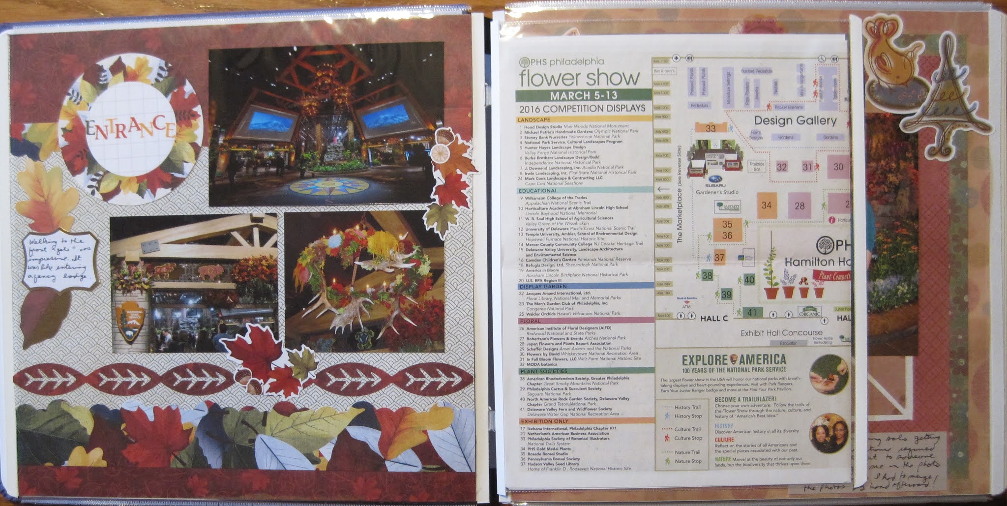
The first 2 pages are broken up with the addition of the map I saved. I have it folded around a piece of cardstock so that you can see the entire floor by turning the page. 


I took several hundred photos, but even for me, it was difficult to get decent shots of everything. Even though I was touring in the evening it was still very busy and full of people. That's why I also used a few photos from the internet which were used for the promotion of the show, like the top photo on the page below.


For the left side of the layout, I used a sketch from the January 2021 Virtual Crop. I chose the Hello Autumn paper pack because the colors on display had that rich fall coloring. I cut one of the mats into a circle to add my title. I used up some more of the small letter stickers. I was able to mix and match a couple of sheets to spell out the word. Using a variety of colors not only matched my layout but also enabled me to use up stickers that were hard to use to make standard words. By this point, having any "E"s in a sticker sheet is a miracle! 

The right side of the entrance has ME. That is actually pieced together from several photos. My selfie skills were not very good so I asked someone to take the photo for me. However, they zoomed in on me getting little of the entrance! By piecing it with other photos I took, I was able to get a decent shot of myself. 


The layout here is based on another sketch in the virtual crop which you can see here. For this layout, I went far back in my stash for some "Earthy" power palette papers and stickers. This is a collection I want to finish but it seems to multiply like rabbits when I'm not looking. The CM 12" trimmer allowed me to cut smaller frames of each of the 3 papers for the outside. By cutting holes in the middle you reduce the thickness of the page and the weight of the album. I chose stickers from spring, summer, and winter (the tree) for the border across the top. The journal box is a piece of vellum. It allows the background to come through in a soft way but you can still see the writing. I don't know what made me think of that but it did work well on this page.

I know this is a lot of photos for one post but I decided to put all of the entrance photos in one place. Just behind the entrance shown above were these amazing sculptures of a bear and bison. 


And one more layout from the Virtual Crop. I used paper from both Rustic Manor and Woodland Whimsy here. The die-cut animals are quite old but were a good addition to the page given the topic (OK, it's a moose, not a bison--but it still works).