Google

Showing posts with label Valley Forge National Historical Park. Show all posts

Friday, June 30, 2023

Meeting George Washington

Now that I've moved to Bucks County I am taking advantage of some events that I never did before. On December 19th every year Valley Forge recreates the march in of the Continental Army in 1777. That was the year they used the "off-season" to learn to become an army. I arrived a little later than I had planned thanks to traffic and work but I was in time to hear Washington give a speech and then to get a selfie with him! I also met one of his aides--James Madison! A little surreal but nice!


I based this layout on Challenge 3 from the April 2023 CM Virtual Crop. I pulled papers from the Winds of Winter paper pack (CM 2017). I liked the starkness of the pages and the brown tones (unusual in a winter collection) matched the historic look of the photos. I traded the 2 vertical photos on the right page for the program/brochure from the evening. With a decorative cover, it works both as a photo and memorabilia. I mounted that with photo corners.

I spent some time in the visitor center (that's where the stamps are after all) and saw a few of the displays. Mostly I hurried out to see GW. I also hiked out to the Muhlenberg huts. They were all filled with reenactors and period displays. Some of it was geared toward children but I found quite a bit for myself as well, such as the camp physician.


For the left page, I used Challenge 2 in the same virtual crop as above. For this page, I used Winter Woods--still the winter theme but this pack has that nice cut-log paper that is perfect for these cabins. I was able to trim my photos to small squares--it actually improved them by giving the viewer a focus. I substituted a decorative card for one photo and turned another into a journal box. On the right page, I used a Power Hour layout from Meggan Jacks. Her technique of folding the paper so that you have a punch running through the middle of the page was unique. This page continues with the Winter Woods papers and embellishments again, trading one photo spot for a journaling box.

My last page focuses on the outdoor experience. I feel bad for the "soldiers" who had the job of guarding the fire and talking about setting up the camp. It was a very cold night and I believe they most resembled the soldiers from 1777. 


For this page I dug back to the Virtual Crop from November 2022. This is a very simple sketch. I used just one sheet of paper and cut the square from the middle. When you flip it over and replace it, you have a two-tone paper for your photos. I wish there was more contrast in the 2 sides but you can tell it is slightly different. I used some embellishments from "Frost" (another older CM line). The darker photos stand out nicely on the medium-tone paper though.

Friday, August 27, 2021

Cabin Remnants

The display for Valley Forge caught my attention because it highlighted the aftermath, not the actual encampment. Once all those soldiers walked away, the huts would have fallen into disrepair and the flowers and trees would grow in the mulch created by the decomposing structures. 


I made this layout for a contest that Creative Memories held for their Independent Advisors. We were asked to use pens for a layout with creative journaling and drawing. I used some of the collection called "Winter Woods". The log papers were perfect and didn't convey a wintery theme at all. The overall layout was based on a sketch from Noreen Smith for May 2018. You can see that I got my triangle cuts backward, but the theme still worked. 

I used the striped background paper as my journaling lines. The doodling is the leaf/branch along each of the wood triangles. I used the Hello Autumn Journal Template to color in on the sides. I added a couple of clusters from the Winter Woods pack--mostly leaves and trees, again--no real winter scenes. The best news is that I WON. I got a free set of papers, stickers, and embellishments for putting this page together!

Thursday, April 1, 2021

No Fooling! Less than a day-trip

I figured I might as well continue the tradition of posting on April Fools day! Enjoy the bonus this week and come back for another layout tomorrow night!

On a Saturday in September 2015, I was near Valley Forge for a conference. Not one to waste an opportunity to refresh my stamps, I headed over after the conference and then drove through some of the park. It was a lovely day for the drive and I was able to get out and explore the various stops.


There are two images of my layout. I had JUST a bit more than would comfortably fit on a single-page spread and less than what I wanted for a 2-page layout. So I ended up using one of the CM 6x12 Peekaboo pockets to extend the page a bit.That allowed me to put the unigrid front and center and have a couple more photos at the back. 


The overall layout was based on the sketch for one of the virtual crops. I used some log paper from the Adventure pack as the base and a matching border sticker to tie the pocket back in. The base paper for the pocket is also from the Adventure pack and the brown plaids were plain enough to not create distraction or eye pain! The stickers of the soldier and drum are from the Eastern National scrapbook kit. The rest of the flowers and leaves came from a variety of packs and were most likely chosen because they were close at hand.

Friday, January 4, 2019

Centennial Part 15--Forging Ahead!

Happy New Year everyone! I hope you have enjoyed the journey along my National Park travels with me. Get ready for another year full of layouts!

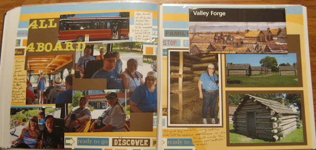
So as I discussed last week, after Hopewell Furnace we had lunch and then drove over to Valley Forge. We had a choice between seeing the movie for its last showing or taking the last trolley tour. We all chose the trolley and had a great time together moving from stop to stop.

This 2-page layout uses an old version of Fast to Fabulous. The images weren't imprinted on a page, it was sort of like buying layout kits that were finished. So I struggled with using this layout as the background is sort of "loud". But the brown tones spoke to me and seemed to match the log cabin feel. The left side is all about the trolley. I suppose I could have stretched that into its own 2-page layout, but by now I was realizing how THICK this album was getting. Still, there was an excitement about the trip and perhaps the movement of the background echoes that theme on our faces!

The trolley drove to several areas of the park but we only got off at 2 stops, the encampment huts in the above layout and Washington's Headquarters in the layout below. The other monuments were photographed from the trolley which had its own challenges in getting a good perspective. But I loved that it took us to Washington's Headquarters as I'd not been there on my previous visits.

This pair of pages was inspired by the flag on the lower right corner. This is the flag that symbolized that General Washington was in residence here. So I had paper that was a blue background with white stars and used a wallpaper technique for the photos. To add to the patriotic flavor I added some red photo mats and red tinted journal boxes. The bear is fussy cut! He's the model for a larger die cut that I assembled, and I didn't want to waste him since he was so cute!

Our tour of Washington's Headquarters took us through many areas including where soldiers stayed and where the slaves stayed. The left page is the stark reality of the difference in treatment of the two classes. I borrowed the title from the British drama of the same name though the roles are definitely reversed.

The left page is sort of scraplifted from this layout. I used 5 different pieces of paper on this page which was challenging for me. Finding the matching sizes of prints as the scraplifted layout allowed me to use up some scraps and create a vintage tone at the same time. The lettering is cut from the Cricut. I intentionally used the paper on the layout to color the openings for the letters. You can also cut small circles and attach to the backs if you want a contrasting look.

The right page is actually wallpaper. I know there are some templates and guides to create a sunburst effect, but it's so much simpler when the page is printed that way! I thought that the mix of patterns was similar enough to the previous page to be a match and had enough of a vintage feel to match the period of the house.