Happy New Year everyone! I hope you have enjoyed the journey along my National Park travels with me. Get ready for another year full of layouts!
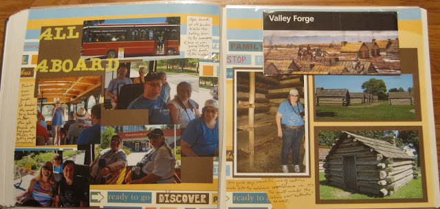
So as I discussed last week, after Hopewell Furnace we had lunch and then drove over to Valley Forge. We had a choice between seeing the movie for its last showing or taking the last trolley tour. We all chose the trolley and had a great time together moving from stop to stop.
This 2-page layout uses an old version of Fast to Fabulous. The images weren't imprinted on a page, it was sort of like buying layout kits that were finished. So I struggled with using this layout as the background is sort of "loud". But the brown tones spoke to me and seemed to match the log cabin feel. The left side is all about the trolley. I suppose I could have stretched that into its own 2-page layout, but by now I was realizing how THICK this album was getting. Still, there was an excitement about the trip and perhaps the movement of the background echoes that theme on our faces!
The trolley drove to several areas of the park but we only got off at 2 stops, the encampment huts in the above layout and Washington's Headquarters in the layout below. The other monuments were photographed from the trolley which had its own challenges in getting a good perspective. But I loved that it took us to Washington's Headquarters as I'd not been there on my previous visits.
This pair of pages was inspired by the flag on the lower right corner. This is the flag that symbolized that General Washington was in residence here. So I had paper that was a blue background with white stars and used a wallpaper technique for the photos. To add to the patriotic flavor I added some red photo mats and red tinted journal boxes. The bear is fussy cut! He's the model for a larger die cut that I assembled, and I didn't want to waste him since he was so cute!
Our tour of Washington's Headquarters took us through many areas including where soldiers stayed and where the slaves stayed. The left page is the stark reality of the difference in treatment of the two classes. I borrowed the title from the British drama of the same name though the roles are definitely reversed.
The left page is sort of scraplifted from this layout. I used 5 different pieces of paper on this page which was challenging for me. Finding the matching sizes of prints as the scraplifted layout allowed me to use up some scraps and create a vintage tone at the same time. The lettering is cut from the Cricut. I intentionally used the paper on the layout to color the openings for the letters. You can also cut small circles and attach to the backs if you want a contrasting look.
The right page is actually wallpaper. I know there are some templates and guides to create a sunburst effect, but it's so much simpler when the page is printed that way! I thought that the mix of patterns was similar enough to the previous page to be a match and had enough of a vintage feel to match the period of the house.


No comments:
Post a Comment