Google

Friday, October 4, 2019

Antietam part 2--Featured monuments

Last week I highlighted the tour I took through Antietam Battlefield. There are a couple of interesting markers that caught my eye and I wanted to give each their own page. First, just outside the farmhouse that served as a hospital was this memorial to Clara Barton. As a nurse, she's a favorite of mine and so here is a tribute to her work.
The background of this page is a piece of heritage paper from an old CM Reminisce line. The mats for the photo on the upper left and bottom right came from the same pack, just a little lighter in color. The concept for putting the page together came from this Pinterest page. I took the tone of the paper and a little of the theme of the embellishments (but toned it down to my taste level). The flowers came from a variety of packages. The middles were in a prize pack I got at a crop a few years ago. The purple colors and the pearl middles are from various CM embellishment kits. The mat with Clara on it is cut from an EN 8 1/2 x 11 page that normally has a variety of people along the edge. I decided to trim it down to just Ms. Barton and I like that not only does it highlight her for this page but that I can use the remaining images on future pages.

Edit for 10-14-19--OK, I'm going to edit the page to add how I met the challenge for Lasting Memories who is asking us to use items to highlight the word "CRISP" (for the fall). Here is my list:
C: Clara Barton
R: Red Cross/red brick/red flower
I: Ink (around the chipboard word "Legacy")
S: Stickers (key and pitcher/basin)
P: Pearls in the flowers

Near the observation tower was this tribute to General Meagher. I heard of him when Jim and I traveled to Ireland in 2001. The other side of his memorial is to the Irish Brigade he led. As Jim's family has a strong Irish heritage, I decided to include the tributes in the album.

This layout is part of the scrapbook class I'm taking so I cannot post the sketch. However, the idea was to use up our stash of papers. CM had, in its early days, provided triangles and paper strips and the class instructor came up with a fresh take on how to layer them to make a page. I like that it almost makes a chevron/arrow pointing to the photos. The strip down the middle here is not cardstock, but a remnant of paper ribbon. I thought the green tones went a long way to highlighting the Irish heritage.

Below is the same page but I'm highlighting the history of the battle.

I've discussed the peekaboo pockets before. What a great way to add a touch of journaling and the story imprinted on the stone but not make it the focus of the page.

Friday, September 27, 2019

Antietam part 1--the beginning and the end

Another part of my spring break trip was to visit Antietam. I have still not been able to get into the Pry Field house as the visiting window is just May to October, so I'm sure I'll have to go back. This week we look at the beginning and end of my auto tour. Next week we'll look at some of the monuments I saw.

This layout is scraplifted from Pinterest. I turned this into a 2-page layout by doubling the stars and the blue banner across the middle. The base pages are from Graphic 45 (see, they do make pages without too much embellishment!) On the flip side is one of the months from Places in Time. I bought a bunch of them to use this reverse side with just some corner flourishes. The large corner stars were cut on the Cricut from basic shapes while the smaller ones were scraps from various sticker and die-cut packs.

Part of the tour included a stop near this LONG fence and I took a LOT of photos though only 2 made it into the scrapbook. I also climbed a viewing tower for a nice overlook of the battlefield.
The left page is a paper I had printed. I downloaded the design with some Gettysburg Civil War pages from someone on Etsy but this one will work for a variety of pages. The right is some civil war canon paper I picked up at one of the scrapbook conventions I visited. The bottom right of the red star page and the journal box are all decorated with stickers from the EN scrapbook kit. Notice that I spaced them so the canon stickers are on the opposite page and the sticker of Burnsides Bridge is on the top of the page while the photo is on the bottom. That helps with the movement of the reader's eyes across the layout.

Friday, September 20, 2019

Locked up

My trek through the Maryland, West Virginia and Virginia area took me to one of the C&O canal locations. Visiting in March, several locations were closed, but Williamsport was open. The visitor center had a movie that was taken in the early 1900s showing traffic along the canal. It was a cold day but I took a walk up to Lock 44 and the keeper's house there. The house wasn't open for tours so I just looked around before heading back to my car.

This layout is scraplifted from this layout that I found on Pinterest. All of the small bits around the top and sides of the pages are scraps (yay for using up scraps!) I debated including the scavenger hunt booklet as the color is so much brighter than the photos, but wanted to fill up the page so I left it in. The sticker below the brochure is from the EN scrapbook kit.

Friday, September 13, 2019

A Short Walk on a Long Trail

While at Harpers Ferry I decided to visit the Appalachian Trail office. It was a bit longer than I anticipated walking from the lower town. AT Hikers stop here for a photo before heading north again and I was able to find a photo of a friend who stopped by in the early 90s.

I scraplifted this layout from the paper manufacturer's post on Scrapbook.com. I've found that when you have a lot of printed paper, using small amounts and layering keeps the page from being too busy.

Friday, September 6, 2019

RAID!

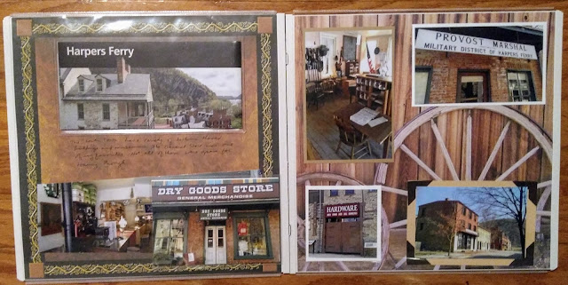
In March 2014 I spent my spring break vacation on a stamp trip. My first stop was Harpers Ferry NHP. While the most famous happening here was John Brown's raid, I wouldn't say it was the predominant story told. Yes there are plaques about it and some parts of the museum discuss his actions but there is much more to see.

The layout above is one that I purchased from Scrapbook Concierge. It came with the pieces in a bag and I had to layer them together. That was a little challenging actually, but I do like the layout. My contribution was the journal box which came from an older CM Croptoberfest kit.

Harpers Ferry has an upper and a lower town. The lower town is mostly just historic buildings, but it still surprised me that it had a western feel. The city is near where West Virginia, Virginia and Maryland connect and that doesn't remind me of western life.

I started this layout on the right as I wanted to mimic that western feel. I found the paper with the wagon wheels and layered the photos on. A couple of the photo mats actually came from the layout I purchased above (saved because of putting the  journal mat in place of a photo). The left paper was out of my stash of heritage sheets but the brown and gold seemed a good fit for the subjects.


The photo of the inside of the General Store proved too long for the page, so I placed the third photo in a peekaboo pocket so that it could be folded out to make one long panoramic photo.

Friday, August 30, 2019

Baby, it's Cold Outside!

I was leaving the conference on Friday because I was scheduled to go to my annual scrapbook weekend. That meant I could go to one of the office buildings to get the stamps you can't get on the weekends, so I chose the Department of the Interior. Constitution Gardens is very close to their building and so I made an effort (in the chilly weather and on icy paths) to visit this park. I'm sure I've walked through it previously but I wanted to actually stop and see the markers.

This layout is based on a sketch from my Scrapbooking Class. Ironically, the template was from June and had a beach theme to demonstrate the technique! My beach ball area became a journaling circle. The background is a piece of rounded corner cardstock that CM provided as a Christmas treat many years ago. The bottom right corner has a circle with a snowflake on it and I intended to use that where the dark blue one was but decided I wanted more contrast. I covered the hole with the vertical paper (an older piece of CM from a winter collection). The border is one I've had for a long time. I didn't have to do each square individually, it comes as one unit. The extra, dark-blue snowflake helps add some color to the top of the page. I thought my use of 2 sizes of letters inspired for this layout. It gives it that frosty look!

Friday, August 23, 2019

Not So Fun with Flags

My next park trip began in January 2014. I was driving toward Washington DC. This house was listed on the trail map and I assumed (incorrectly) that there was a passport stamp there. But I did find the story interesting and so made a layout about the brief visit.

This layout was created for a scrapbook summer camp I joined online. The camp started at the end of June and our first challenge was to make a patriotic layout and use a sketch. I can't post the sketch here but I did turn it 90-degrees to match the direction of my photos. The papers are from an older CM line called "Americana". I liked the duller/historic look of the paper for this layout. Stickers (border, upper left and the 3 arrows) are from a Reminisce sticker page.