Google

Friday, September 17, 2021

Boy oh Boy

My next stop was at the Lincoln Boyhood Home. Hard to believe that it is even smaller than the original, but they included an outdoor garden as a main focus of plants.


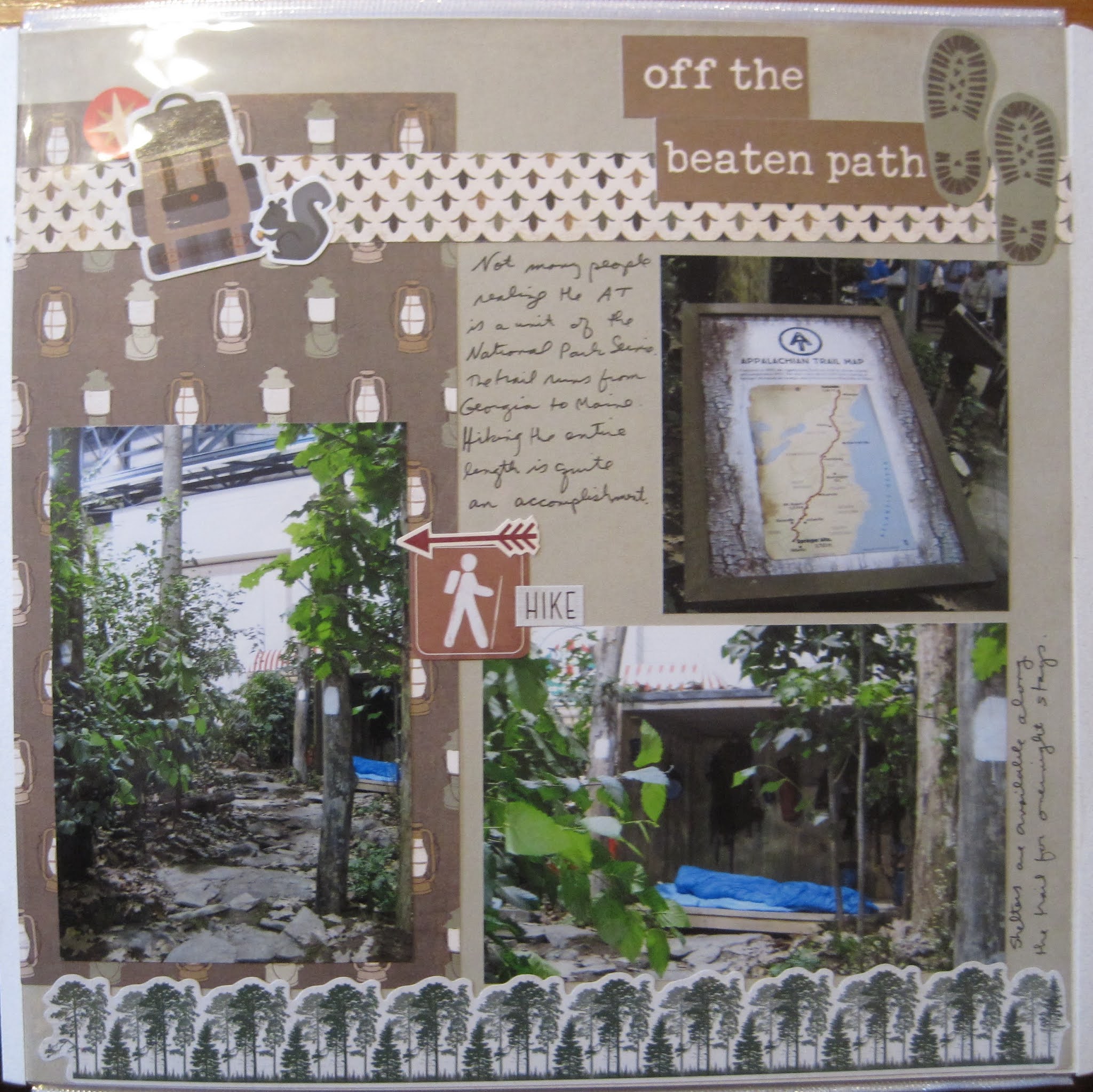
This layout is from my year-long class so I can't link the sketch. I used several variations on branches to get my rustic look. The paper at the top is from a photo paper pack. By cutting it I could stretch one piece of paper over 2 pages. The brown plaid is a leftover piece from one of the adventure/outdoor paper packs. The borders at the top and bottom are made with different border punches. The top is a border maker cartridge. If you look closely I have the branches facing to the middle to draw the eye there. The bottom is a stand-alone border punch. I chose to leave the branches bare this time because of the split rail fences in the photos. 

I balanced the left and right sides with 2 quotes. On the left is the sign from the display. On the right, I stacked a sticker from an NPS sign sticker pack (all blank) with a heritage phrase from Paper Loft. Just a couple of left-over fall stickers finished off the layout.


Friday, September 10, 2021

Off the Beaten Path

 The next display is of the Appalachian National Scenic Trail--the big one that goes from Georgia to Maine! I've been on very small segments of it and I'm sure there were a lot of options for the designers. They chose a generic-looking walk in the woods but also included one of the sleeping shelters. For through-hikers, this is their hotel on many nights. Also authentic--the white blazes on the trees indicating the path!


For this layout, I broke up a 2-page layout I made at a paper-loft class. It was mostly lantern paper so I added a border of trees from one of the CM outdoor packs (Winter woods--but it doesn't really look wintery). A few more random stickers of backpacks, hiking, and squirrels, and this one was complete!

Friday, September 3, 2021

Dele-Where?

 The next park to be highlighted is First State National Historical Park in Delaware. Which in reality takes the entire state of Delaware and includes several stops. The components highlight the founding of the county as well as its participation in the Revolutionary War, so the designers created a "Colonial Garden". To the best of my knowledge (and I've been through the various sites a couple of times) the only places that you would find this is either Lewes (which as a bunch of historical houses though not part of the park system) or the John Dickinson Plantation. Which I don't remember from my visit there. Still, they put together a lovely display.


This layout is based on one of Organized and Creative Mom's sketches. It's the same page as last week's layout, but the other sketch. I used the very old "Sorbet" line. The stickers are a bit "cartoony" but the background papers worked well. I like using the middle of a frame that  I cut for a different project as the base. 

Friday, August 27, 2021

Cabin Remnants

The display for Valley Forge caught my attention because it highlighted the aftermath, not the actual encampment. Once all those soldiers walked away, the huts would have fallen into disrepair and the flowers and trees would grow in the mulch created by the decomposing structures. 


I made this layout for a contest that Creative Memories held for their Independent Advisors. We were asked to use pens for a layout with creative journaling and drawing. I used some of the collection called "Winter Woods". The log papers were perfect and didn't convey a wintery theme at all. The overall layout was based on a sketch from Noreen Smith for May 2018. You can see that I got my triangle cuts backward, but the theme still worked. 

I used the striped background paper as my journaling lines. The doodling is the leaf/branch along each of the wood triangles. I used the Hello Autumn Journal Template to color in on the sides. I added a couple of clusters from the Winter Woods pack--mostly leaves and trees, again--no real winter scenes. The best news is that I WON. I got a free set of papers, stickers, and embellishments for putting this page together!

Friday, August 20, 2021

Wild Flowers

My next photo op was for a planned garden representing Acadia. Now if you looked at the website for Acadia (I've not been here yet) you would see the coastline, hiking, auto tours. But you might not expect to find a cultured garden! Indeed there is space set aside for preserving the special flora of the area and this display presented that perspective of the park.


If you remember the last layout, I used a Fast-to-Fabulous page as the base. This is the back of that page and it worked PERFECTLY for the layout. I mounted my 2 key photos in the area of the pre-printed mats (CM has since stopped printing mats on the page if you want to try this type of layout--it makes for a very flexible layout). I added 3 clusters of stickers--one near the journal box, one at the left side, and one at the top right (including the title). All of this comes from the Secret Garden embellishments.

Friday, August 13, 2021

The Rustic Look

One area focused not on a specific park, but on the "Rustic Style" used in many parks to evoke a sense of nature while allowing for groups of people to gather. This stage and campfire ring fall into that category. As I visited on a weeknight, I'm not sure if they used this for classes but I wouldn't be surprised. It has a very cozy feel to it.


I didn't go as far back in time for this layout, but I completed it in March using a sketch from my January class. It's always nice to get caught up! I kept with the "rustic" feel by incorporating textured paper. That doesn't mean it is thick, but rather you can see the depth of a photo or textile on the paper. The background page is from the Secret Garden Fast to Fabulous pack. Again, a lovely washed look helped set the tone. I added a scrap of the stone paper down the middle as an anchor for the elements. Although you don't see much of the middle, it is there. I punched 3 circles out of a gray textured paper for the middle and then layered the photos. The embellishments were a mix of Paper Loft (for the title words) and some old CM rustic (or perhaps they were called Rugged?) stickers. I have to say brackets always stump me but I think it worked well for this title.

Friday, August 6, 2021

Home Town Crowd

Of course, Philadelphia had to be highlighted--the flower show is on their home turf! In fact, there is a ranger presence here from INDE which you'll see later. Independence National Historical Park encompasses not just the Liberty Bell, but also Independence Hall, Thaddeus Kosciuszko, and Edgar Allan Poe houses. While Poe will be highlighted at the end, only the Liberty Bell is used to represent the park. Still, the use of red, white, and blue flowers to create the bell was attractive. 


I was finally able to use a sketch from the Scrap Your Stash class in October 2019 (about 18 months before I completed this layout!). Though I cannot show you the sketch, I can say that I followed it faithfully though I turned it 90-degrees to accommodate my photos. There are a lot of different pieces here, but luckily they all had the same tones so they worked together well. The background page gave me the "blue" (I don't recall what pack that came from). The red plaid in the middle is from an 8 1/2 x 11 Americana tablet that I bought when I first started scrapbooking. Nice to be able to use it up! The border is from a pack I bought from Our Memories For Life--a spin-off of the old CM company by one of the original founders. I don't have much of their materials because it is honestly difficult to navigate their ordering page, but these borders were a great find. The Liberty Bell photo sticker came from a pack purchased at the INDE visitor center. The cartoon-like sticker and the other random elements came from an older CM Fourth of July kit. It sounds like a lot, but in the end they all pulled together for a fairly straightforward layout.