Google

Showing posts with label Eisenhower National Historic Site. Show all posts

Friday, September 23, 2022

Some Retro Pages

As the tour moved upstairs we saw fewer Christmas touches. Mamie and Dwight kept separate bedrooms. Hers all in pink! I guess the general needed his own side to escape the pink. 😁


This layout is based on another CLS PJ party idea. Using the CM Custom Cutting system I cut progressive sizes of shapes and used the positive (shape) and negative (hole) to layer into different pages. I used some retro paper from older CM (I think this is the Vintage pack but it could be something else). The paper matched the decor but to me it all sort of blends together and I don't see the different papers as much as I thought I would. Well, done is better than perfect!

Back downstairs we visited the kitchen (where they are making Christmas Cookies!) and the den (where they are wrapping Christmas Presents). I remember seeing the kitchen on my previous tour but had not known it was state-of-the-art when installed! I always enjoy the den. There's such a warm, homey quality to the space.


The left page is a continuation of the negative/positive papers from the last layout. They were leftover from my cuts so I thought I could stack them in a similar fashion. Again, not my favorite but it does match the kitchen decor. I got to use up some non-CM stash with the stickers of the kitchen goods. The right page is wallpaper. That argyle/border/decorated circle was from a similar pack and since it matched the left page I used it for the den. I think that the paper matches the photos well. 

Just before you exit the house is Eisenhower's workspace for his presidential years. It's a small space as he preferred this home for relaxation. But he could never escape the "football"--yep, that briefcase was the nuclear armament codes! It's of course empty now (or is it!?!). After our tour, some of the group had lunch at the Lincoln Diner in Gettysburg.


This page is my take on a Creative Scrapbooker sketch. This is the link to a page with a step-by-step layout. I used some scraps of paper for the border across the middle and then some longer border stickers from a very old CM Christmas-themed gift pack (it had some strips of paper but never full sheets). I liked that the border helped differentiate between the house and the lunch. Since there was just one photo of the lunch I was worried about making a page. This solved that problem!

Friday, September 16, 2022

A Christmas Twist

Inside the house was made ready for Christmas eve! There were even presents under the tree! I love the way the room was lit and the tree was glowing even though it was in the afternoon.


As I said last week, this is the page I made for my stint as a guest designer with Lasting Memories. The change is that the door photo that you saw last week was originally on this page in the top left. When I got to the remaining photos I realized that I could add another indoor photo here so I carefully peeled the door off and replaced it with the poinsettias. I love collecting memorabilia and added an 8 1/2 x 11 pocket to include the tour brochure. You may recall that the left page is a Fast-to-Fabulous base in the Season's Greetings collection. I have some paper from this line too so I was able to add a bit to the pocket to help match the decorations of the left side.

The living room and dining areas were also heavily decorated for Christmas. Poinsettias were everywhere but so too were vintage decor like the Santa bottom right.


For this layout, I used CM Virtual Crop Sketch #8 from the June Worldwide Virtual Crop. Because the left page is 8 1/2 x 11 I had to modify the proportions. The large butterfly-looking piece in the middle of the sketch was reduced to just the bell on the right page. (I made that bell once before--it's several ovals stacked together). The sketch has borders around the bottom and sides. I used 2 different borders and alternated the colors so each page is a little different. I did keep the stacked corners--just a couple of scrap pieces from the Season's Greetings line. I also used mats from that collection on the right under the photos. The tree and sleigh were fussy-cut from the mats as well. I think I nearly completed this collection!

Friday, September 9, 2022

More Meetup Madness

The next park I visited was in December 2016. The Eisenhower home decorates each year for Christmas and I was interested in seeing their display. They were also hosting a special weekend open house at the beginning of December with cocoa and cookies in the visitor center. I planned a meetup for that weekend and had quite a few NPTC members join me for the event. Below shows us getting on the bus at Gettysburg and riding out to the park. We gathered in front of the sign for our formal group picture. I still had the banners from the Philadelphia convention so we could get that in the photo as well.


This layout is based on a sketch from the CM Virtual Crop in November 2021. I used 2 Fast-to-Fabulous base pages for this so I only had to add a little detail. I added the dark blue page that is split across the middle, and the border on the bottom (one of the border-maker cartridges). Most of the materials come from an older travel pack called "Gallivant". I liked that I could use the mat as a filler for one of the photos but also as a journal box. I just added some lined paper to the bottom.

The tour took us around the outside of the house, and you'll see a bit more of that on the next layout as well. You can see that they included Christmas touches starting at the front door!


You have seen a small bit of this visit as I used several photos for a layout when I served as a guest designer for Lasting Memories in the summer of 2021. However, I moved some photos around. Check out this original blog entry. That front door photo was moved! The background paper is from a store in Gettysburg called Forevermore Scrapbooking. It's a favorite of mine, and I'm hoping that they find a new home as their landlord made them close the original store a few months ago.  Similar to the Lincoln Memorial page a couple of weeks ago, I used this base to show the other dimensions of the entrance. The photo of the side and the front door makes for a complete outside view of the structure. The title element was also from Forevermore.

Here's more of our group as we toured the grounds. Eisenhower was quite a golf fanatic going so far as to install his own putting green. I got lucky as the wind stretched his flag out so you can see it has his general's stars on it! For December the weather was chilly but we didn't have to deal with snow so the outside walk was not too uncomfortable.


This layout was based on sketch #6 from the CM virtual crop. I used a pack of paper and embellishments earned as part of a challenge called appropriately enough "Picture Perfect". The neutral tones worked well with the winter grass. Not sure I like the punched border down the left side but if you don't think about it much it may look like photography flashes. 😃 I used one of the decorative blades on the 12" trimmer for the middle of the square, and I think I forgot to change it out when I cut the black wave under the "flashes". But it seems to have worked out fine!

Sunday, July 4, 2021

Celebrate with the Eisenhowers

Hello and welcome to a special edition of my blog. This month I'll be serving as a Guest Designer for Lasting Memories. That blog posts a weekly challenge and then encourages others to play along with drawings at the end of each month. This month's challenges are all Title challenges. This week the challenge was to use the word "Celebrate" as the title. So I chose some photos of a visit to the Eisenhower Ranch. These were taken as part of a National Park Travelers Club Meetup that I sponsored in December 2016. The Eisenhower home was transformed to celebrate the holiday season. That particular weekend featured cocoa and cookies in the visitor center as well. More of that visit will be forthcoming I assure you.


The page I created was based on a sketch from my year-long class (so I cannot post the sketch). Suffice it to say that I had to turn it sideways to accommodate my photos. The background page is a Fast-to-Fabulous page from Creative Memories. All of the items come from an older line called "Season's Greetings". I like the vintage feel to the papers and knew it would work well with the home decor based on the 1960s lifestyle.

Friday, May 26, 2017

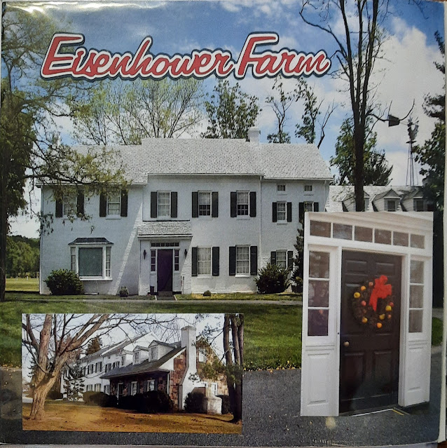
Generally speaking...

If you've been to Gettysburg you probably noticed that the visitor center also serves as the starting point for the Eisenhower National Historic Site. In October, 2007 Jim and I made a visit during my fall break. It was nice traveling on a Monday because there were no crowds to deal with. We did take time to walk through the museum at the visitor center (I have NEVER seen so many Civil War rifles in one cabinet before or since!) But the focus was really to visit a new park and to see the Eisenhower Farm.


This layout was made during my first "Virtual Crop" with Creative Memories. Using a Facebook page and their blog, Creative Memories would post a "challenge" and while working at home on my own I would create a page that fit the challenge and then upload a photo to their site.

The challenge was to copy one of their Design Team layouts. The company has changed websites and the original is gone, but a similar layout can be seen here: Click here to see the inspiration. To be thrifty I saved those punched out bits and used them to mount the title letters. I've said before that after a few uses, a sheet of sticker letters gets difficult to use because you are missing key letters. On this page I tried to use a salvage technique where I cut out around the outline of the remaining image on the sheet, mounted it on similar colored cardstock and then "fussy cut" around the letter before mounting it on the stamp. It was successful but I don't like the look of the residual white bits it generates.

The bottom right corner features a memorabilia pocket. Similar to the large ones I love for the brochures, this medium size one holds the ticket stub for our bus trip and tour. If you have an item that you are worried about putting in contact with your scrapbook pages, the pocket helps mitigate any acid that may leach to surrounding paper and photos.

I really enjoyed the house tour but didn't feel like we had enough time to see the grounds. The bus returns periodically and you are supposed to return on the next run but you would have to choose a later bus if you wanted to see more of the farm and the visitor center.


I used a multi-square block technique on the left page. I took a pack of 7"x7" paper I owned and cut an inch from two sides to create 6" squares. The 4 squares were mounted next to each other to create a background. Because my cuts weren't perfect there was a gap in the middle which I covered with a circle punch. It sort of looks like a sofa cushion button and I thought it worked well.  The other technique I like on this page is the journaling. I used a strip of plain cardstock, wrote out the journaling, and then cut it into strips and mounted it.

Again, being thrifty (and after all it IS called SCRAPbooking), I took one of the page remnants from the 7" papers to create the mounting square on the right page for the stickers and under one of the photos. Because of the memorabilia (house guide) taking up so much room on the page there wasn't room for much embellishment, but the stickers help revive that 50s-60s era feel.