Google

Friday, April 15, 2022

The BEST Jerry, the BEST!

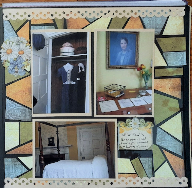
 In June 2016, Monocacy National Battlefield held an open house. Literally--one of the farmhouses (called the Best Farm) was opened for special tours. It's only open 1-2 days a year so I took advantage of the opportunity to visit. And get stamps. They had some reenactors in period costumes and some ranger talks in the barn. I spent a nice day wandering around the displays.


I was playing along with the Creative Memories Virtual crop and based this on sketch #12. This was another mystery box weekend and the contents (Shabby Chic Rose) had a perfect rustic fit for the farmhouse. The box also included the medallion flower punch and I used a series of them to create the border between the top and bottom sections of the layout. You'll notice I doubled the sketch and repeated the process on the right as well. The title sticker on the right is from a very old pack of CM paper but I thought the sentiment worked well with the theme.


In order to use all the photos I wanted on the layout, I included 2 peekaboo pockets on the right page.


My second set of pages focused on the living history encampment featuring a physician. I can spend a long time looking over the medical history items. The ether bottle was a new one for me.


This layout is also based on a sketch from the virtual crop. This time sketch #11. The paper is from the Homestead collection--another pack that works well with historical and rustic themes. The overall technique is a series of 12" strips (varying widths) and some border stickers to separate the areas. There is another peekaboo pocket here. I have the contents of the lean-to tent as a close up once you lift the photo of the tent. I thought that was clever.

Friday, April 8, 2022

Pretty in Pink

 The last stop on the Ranger Tour was the Jefferson Memorial. I found it difficult to get a decent picture of the statue because there is little light coming in. As you can see in the left photo it was a bit of a cloudy day, and while that's normally great for photography, not when the statue in question is under a dome with narrow spaces between the columns. The ranger went so quickly from monument to monument that I did not have time to gather stamps on the way. After the tour was over I retraced my steps back through the tidal basin so I could get the stamps at all the gift shops. That made for a LOT of walking (over 20,000 steps on my pedometer!) Luckily I could hop on a red bus to take me to Union Station for my trip home.


This layout is from a pajama party layout. I chose to use pink for the Cherry Blossoms on the unigrid, even though it clearly was NOT Cherry Blossom time along the tidal basin. I don't get much chance to use pink paper so it was a nice way to dig into my stash. The 2 pink background papers are from the Blend and Bloom pink pack. I used aqua as the accent color. The class taught us how to make the borders to divide up the page. I wish I had lowered the left border a little so that it was more in line with the strip under the statue. I added some of the smaller stickers from my DC stash that either highlighted the Jefferson Memorial or Cherry Blossoms. The small sticker on the bottom left of the journal box was fading into the background so I mounted it on a spare piece of aqua.

Friday, April 1, 2022

No Foolin! It's back to FDR!

Happy April Fool's Day! I guess no need for an extra post since it's a Friday. Today we'll cover a bit more of my ranger talk along the Tidal Basin. Our next stop was the FDR memorial. The ranger is quite a character and continually mugged with the various statues. But he was quite knowledgeable and I enjoyed hearing his perspective on FDR's 4 terms. 


Although I completed this in May, I used a sketch from my January class. I wanted to pull out the oxidized look of the statues and plaques so I chose a piece of paper from "Painted Harvest" (which I think was a bonus pack of paper--it only had one of each design included). The green is probably supposed to be a leaf, but it gives a nice base for the antique look. The other thing to highlight was the stone so I chose another piece of the Stone paper pack. Black borders define the edges of the page. The sketch was set to have all the photos on the decorative pages. This is another instance of using that as a background and adding my photos regardless of shape. The 2 vertical photos do not detract from the layout even though they cross the black borders. However, if you would like everything to be "between the lines" you can cut the strips in the middle wider so that everything is tucked away.


FDR's second term is marked by the great tragedies of the depression and dustbowl. The wall behind the ranger highlights all of the programs he created in his "New Deal". They include faces and hands of those helped by the programs. It's the first time a ranger explained this mural to me and it really highlighted the chamber. Before that, I thought it was a random decoration. Though I should know that the NPS doesn't do "random" too often.


This layout  is based on a May class sketch. It called for 2 decorative circles and a wide strip through the middle. I chose the same paper pack as the first 2 pages--Painted Harvest and Stone. I took one 12" laser-cut border strip and cut it into 3 sections to use as embellishments around the page. The title comes from the Memoirs and Memories sticker pack. Though it has gears on it, I think the sentiment fits perfectly.

The 3rd term focuses on WWII of course. The second statue of Roosevelt, though much larger, shows how much he's aged. His knee and Fala get a lot of touches so they don't have the oxidation that the rest of the statues do.


This layout is based on a PJ party that I attended. I cannot show you the sketch, but it focused on building the border on the left. Cutting the triangles and diamonds was a little tricky but using some scraps from the Memoirs and Memories pack as well as the Archiver pack, I was able to get a nice "army" feel to the page. I added the stickers of the WWII hats and helmets to provide context. Not a lot of embellishment but it sets the tone nicely.

Friday, March 25, 2022

Monumental Memories

 I walked from the Mall toward the Tidal Basin, passing a few well-known statues. I made my way to the MLK memorial where I would meet with a ranger for a guided tour of the larger units along the path. This will be the first time I see it in this direction.


For this layout, I followed the 1-2-3 layout for February 2021. The video of the sketch being put together can be found on YouTube here. The download is available through her Facebook group. I used a paper from the CM texture pack "Stone". The black marble and tan stone on the opposing sides reminded me of the materials used in these monuments. Even though they don't all stand together, it brings them together on the layout. The cuts were simple and I had just a few embellishments to add. The ship on John Paul Jones' statue is from the Eastern National Scrapbook pack. The "Monumental Memories" title is a die-cut from that pack as well. The small honor and star stickers were from a different patriotic sticker sheet.

Friday, March 18, 2022

On the Mall

After lunch, I stuck around to take a tour of the tidal basin. As we passed the NPS Information booth on the mall, we were disappointed that it wasn't staffed and the stamps were locked away from us! I stopped for a moment to take my photo with the Washington Monument. It was being renovated during my visit so I was unable to go to the top.


This page is a leftover sketch from a summer camp. The main idea was to do some stitching. While the class leader advocated using real thread, I stuck with faux stitching. I outlined the banner by holding a ruler against the edge and dotting every other block along the path. Then I free-handed the cross-stitch look along the bottom. I used a bit of my non-CM stash here. The background paper was just shy of 12x12 and I don't know if I bought it that way or if I trimmed it previously. I layered with the grid paper so I could do my stitching and then cut a scrap of light blue for the banner. I used some star and heart stickers from various sticker packs. The title is from a Paper House sticker sheet. Does that make too many monuments? (2 photos and a sticker). I don't think so!

As I usually do, I visited the WWII memorial briefly. I managed to find someone to take my photo with one of the title pillars but strolled along the outside mostly. 


I bought this kit from Scrapbook Concierge. They create elaborate layouts that you buy as a kit and assemble at home. They look straightforward, but I always end up looking at some pieces and saying "What do I do with this?" For this kit it was the small gray rectangles. It turned out they were to create shadows on the pillars around the reflecting pool. I really had to concentrate on aligning them from smallest to largest and matching the left and right sides. While I like their layouts they don't leave a lot of room for photos, though I was able to add one more by covering some of those pillars. I don't always use the photo corners provided but I did like them here. I used one photo spot as a journal box so I was able to get all the components I wanted included.

Friday, March 11, 2022

A day in the Life

Our tour downstairs included the space used as an office. It was a large 4-person desk and there were typical office supplies still in evidence. My favorite were the stamps. I wonder how many Park Traveler folks are disappointed that these particular stamps do NOT go in our passport books! 


I used the remnant of an Archivers paper (I used the left side on the New Castle courthouse page) because it had the typewriter on the bottom and that went well with the office theme of the page. I then included the phone and typewriter die cuts and some old stamp stickers I had. It's a fairly simple page but highlights the important work done here.

Upstairs is one of the bedrooms Alice Paul used. You can still see her dresses and correspondence ready to go! You have to wonder if they knew at the time how important their legacy would be. No one really knows how much influence they have on others. You just have to keep working at what you believe in!


For Earth Day, CM hosted a special challenge that would help use up scraps (a sort of focus on reduce, reuse, recycle). One of the sketches was this mosaic pattern. The original video had various papers abutting each other and then using thin strips of black cardstock to create the "leaded" effect. I decided to try a variation. I used a black base page for the layout and then used a technique that Noreen Smith showed called "Crazy Squares" spacing the pieces so that the black showed through. There are some uneven pieces but I like the way it turned out. I was able to use up strips of the Reminisce line from OLD CM. The tones of the page went well with that paper.

Finally, we went outside and took a group photo. It was a pretty good-sized group! Afterward, most of us went to the Museum of the American Indian which was said to have a great cafeteria. My lunch was fabulous and I even took a photo of it! Though we went our separate ways after lunch, my time in DC wasn't done. Look for more of this trip next week!


This page fulfilled my April challenge for my monthly scrapbook class. We were given a tic-tac-toe page and I chose a diagonal with Purple, Stripe, and die-cut. I think I may have cheated a bit using purple striped paper (from a special pack CM had recently released) but I like the monotone look of the piece. The die-cut is the title and although it was from a different collection, an older travel collection, it matched the tone of the paper so I used it. I was impressed that I even found a "Circa 2016" sticker to include in one of my groupings. I like that I was able to include 2 rather random photos on one page. I was really impressed with lunch that day and was glad to include it.

Friday, March 4, 2022

Women Warriors

How appropriate that March is Women's History Month and my first blog of the month starts with the Women's Suffrage Movement!

Perhaps you have heard of the Sewall-Belmont house? Up until 2016, that was the name of this house. The National Women's Party, who had owned the house, donated it to the National Park Service and through a Presidential Proclamation, the new unit was formed. They changed the name to Belmont-Paul to highlight the work of the NWP crusaders. Several members of the National Park Travelers Club met there in April to see the new unit. We began our tour in the main entryway (though you don't come in the door under the stained glass transom) and you can see all of the busts and statues of prominent women in the suffrage movement.


This layout is based on one of my year-long class sketches. Since I didn't have to use CM papers, I used Paper Loft and Graphic 45 for the components. With the door, I thought the old key paper was a good choice for the layout. The box on the upper left is actually to be used for genealogy or family trees, but they make great title boxes. The title is from one of the CM die-cut sentiments packs. I've been turning to them more frequently.

Throughout the house, they have included "Selfie Stations" in mirrors. I tried to take advantage of them though you end up getting caught with the camera in front of your face. There are plenty of historical items such as banners and sashes used for various marches. They are kept in great condition considering the use and age of the items.


This layout is based on a bonus sketch for the April CM Virtual Crop. Bonus sketches tend to appear on Monday and you have about a week to put them together (vs. the weekend for the actual crop). But because they don't post the sketch on the blog, it's harder to link. For this sketch, I did upload it to Pinterest so you can see it here. The paper is from the CM Reminisce line--a rather old collection. Because they are so decorative I find them hard to use. I ended up cutting the decorations off the original pages and rearranging them into a semblance of the sketch on 2 background pages. I used mats to punch the embellishments or to create ribbons.