Google

Friday, October 15, 2021

What a Blast

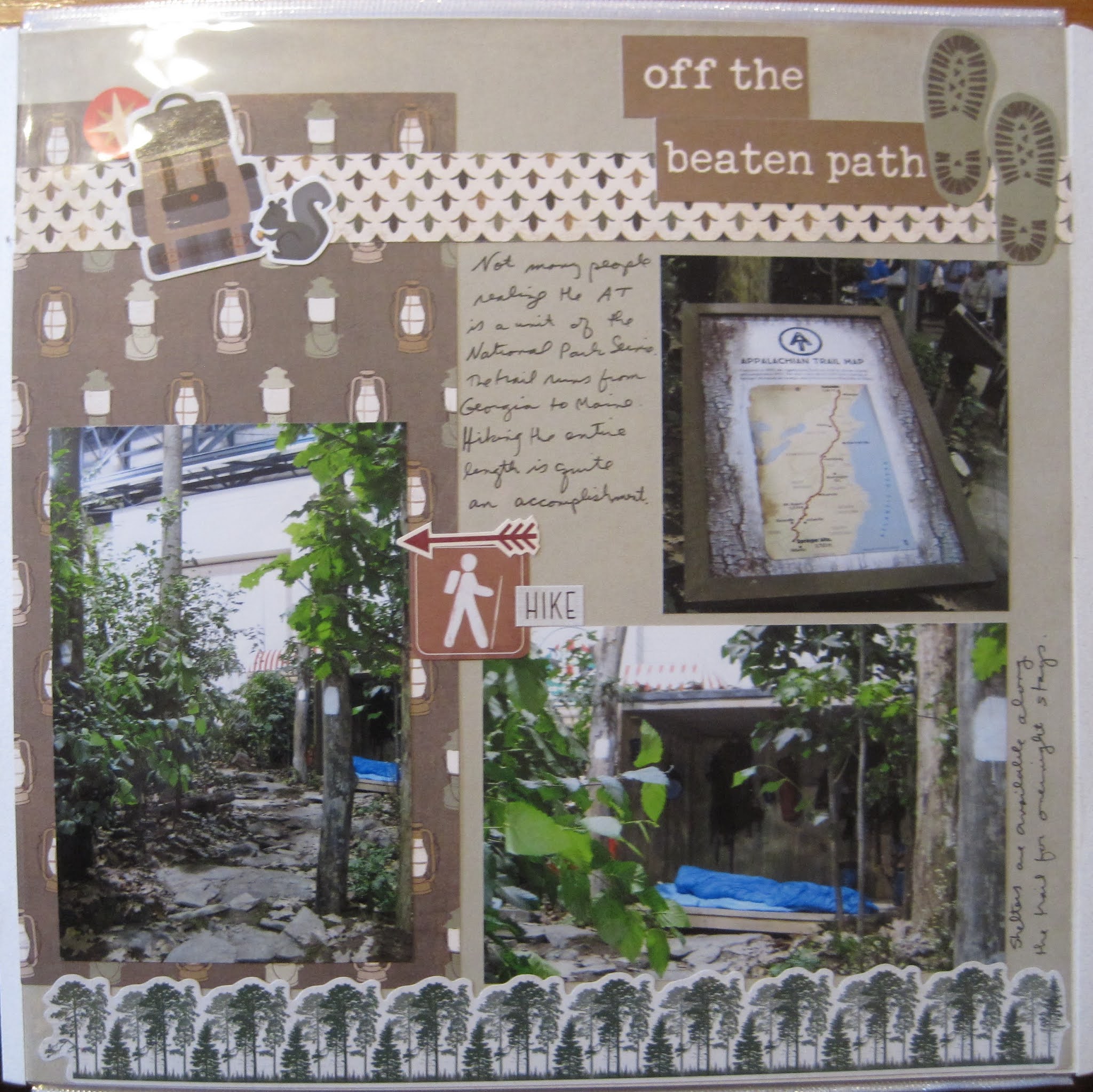
The next display was of Hopewell Furnace. Located not too far from Philly it's another local favorite. As with the Valley Forge display, the creators decided to go with what the place looked like after its original purpose (iron making) was over. The elements such as the furnace were recreated with fall-type leaves. The display was rather large and you could walk through the structures. I liked that they also added non-floral elements such as the pantry supplies.


The layout is based on a class I took and I am not allowed to share the sketch. I used the Hello Autumn collection from Creative Memories. The green and orange colors matched the display perfectly. I liked the portion of the sketch where we punched borders and layered them into a small 4x6 space (see the rustic fence behind the bottom photo on the right page?  Just 2 embellishment clusters here. CM had a matching foiled leaf pack to go with the collection and I clustered them for titles and a little journaling. I also substituted one photo for a journaling box. 

I like that we didn't center the photos in the boxes. It gives a little more movement to the page and shows the background papers a bit better.

Friday, October 8, 2021

It's more than Atlantic City

When most people think of the Jersey Coast, they think of the casinos and not much else. But just inside that commercialized zone is a series of small protected zones like the Pine Barrens and the Maurice River. These were temporarily combined to form the New Jersey Coastal Heritage route--an affiliated unit for the National Park Service. I'm surprised that this was the topic of one of the displays as in reality there is no organizational body overseeing that designation. There is one stamp left in Southern Jersey. However, the areas are protected by private foundations like the various lighthouse agencies. 


The inspiration for this layout was from a class I took and I cannot share the sketch. It was pretty straightforward though--3 pairs of patterned papers cut with the Decorative Trimmer and separated just a bit to create a "river" through the middle. I used more of the Woodland Whimsy papers for this layout as well as a few animal stickers from the pack. It was originally a baby pack so it can be difficult to use some of the titles from the kit. The title across the bottom is a mixture of mini ABC-123 letter packs. The yellow didn't show up well so I outlined them in dark pen. The title isn't SUPPOSED to be another river on the page but I won't argue if you think it matches that layout. I'm just bad at making things straight sometimes!

Friday, October 1, 2021

Of course there's a stamp!

 In the corner, the NPS set up an authentic Ranger Station with real NPS rangers staffing it throughout the show. To prevent overwhelming the Philadelphia staff, additional help was brought in from volunteers across the country. That was probably beneficial as they might have had to field questions about a number of far-flung parks on display.


Creative Memories posted a special sketch challenge for National Sticker Day. They had recently released a second version of the Emoji stickers which had more masked versions due to COVID. I chose to use the original packaging to complete the challenge. It worked so well for this page because it was such a lighthearted topic.I especially love the Indiana Jones emoji--it just seems to go with the ranger page perfectly. The background paper is from the Woodland Whimsy collection. The log paper is some scraps of Adventure I still had. I used the rolling trees border maker cartridge for the edging.

Friday, September 24, 2021

How Green Was the Inn?

 The next display covered one of the affiliated units of the NPS (as if the choice of the more than 400 parks wasn't enough!) The Schuylkill River NHA runs through Philadelphia but goes up into the Pottsville area. They have yearly paddle events along the length. Of course in Philly, this runs right into the Boathouse Row area. This mid-19th century site still runs as a restaurant today in the Wissahickon area.Creative Memories wanted to honor Australia Day which occurs in late January. They posted a blog featuring a cute layout and then turned that into a sketch for us to follow. I used that sketch for this layout--the main feature of which is the circle on the bottom with the 3 tails. I used paper from the Woodland Whimsy pack (the girl's pack I think). That's the background and the darker orange papers. For the circle, I chose one of the circle punches. By starting with a 6" square of paper, you end up with a lacy-trimmed circle. This one had a tulip pattern that I thought went well with the page. I added 2 strips of paper for the tails and then added a border sticker in the middle. A few sticker embellishments from the same collection finished the page.

Friday, September 17, 2021

Boy oh Boy

My next stop was at the Lincoln Boyhood Home. Hard to believe that it is even smaller than the original, but they included an outdoor garden as a main focus of plants.


This layout is from my year-long class so I can't link the sketch. I used several variations on branches to get my rustic look. The paper at the top is from a photo paper pack. By cutting it I could stretch one piece of paper over 2 pages. The brown plaid is a leftover piece from one of the adventure/outdoor paper packs. The borders at the top and bottom are made with different border punches. The top is a border maker cartridge. If you look closely I have the branches facing to the middle to draw the eye there. The bottom is a stand-alone border punch. I chose to leave the branches bare this time because of the split rail fences in the photos. 

I balanced the left and right sides with 2 quotes. On the left is the sign from the display. On the right, I stacked a sticker from an NPS sign sticker pack (all blank) with a heritage phrase from Paper Loft. Just a couple of left-over fall stickers finished off the layout.


Friday, September 10, 2021

Off the Beaten Path

 The next display is of the Appalachian National Scenic Trail--the big one that goes from Georgia to Maine! I've been on very small segments of it and I'm sure there were a lot of options for the designers. They chose a generic-looking walk in the woods but also included one of the sleeping shelters. For through-hikers, this is their hotel on many nights. Also authentic--the white blazes on the trees indicating the path!


For this layout, I broke up a 2-page layout I made at a paper-loft class. It was mostly lantern paper so I added a border of trees from one of the CM outdoor packs (Winter woods--but it doesn't really look wintery). A few more random stickers of backpacks, hiking, and squirrels, and this one was complete!

Friday, September 3, 2021

Dele-Where?

 The next park to be highlighted is First State National Historical Park in Delaware. Which in reality takes the entire state of Delaware and includes several stops. The components highlight the founding of the county as well as its participation in the Revolutionary War, so the designers created a "Colonial Garden". To the best of my knowledge (and I've been through the various sites a couple of times) the only places that you would find this is either Lewes (which as a bunch of historical houses though not part of the park system) or the John Dickinson Plantation. Which I don't remember from my visit there. Still, they put together a lovely display.


This layout is based on one of Organized and Creative Mom's sketches. It's the same page as last week's layout, but the other sketch. I used the very old "Sorbet" line. The stickers are a bit "cartoony" but the background papers worked well. I like using the middle of a frame that  I cut for a different project as the base.