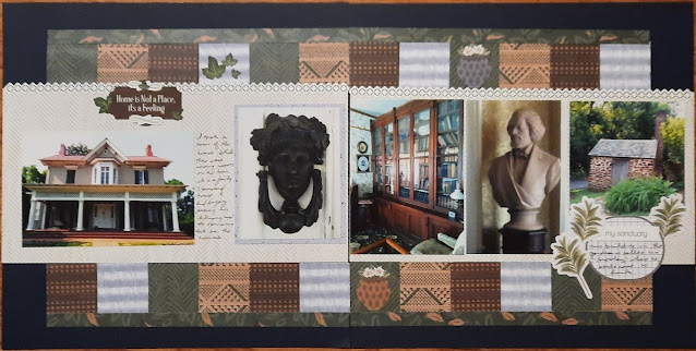
Today's post is the last entry for the Frederick Douglass stop on the NPTC bus trip. This is more about the club and our members instead of the site, though. Stamping is an obsession with some of our club members. We like to find and stamp all the variations of a stamp (all caps? mixed upper and lower letters? with a period after D.C., without a period after DC? Those little details are important to us). Frederick Douglass has always been a site with a considerable supply of stamps (as of this posting, there were 18 different stamps available in the visitor center). With over 100 stampers converging on the site, they wisely moved all the stamps to the front yard where we could form a line and get our images. I wish I could say that it was orderly. As I was trying to get stamps (and trying to logically keep them all separate from what I had and hadn't used yet), people in the line behind me were reaching over me and moving the stamps about as if I were not even there! I know I'm not the only person who has experienced that, and it saddens me to see that sort of behavior. If you are a club member, I urge you to act politely and responsibly when visiting our 433 (current) units. The staff will appreciate it, and so will your fellow club members.
This layout was supposed to be another bonus post, but I goofed up on the directions. The June challenges at Lasting Memories focused on using a series of specific paper sizes when creating a layout. For challenge #755, it was three 5" squares, three 1.5x5" strips, and three 2" circles. I noticed that one of the designers had used three squares and three strips to create a block in the middle of the page. I started there but moved the pieces around a bit more and used the strips as borders. I filled the top and bottom of the page with borders (a set of 3 star banners in red, white, and blue for the top and half of a boot border punch for the bottom). The papers for the 3 squares came from a 6x6 paper pad in my Patriotic collection. I struggle with those pre-cut sizes, but I was happy to be able to use them in this manner. I added my journaling to the page and photographed it as DONE. And when I went to post my link, I realized--I forgot the circles! So I couldn't post the layout to the challenge, and I wasn't interested in going back and trying to figure out where to add the circles. So the most we can say about it is it was INSPIRED by the challenge. It's still one more page done in the album!


