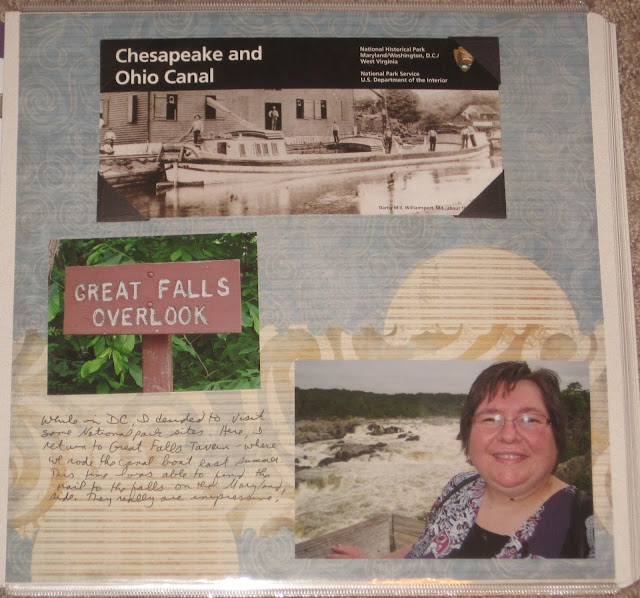
In May 2012 I traveled to DC for a surgical technology convention. In my spare time I visited a few parks. My first trip took me back to the C&O Canal on the Maryland side (where the Great Tavern is). We had been here the previous August with the NPTC convention. This time I was able to find the trail to the falls, and it made for a completely different visit.
This is a wallpaper technique. I used a piece of older Creative Memories paper from a travel kit. I liked the way the design looked like falling water. This is just the right hand side of the layout because the left focused on my convention activities, so I actually posted the end of the trail first--the falls. But that gives good context for what comes next. One notable piece to this page is that I used photo corners to mount the unigrid as I usually do. However, I had 3 made of black paper from my stash (older than 8 years I think), and since they didn't detract from the unigrid, I used them. I couldn't use the 4th one because it would have partially covered the title--so I used one clear corner mount in the upper left.
The new part of my park experience was the walk to the falls. It was an easy walk across planked wood for the most part but took me past some very nice plant and animal displays.
The left page of this layout is also wallpaper. I toyed with the idea of cutting out the left edge as a border but decided I liked the all blue background. I tried to match it on the right with some blue and green mats in the same shades. The right border is another scrap of paper in blue tones. I layered the stickers at the top and bottom onto dark blue paper to make them pop and used a corner rounder to try to match the shape of the stickers. A little dragonfly in the middle made for a pleasing symmetry. And on this unigrid, since the bottom has some color, I used all clear photo corners.


No comments:
Post a Comment