Google

Showing posts with label Cape Lookout National Seashore. Show all posts

Friday, May 13, 2022

Summer Road Trip Part 3--Lighthouse in the Dark

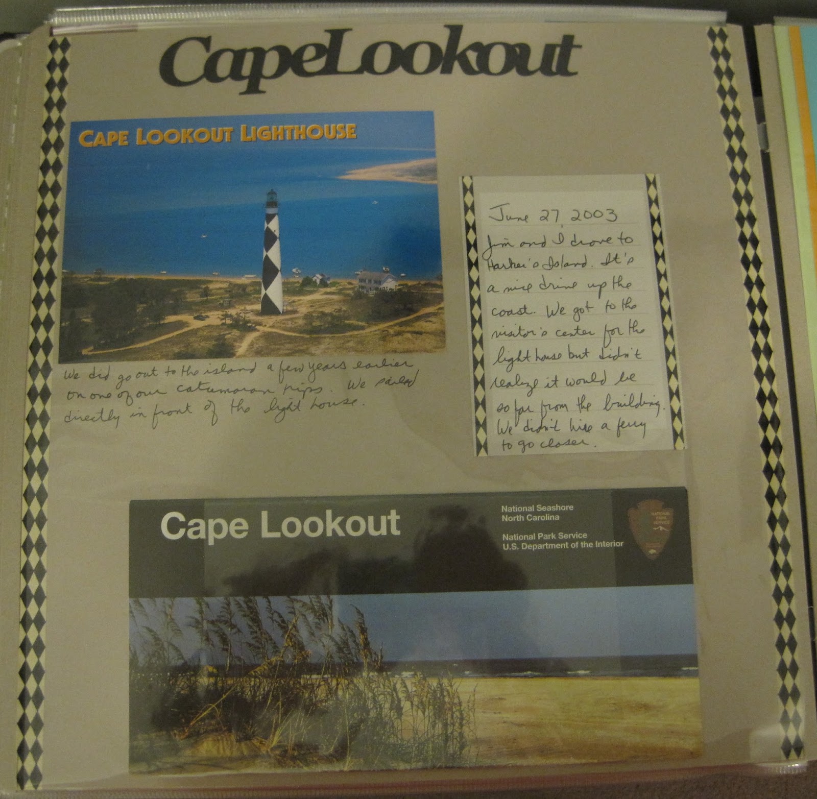
I made it to the beach in Atlantic City and spent several wonderful days with my in-laws. Luckily, our trip fell during a full moon and in the summer Cape Lookout holds special night climbs since there is extra "illumination". So my husband Jim and I signed up. We drove to Harker's Island where we caught a ferry to the lighthouse. We walked to the beach for some moon photos and then returned to the lighthouse. Rangers were stationed at the bottom of the entrance to talk about the lighthouse and the job of the keepers. 


This layout is all my own idea! I knew that I wanted to use the Graphic 45 By the Sea collection as I still had quite a bit in my stash. I looked at the pieces and started planning how I could arrange them to highlight our visit. I did a bit of paper tearing and some fussy cutting and came up with the layout you see. I entered this in a Scrapbook.com challenge on their forums and won the monthly prize of more Graphic 45 items. Since I know I have a ton of lighthouses to show later, it won't be a problem using them up!


The event included the opportunity to climb the lighthouse. I was not sure that I would be able to do it, but I had talked to a ranger the day before at the Beaufort visitor center and she assured me that I would be OK. I just would want to pace myself and stop periodically. I did that and am happy to say that I MADE IT! Jim and I took a few photos from the top but since it was completely dark out it is hard to make out much detail.


I made this layout as part of a Summer "MotherLOAD" class (LayOut A Day). We were to create a page based on a photo prompt from the leader which had a lot of tall trees in it. I thought about it and decided that the trees reminded me of the lighthouse and so I put this page together. I had a scrap of brick paper so I used that to anchor the right-side photos. Because Cape Lookout is painted in black and white I thought the mosaic background would be a good base. The red elements are from a travel pack from CM a few years ago. I feel lucky to have found that quote for the middle. Not only does it capture the event with my husband but it has the up and down arrows reflecting our climb!

Friday, April 10, 2020

50-States Album Part 17--North Carolina

 Jim's family traditionally takes a week vacation in North Carolina each summer so I've made many trips to that state--generally in the Atlantic Beach area. That is very close to Cape Lookout so I've made several visits to the visitor center as well as the lighthouse which is on an island offshore. The Old Burying Ground is in nearby Beaufort and is another favorite spot to visit while we are in the area. There are some very interesting characters buried there.

The background paper is from Keller's Creations. I discovered that company at a scrapbook convention in Lancaster. They teach a class on quick layouts with their paper packs. They have some pre-cut shapes that help things come together quickly. I used the 6" square technique to create the background.
The polaroid looking photos on the left were from a different kit that I used and had leftover. The center one with the die cuts was meant as decoration. The other 2 were empty. I matted them with coordinating blue cardstock and added some embellishments from the cut-out page included with the paper. The letters were also part of the kit and I like the way I arranged the state name.

Friday, March 16, 2018

Portsmouth (AKA Mosquito) Island

Hello from Scrapbook Camp! As this is being posted, I am sitting in my favorite scrapbook retreat putting together more wonderful layouts of National Parks with several friends. I try to do something like this at least once a year, and I can usually get about 40 pages done in a weekend.

But enough about me, let's talk about my trip to Portsmouth Island. And my poor husband who got dragged along and was SUCH a good sport about it. In order to collect some rather rare National Parks Passport Stamps, I arranged a boat ride out to the island. It's a primitive island meaning you pack what you need and pack it out. There are luckily regular bathrooms on the island. So, in the backpack I'm wearing are several bottles of water, mosquito repellent and a large bag of a homemade trail mix. I knew there were going to be bugs. I had read about the island. But trust me, nothing prepares you for the onslaught of insects flying at you. With the repellent, we were protected from bites, but they still flew near enough that you worried they would fly in your mouth! And Jim even put a mosquito repellent wipe on his head under his hat!

So in the photo below, I'm smiling. We haven't hit the buggy part of the island yet. Interestingly, inside the buildings there isn't a bug in sight so we were able to explore indoors with no problem. The problem is moving from building to building. This is an old village so the buildings have quite a bit of space between them.

This is the simplest of scrapbook layouts. There is nothing on the page other than the photos/memorabilia and a few accents. I used every flying insect sticker I could find to illustrate our adventure and I think I just about nailed it. The "Bug Spray Required" sign and the actual bug spray can in the bottom right are both cuts I made with Cricut. I also cut the title "Mosquito Island" on the cricut with a somewhat wacky font I found. I was using a scrap of paper and got too close to the edge on a few of the letters so they have a bit of a scalloped look. With the way the letters are cut, it's really almost too difficult to tell, even up close.

The island looks like everyone just disappeared and could return at any moment. There are stores, a post office, homes, and a life saving station (like a coast guard). Lots of interesting items on display.

This layout was created at a local scrapbook shop called Enchanted memories. I would take a class there about once a month and we would get the layout as well as a sketch in case we wanted to recreate it with other papers. I thought the nautical and somewhat aged look of the accents matched the location and so I just had to apply the photos.

After exploring the life saving station, we sat inside and ate the ENTIRE bag of trail mix I made (and it was about a gallon) then had to make what turned out to be a prolonged hike to the other side of the island for pick up. While being attacked by mosquitoes. We had not brought beach gear with us thinking we would get picked up from the same dock where we were dropped off, so we had to sit in the sun, back to back and await the return boat. On the plus side, our ride back took us past an island full of pelicans, some newly hatched. As you can see from the photo, we lived to tell our story!

This page started with the border on the bottom left page. I made this at a class many years ago and had nearly forgotten about it. The boat that we rode in was sort of small, so this captured the essence for me. On the right page, I made the journaling box from an idea posted on the old Creative Memories website. I had saved the instructions in the comments. If anyone is interested in recreating it, check here. Both the border and journal card had the same color palate, so I looked for more scraps of paper in the same shades and found the 2 long borders at the top as well as enough blue and yellow to throw some mats and some vertical strips on the pages. It was completely random, but I really like the way the pages came together.

Friday, September 1, 2017

Lookout!

Jim's family makes a trip to North Carolina every year and many times we take a trip to or near Cape Lookout as it is only 20 miles from the beach house. This time I wanted to land on the island with the lighthouse and get the stamps available there. I booked a ferry trip from nearby Beaufort and you can see my transport in the photo below. I did NOT expect that the sea spray would completely SOAK me on the ride out and I had not packed a change of clothes. I only stayed a few hours before returning so I could eventually get into something dry.


I scraplifted this from a Creative Memories idea sheet (Click here for directions) and while I like it, I think I might have focused too much on the background than the photos. Now, the photos are all good and tell the story of my visit along with the memorabilia (unigrid), but the paper pieced lighthouse I made in the middle sort of draws the eye away and that wasn't my intention. I'd like to hear from others--do you think the page would still sing without that hunk of paper in the middle or does it set the tone? Comment below!

Friday, March 3, 2017

Scrapbooking without pictures

This page is a one-page layout of a trip Jim and I made to Cape Lookout. Or more precisely, Harker's Island which is where the visitor center is for the lighthouse. You have to take a ferry to the lighthouse which we didn't feel like doing that day. We just looked through the view finder lenses. We had visited the lighthouse previously during a boat trip. It landed us on the beach side of the island where we swam and looked for shells. That was of course prior to my learning about the stamps. I remember the visitor center at Harker's Island was not that impressive but I did buy a postcard and that and the unigrid became the focus of the page.
This turned out to be a very simple layout but I got lucky by having the large and small diamond border stickers. They perfectly matched the design on the light house, and really that's all that was needed. Looks like I used another photo holder for the unigrid and if I get a chance I will probably replace it. Just remember, it's about the story (journaling) so don't worry if you only have memorabilia to make a page!