Google

Friday, March 31, 2017

I guess it was a visit...

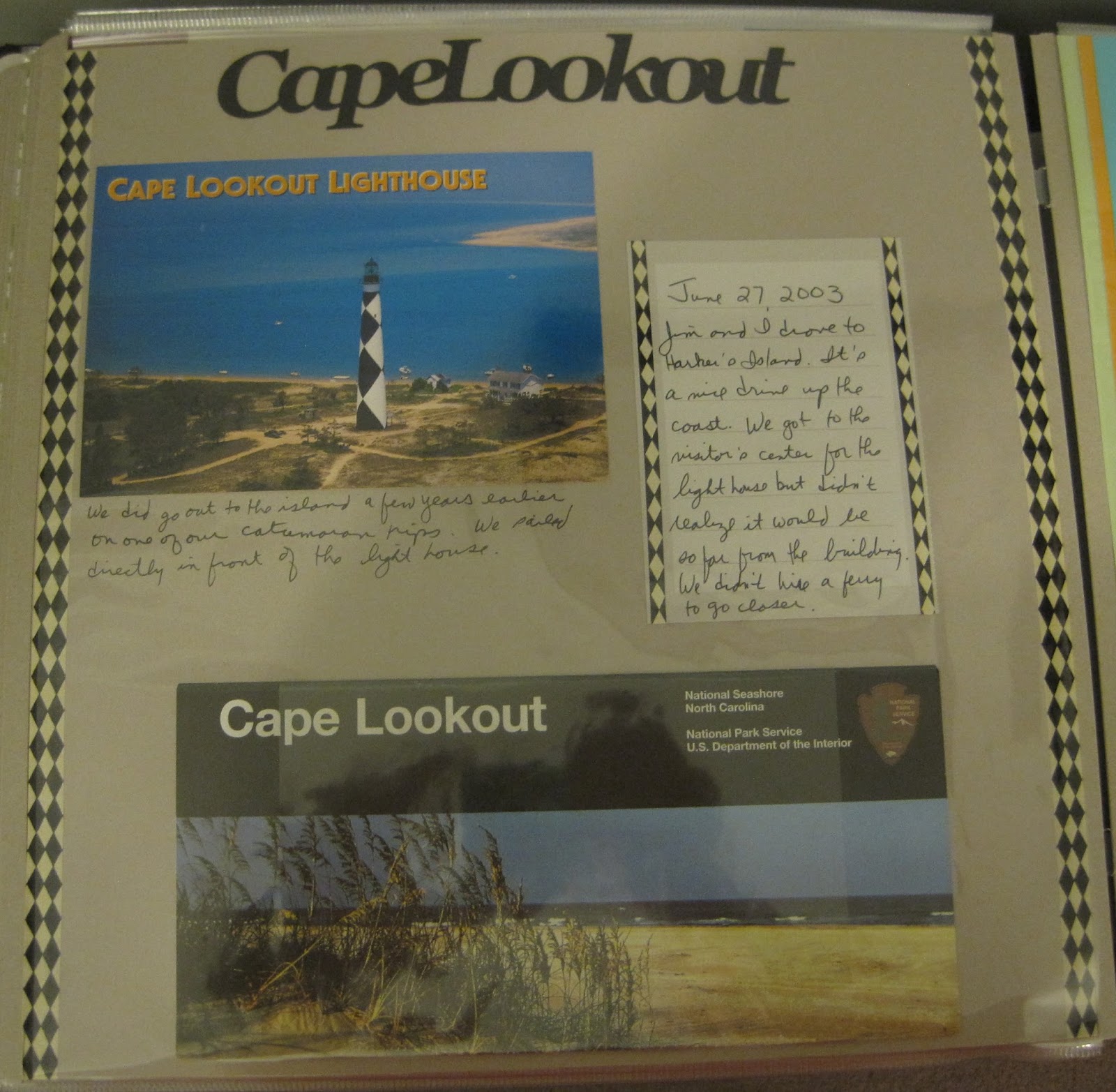
Jim and I often had date night by taking a trip to a dinner theater, so this trip was focused on attending the Lazy Susan Dinner Theater. I did some research to find a National Park nearby so I could get a stamp and decided on Manassas. We went to the visitor center and saw the maps then bought a tape of the auto tour to listen to as we drove around the battlefield. Unfortunately the map in the unigrid did not match the auto tour numbers and the map that should have been given to us with the tape was missing. We got frustrated pretty quickly because a lot of the drive is on local roads and there was quite a bit of traffic. We felt unsafe making stops in what clearly was not a standard stop. We drove back to the gift shop to demand our money back, skipped the battlefield and headed over to Arlington Cemetery where we walked up to the Marine Corps Memorial. I did save the entrance tickets from Manassas for scrapping and so that is as close to a National Park as I could get for this layout.


This page is another example of wallpaper technique. It's a little hard to make out but this is a pattern paper with cars on it to represent our car ride. Patterned paper can be very useful in setting a tone for a page.

Although the Manassas tickets are red, they accent the page well because red and green are complimentary colors (there's a reason they look good at Christmas time too!) If you haven't picked one up for scrapbooking, investing in a simple color wheel helps find colors to use together. You can take a single color in a variety of tones (monochromatic), two colors opposite each other (complimentary), or three colors evenly spaced around the spectrum (triad). If you try something new, drop me a line below and tell me about it!

Journaling is always important to scrapbooking because it helps tell the story of the pictures. I generally feel like I over journal but given the limited amount I shared above I think shortchanged the reader. I guess I didn't want to sound too harsh to the park in something that will outlive me. What do you think, should I add more detail to the journaling on the page?

Friday, March 24, 2017

New Years Eve in Tennessee

Instead of driving to Atlanta for Christmas 2004, Jim and I met Lisa and her family about halfway in Johnsonville, TN. Jim and I arrived a little earlier so I could visit the Andrew Johnson National Historic Site. Not knowing about the NPTC yet I don't even think it dawned on me that they might have been closed for New Year's Eve or that there was more to see than the visitor center. But we made a thorough tour of the museum at the visitor center and I got a stamp.

This page features a border that I made. I occasionally set aside time to make borders and store them for future use. It is in the vein of "Between the Rails" since there is a line sticker at the top and bottom. I like that I used stickers to create the "i" in trip but I put too many stickers on there. I think a little natural space between the words would be better. Very little other decoration on the page, but that's OK because that header is so busy. Still, perhaps a photo mat or two would be in good taste.

Saturday, March 18, 2017

Independence Hall 2005

So, another spring and another class trip to Philadelphia. This year I made plans to get tickets to tour Independence Hall. They have also completed construction on the new Liberty Bell pavilion which includes the museum pieces and x-rays of the bell. There is a much better view of Independence Hall from the Liberty Bell itself but a little tricky to get just yourself in the photo!

The 2-page layout above is an example of the wallpaper technique. This is the Jewel tone Fourth of July set from Creative memories. All I had to do was add a couple of mats to set off some of the lighter toned elements (like the ticket to enter Independence Hall) and the page comes together fairly quickly. Journaling on printed paper is too difficult so I have a plain white journal box. If I HAD to edit the page I might add something fancier to the journal box, like a sticker or 2. Or maybe journal in blue or red ink.

This layout also benefits from my standby scrapbook fodder: postcards. I ALWAYS get a postcard or two when I stop by a new site. They are professional photos that I will most likely NEVER be able to replicate. They really set the scene and provide detail. I tend to mount them like photos unless there is something very unusual on the back (like a good description of an object or area). In that case, I will mount them with photo corners but that's a pretty rare occurrence for me.

This became a 3-page layout which is a little unusual for me. I do a LOT of 2-page layouts except for the last page of an album. The third page was more of the city life page concept then the national park itself. You can see that I incorporated more of the photo stickers on the page. Otherwise it is a simple border piece (pre-cut from a pack from Creative Memories) and a piece of scrap paper also from the jewel tone pack mentioned above.

Would love to hear your comments, so take a moment and drop me a line below!

Wednesday, March 15, 2017

Another trip to Washington D.C.

Well, I'm on my 2nd snow day thanks to Winter Storm Stella so I thought I'd post another entry. Today I highlight a trip my husband and I made to DC, or at least the NPS portion of it. I am not including a stop we made to the US Postal museum or the Supreme Court because they aren't an official unit of the National Park Service. So if you want to see those pages, you'll have to stop by sometime!

We visited the brand new World War II Memorial just a few days before the official opening ceremony. This was a great visit and especially important to me as my grandfather served in the Army Air Corps during the war as a flight mechanic. I was especially moved by the wall of stars.


I did not digitally merge my photos of the wall of stars, I just took sequential pictures. (My camera does have an option to allow me to line up the pictures but it isn't perfect). I ended up cutting the middle section in half and spreading the image across 2 pages which I really like. I also included photos of the Atlantic operations memorial as that is where my grandfather served. The red, white and blue theme was a sure-fire win but it's still got a lot of blank areas (and that isn't really intentional dead space).

Our walk around town included a stop at the Old Post Office Tower and we went up to take a look and get the stamp.

Here is another lesson in what to do with 8 1/2 x 11 paper in a 12x12 scrapbook. Cut it into strips and spread it across the page! I actually own a template which sizes the strips appropriately but you can work with just about any size that is effective. On the right is a Creative Memories pocket page. I used that to include the unigrids for the various parks. I only put the name of the city at the top, but I probably could add some decoration to the page as well.


Here is the other side of the pocket page and the beginning of our special Mall experience. You'll notice that the letters I chose for the title are all different shades. It was my attempt to not have to manufacture letters. One problem with sticker sheets is that there are limited letters and once you spell out your first title you are sometimes stuck missing a key vowel to complete the second or third use. I actually like the effect as it becomes sort of an ombre look and goes well with the "wallpaper" I chose to mount the photos.


We were in town for several days as I was there for a conference, so we had evenings and then the weekend to explore the city. It was our second visit to the Mall when we discovered that to enhance the WWII memorial opening, they held an encampment of WWII memorabilia, reenactments, and displays. The stickers used on this page actually came from one of the displays at the event. I carried the green theme through from the prior page but just as accents along the borders. There was quite a bit of green from the grass and vehicles though so not much more was required.

It's nice to know that you can return to a park and see it in a different way over and over again.

Saturday, March 11, 2017

Back to Petersburg

My early trips show a very limited exposure to the various parks in the system don't they? Well, at this point even though I had purchased the passport book I hadn't yet found the National Park Travelers Club (NPTC). So this visit is a return to Petersburg. That isn't too surprising because I mentioned our previous visit was for Jim to get ideas for a book. This time the book is in full production and he arranged to spend time in the archives as well as tour the battlefield and Crater sites.

Very little technique on these pages, but I've tried to add some ivy as a nod to the heritage/historical aspects of the place. Not sure the "Remember When" sticker is enough of a title and there is plenty of space to put one on the left upper corner. The journal mat is an odd choice. Perhaps I didn't notice the swirls in the background as I journaled.

The photo mats show some promise as I purposely arranged them to get the most of the NPS arrowhead paper around the edge. The kit is available at many gift shops and online at the Eastern National store. Unfortunately it includes 8 1/2 x 11 paper, not 12x12.

So this is the first lesson in what to do with non-12x12 paper--use it for photo mats!

Friday, March 3, 2017

Scrapbooking without pictures

This page is a one-page layout of a trip Jim and I made to Cape Lookout. Or more precisely, Harker's Island which is where the visitor center is for the lighthouse. You have to take a ferry to the lighthouse which we didn't feel like doing that day. We just looked through the view finder lenses. We had visited the lighthouse previously during a boat trip. It landed us on the beach side of the island where we swam and looked for shells. That was of course prior to my learning about the stamps. I remember the visitor center at Harker's Island was not that impressive but I did buy a postcard and that and the unigrid became the focus of the page.
This turned out to be a very simple layout but I got lucky by having the large and small diamond border stickers. They perfectly matched the design on the light house, and really that's all that was needed. Looks like I used another photo holder for the unigrid and if I get a chance I will probably replace it. Just remember, it's about the story (journaling) so don't worry if you only have memorabilia to make a page!