Google

Friday, November 10, 2017

Northwest Adventure part 5--Skagway

Our next port of call was actual land! Skagway is the home of one of our host parks and we had a presentation of the iconic stamper, as well as several tours of the area. Our first tour was to the start of the gold fields. The rest of our group took a railroad trip to the Canadian part of the gold rush trail, but we chose a van tour (partly because I wanted a photo of the Alaska state sign).


The left page was my take on this idea Corner Rounder idea page). Somehow my cuts don't QUITE match up the way the sample does. (I know, I'm probably the only one who can see the errors). The right page is a Fast to Fabulous page. Since we took a van tour the road sign was the perfect accent. I added the words from a sticker in my stash, but it looks like it was always part of the page.

After our tour we opted to be dropped in town. Our convention host is Klondike Gold Rush which is actually comprised of 2 different locations--the one in Skagway, Alaska where people started their trek to the gold fields and the one in Seattle, Washington where they boarded boats for the trip to Skagway. By taking the cruise we were able to visit both halves of the unit which is somewhat rare.

On the left is actually a wallpaper technique. The page is from Creative Memories' Discover paper pack. I like how rustic it is and it is one paper with a patchwork design so I don't have to paper piece. It was a good choice for the building covered in driftwood. On the right is another Fast 2 Fabulous page. The blue backdrop helps link our convention shirts to the page. 

After we presented the iconic stamper to the Skagway part of the unit, we broke into a couple of groups for a tour of the city and National Park areas. My favorite photo is on the left page. So many people ask me if that is my husband Jim! (It's not, it's just a mannequin that looks like him). We started with the museum next door which covers what someone would need to take with them to the mining fields. It took over 10 trips up and down the mountain to haul everything.

This layout is part of a class I took with Paper Loft (https://paperloft.com/). I found a scrapbook convention in Lancaster and took this class because they make layouts with paper and not a bunch of wood, bling and other 3D materials which make my books bulky and can put dents in my photos. I love their paper--great designs and they make coordinating sets so you know that the various prints will look good together. 

As we moved through the city we got SOAKED in the rain. It turns out the jacket I brought wasn't actually water proof even though it felt like it should be. We saw several historic buildings--people who helped the miners to prepare or came to mine but found out the real money was in selling supplies.

The entire layout is also a wallpaper technique. Like the winding road photo in my Rocky Mountain layout, the left page picture of a log cabin is actually 12x12 pre-designed paper but matched really well with one of the log cabins used by an early settler. Next door is their richly decorated house that they moved into with their profits. The paper I chose for that page was from the Creative Memories Reminisce Travel pack. I love the gold tones that swirl through the page.

After touring the town we took a van tour out to the start of the Chilkoot trail--Dyea. The town has been nearly swallowed back into the forest in less than a hundred years. And it's still raining.

This is another layout from Paper Loft (though made in a different year). Look closely--there's footprints! (It's been a while but I told you there would be more!) Unlike my other pages though, this was actually a print from the Paper Loft paper that we cut and strategically placed across the page split. I'm glad when I can use a premade layout from my stash. If you don't take a class, make sure that when you buy paper you buy a few of their cut apart sheets with the phrases and pictures. It helps make a complete layout.

Friday, November 3, 2017

Northwest Adventure Part 4--Cruising Glacier Bay

On day 2 of our cruise we entered Glacier Bay. I was delighted that Princess Cruises works with the National Park Service and has rangers come on board. There was a ranger talk in the theater and then later the rangers narrated our trip over the loud speakers as we approached various glaciers. They brought a lot of materials with them and one sign was a great stand in for the Visitor Center sign photo I usually take. The white square of paper is something the rangers bring--probably because they don't expect people to have the National Park Passport with them and this gives them a place to stamp. Of course my group all had our passports but we took these as well.


I'm interposing material between the pages of my layout again, though instead of eliminating it, I'm actually showing the newsletter and the brochure that they provided about Glacier Bay. Above, the left page is another page from the picfolio travel album kit. It eerily mimics the cover of the unigrid doesn't it? As noted in a previous post, the Princess Patter is in a protective 8 1/2 x 11 photo sleeve from the early Creative Memories years.


You can see the edges of the sleeves pretty well in the above photo. An additional piece of memorabilia is the information sheet specifically about Glacier Bay.


The right hand side of the layout is a Fast to Fabulous page with a bunch of post marks on the paper. Sort of mimics the passport stamp even though that's now covered up with the brochures. The photos are of the ranger talk in the ship's auditorium. I photographed our bunch of club members as we all hung together. A couple of stickers from the NPS scrapbook kit adds to the journal box. One other piece of memorabilia is a little note from the rangers welcoming our group. Nice to be noticed!


Now we move into the cruise through the bay. Sorry that this photo is blurry. I didn't realize it until after the album was packed away. (I will be happy to be moved and unpacked!) On the left page I used another pre-made picfolio page but I did add a few stickers along the blue strip to give the page a little character. The right page is another paper bought specifically for this book and other than our weather was more dreary, it was spot on!


The cruising took all day, so after we spent some time out in the drizzle and cold we decided to have lunch. The left page reflects our Alaskan themed food again. I used a sketch to create the layout (click here to see the sketch). I like that it gave me a good chance to use up some scraps. Then I was able to use similar scraps on the right to create a background for our pre-dinner preparations (alternately relaxing and looking out the window).


The last 2 pages are from our last foray out of doors. As we neared the main glacier we returned to the deck and I squeezed my lens between the protective plexiglass so I could get some unobstructed views. I still cannot believe how close we got. This is another picfolio page with the addition of a camera sticker from the kit as well. On the right is a set of borders I made with an old die cut (use silver shimmer cardstock to highlight the lens and flash) and travel themed paper. This page is all about those out taking photos so I thought the camera appropriate to the layout. One thing about Alaskan photos, the stark blues really reduce the need for photo mats!

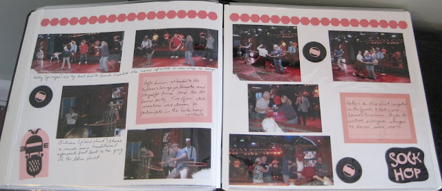
OK, this last layout has nothing to do with the National Park, but after dinner we went to one of the lounges and several of our friends were put in a hula hoop contest. The results were hilarious and one of our friends actually won! I just add it here because it gives me a chance to wax poetic about the Cricut.


All of the decorations on this page were cut with the Cricut (formal affairs cartridge believe it or not). I think I actually cut the records backwards but it still works! I love the detail you can get on the die cuts and being able to layer them adds a nice bit of color and texture you can't get with the old-fashioned diecuts.


Friday, October 27, 2017

Northwest Adventure part 3--Smooth Sailing

Here's where we stretch the imagination of "National Park" scrapbooking. These pages are about our first couple of days on the ship and the closest we get to a park is our club meeting in one of the lounges.

These 2 pages are laser cut layouts which I bought for the album. They came with the blue background which I'm not sure was anything more than filler paper, but it did make a nice background. The only thing I don't like about these types of pages are the pre-measured blocks. My photos never seem to fit so as on the left, I just covered them up willy nilly. On the right I used a variety of stickers to fill in most of the little squares making a type of border. Two of them became journaling blocks as well. The whole point of this layout, I have to confess, is the photo on the right. I had seen something like that on Pinterest and just had to copy it and I was bound and determined to get it into the album. Big thanks to my hubby for participating in the photo op!


So here's the club meeting on the left. It's a very simple background paper with a sticker border on top. I used the red in Nancy's shirt to pick a color for the journal box. We had a great time at the meeting even if we weren't the ones to win a free cruise! On the right is another Fast to Fabulous page. I liked the Good Eats theme and used it to highlight the lunch with somewhat unusual food (reindeer chili!). Look, I remembered to layer the photos!


And lastly is a gratuitous look at formal night. There was a special display of champagne flutes and they poured many bottles over them to fill the tower. They also passed glasses around. We were encouraged to have our photo taken and I definitely wanted to try that. We can't actually hold the bottle, just the maitre' d's arm, but it was still fun!

On the left is a border I made with the Creative Memories Cruise stickers. The black banner is slightly wavy and trimmed by hand to have the triangle ends. On top are 3 double mounted squares and then the stickers. On the right is a champagne bottle I found in the Cricut library. I added a few streamers for the party feel and the pages were done!


Friday, October 20, 2017

Northwest Adventure part 2--Anchored down in Anchorage

Our cruise ship left from Anchorage--though in reality the port is just a few miles further inland in Whittier. So we flew in the day before and stayed in a hotel overnight. I was still up early even with the time difference so I decided to go downtown and see the sights. And if I was lucky I would find the newly made Iditarod Trail stamp our NPTC group presented the day previously.


In town I found a variety of things to temp my camera--sign posts, murals and interesting food (street cart is selling reindeer hot dogs). I was able to use 2 more of the Fast to Fabulous pages here. You can see that by cropping I was able to keep the essence of the photo of the sign but add another photo to the page. The pre-planned photo boxes were perfect for the pictures I took and left me room to journal along the side.


On the left is the grass-roofed visitor center. On the right is the loose National Park affiliation, the Iditarod National Historic Trail. It is technically run by the Bureau of Land Management, not the National Park Service, but they do participate in the Eastern National Passport program. There are statues in town and I took a taxi out to the BLM office for the stamps.

These 2 pages were part of the pre-assembled vacation packet I bought and I thought these 2 went together nicely. It does save time when putting pages together. I started this album at a weekend scrapbook retreat and one of the other ladies commented on how quickly my album came together.


Soon it was time to take our bus over to Whittier to board the ship. As we drove we passed part of Kenai Mountains National Heritage Area at Turnagain Arms inlet. Our driver allowed us time to exit and take a few photos. The glacier was on the other side of the road from the inlet.

I bought the left page for the trip and thought this was a good place to indicate a "starting point" with our bus photos. The photo box became a nice journaling box. On the right is another pre-designed page from the kit. The brown allows the blue of mountains and glaciers to be seen without too much matting. The yellow note on the right was cut from one of the tourist guides. I didn't want to include the entire thing, but this note about tidal flats was perfect. Don't be afraid to cut up brochures to get to what is important.


The last set of pages covers our trip to the cruise ship. The bus had to traverse a 5-mile tunnel which only moves in one direction and takes either cars or trains, but not both. That means there is usually a significant wait to get in there, but once through we were able to see our ship. A train waited at a siding and I took a photo of it which spurred the use of the borders for the page. I had pre-made these and had been waiting for a good chance to use them. The bottom is wavy cut paper with the Creative Memories 12" trimmer with wavy blade. on top are stickers from the old Cabana travel kit. Then the train and vellum saying were double matted and attached at either end.

The right page has 2 pockets. One holds our cruise cards, the other holds the notice of gifts we found inside the cabin. In addition to the hors d'oeuvres and petit fours we were given travel mugs. In lieu of putting something very bulky in the page I took a photo of the door hanger made for everyone in the club on the trip. It was easy to identify where people were when I had to deliver notes to staterooms during the trip. Unfortunately by the end of the trip the bells were pretty flat from being crushed in the doors accidentally. When you don't want to damage your book, remember to take a photo of an object so you can still scrapbook the memory!

Friday, October 13, 2017

Northwest Adventure Part 1--Itinerary

Unlike kick-off pages, I don't often do itinerary pages, but for a complex trip like this, I did.


This actually covers the entire trip as I didn't realize I would need 2 albums. For each day I list the month and date as well as a basic idea of the events (cruise stops, major visits, etc.). For this page I chose to use stickers as bullet points and tried to find something that would be appropriate for the day. For example, on the day we cruised Glacier Bay I chose a small sticker that says "Park Entrance". The die cuts on the right side of the page help fill in the blank spots. I had to fussy cut the directional sign from a themed piece of paper.

The right hand page became a long journal box. This is one of the Fast to Fabulous pages and since it had the airplane and the trip to get to Alaska was a bit long, I decided to tell all about it. While on a trip I keep a journal of where we go and how long it takes us to get there. On this trip I forgot the usual journal but used my computer to keep a Word document with all the details. I recommend it if there will be a break between the trip and creating the scrapbook pages.

Saturday, October 7, 2017

Kicking it....and myself

I completely neglected to get a post ready for last night and with a drive through horrible traffic to my niece's senior night, I just didn't get a chance to post until now. So, since I'm kicking myself let's talk kick-off pages!

I always do a kick-off page for every album, even my chronological albums. It serves 2 purposes--1) I don't have to come up with a reason for a one-page layout, and 2) It can help highlight the theme and bring the reader into focus. For my chronological albums it includes the years or months within the book so it also helps me file the albums. Let's look at a couple of examples:


Above is the kick-off page to my first album for the 2014 NPTC convention trip which was a cruise and then a land vacation in Seattle. I cut the letters with a Cricut and given what I've had to do to "manufacture" a letter when a sticker sheet ran low, I HIGHLY recommend getting one or at least getting access to one (or something similar, I like Cricut but I know there are many other machines out there).
The base to the page is a pre-designed page that came with a travel-themed album from Creative Memories. This album featured a cruise as I said, so the wavy tone to the paper seemed perfect to me, and the letters are in a slightly darker tone so they can be seen on the page. I think I may have made the letters a little too big as they are really crunched in the last line, but it works. A few stickers for the cruise and the wildlife finish the page. (Did I mention this was Alaska!?!).


The opening to volume 2 is above. There were so many pictures that this trip had to be divided to 2 albums which I didn't realize until I was halfway through the project. That's why this kick-off page says "Vol. 2" and the first one doesn't say "Vol. 1". The background here is a fast-to-fabulous page from Creative Memories. It is mostly travel stamps and since this was the transition from cruise to land (and clearing customs in Canada) it also works. Now I didn't have access to a Cricut when creating this page. The one I used in the first album is at a craft retreat house we go to periodically. So, I do own some paper letters in various colors and I felt I had the most letters in green.

By the time I got to "Adventure" I had to manufacture the "n" and "e" by putting other letters together (or turning a "3" upside down). I also was reduced to all lower case for the "vol.". Again, I think it worked fine and only takes a moment of notice from the reader.

I'm going to start jumping ahead chronologically beginning next week as I highlight the other photos from the cruise and Seattle vacation. These books were completed as a special project, not part of the chronological albums because of their number of pages, and I had a chance to photograph the album before most of my supplies were stored for a move! We may even highlight some non-NPS themed pages. Let me know in the comments below if that works for you!

Friday, September 29, 2017

Two Small Stops

In 2011 Eastern National produced the 25th anniversary stamps to commemorate the Passport Program. Since Jim was visiting his family I took the opportunity to make a day trip visiting Monocacy for the first time and revisiting Fort McHenry.


I debated cutting the photo in half and posting  each page separately, but there isn't much unique enough about either experience, and the visits were literally hours apart. In fact, I also visited Catoctin Mountain Park but didn't take any photos. You'll notice that there are just simple photos of each place--the sign without me near it and an establishing shot of the park. In some ways this is the epitome of a "stamp and run" layout.

The left page is another page from Forevermore Scrapbook's civil war papers--just a line of rifles across the bottom. Adding the drum and bugle to the title/unigrid area finishes the decoration. On the right I used 6x6 paper in flag colors as the base for the quintessential story of our flag. The red sticker is my admission proof (they change color every day). On my way home I mounted it on one of the passport pages so I could scrapbook it later. Journaling on that page is a silver/white pen on dark blue paper. I will say it's hard for me to find a suitable pen that writes in a fine tip and in a color light enough to see on dark cardstock. Do you have one to recommend? Comment below!