Google

Sunday, April 1, 2018

No Fooling--There's a reason they call it "Grand"

I was planning on posting this Friday night, but could not resist another April Fools Day Post. Plus it's Easter and the canyon walls are striped like Easter eggs. What a perfect fit!

Well, after the 5 HOUR bus ride (see last week's comments) we arrived at the Grand Canyon. The bus driver had said that no photo could do justice to the actual beauty of the area, and he was right. While this series of layouts commemorates the visit I made, the colors just cannot compare to seeing the canyon with your own eyes. If you haven't gone yet, please plan to do so!

The left page of this layout is actually wallpaper. I had purchased a series of papers from Ebay which you'll see in the next few layouts. The bottom 3 "photos"  are actually part of the paper, which allowed me to focus on photos of me and my family at the canyon. The right page features a detailed die cut from Paper Wizard. I purchased it at a scrapbook convention in Lancaster and the idea for the page was actually featured in their booth. I took a photo and scraplifted it as part of the kickoff for this trip.

We were given just 2 hours to walk from our drop off point on the eastern side of the south rim to the pick up spot on the western side (in the village). It made me feel rushed, but we did take time to photograph the area.

The right page was my attempt to show the distance to the north rim. I took one photo at wide angle lens and then a zoom photo of the same spot. I thought it rather clever to highlight the similarities in the photos with different sized black rings. The sticker between them is supposed to be an arrow with a right angle turn, but it was a bit too transparent and I think it gets a little lost on the page.

About halfway to our destination we came across the nature walk that describes the formation of the canyon. I do think we went backwards, but it was still interesting.


As I mentioned, all of these papers are wall paper. For the left page above I augmented the text that was pre-printed on the page. I thought adding the word "geology" would provide context for the trail. And we made it to the destination area in plenty of time!

Friday, March 30, 2018

A Non-visit Visit

In September 2011, Jim and I joined our family in Las Vegas to share in my brother's wedding festivities. As a group (bride's and groom's families) we took a bus trip to the Grand Canyon. While that  will be the focus of next week's blog, I wanted to share the first layout of the trip which is actually Lake Mead NRA. I don't count it as a visit because although I saw it, the bus just drove through on the way to Grand Canyon. Which I will point out is a 5 HOUR drive from Vegas. It was not our brightest move!

This layout uses a Fast-to-Fabulous page on the right. I accented both pages with a set of borders I made using Creative Memories travel paper and cardstock. The borders are 2 layers of their Border Maker System. Although both cartridges have been retired, there are ways to layer the cartridges which make for additional interest. It's a great way to perk up a page. After adding those, a couple of accent pieces and mats were all that was needed to finish the page. The yellow mat I picked because I really wanted to use the "Are we there yet?" tag (see 5 HOUR comment above). That helped tie the tag to the page.

Friday, March 23, 2018

Two lighthouses

After returning from Mosquito Island we were headed back to our cottage. Since we were passing Cape Hatteras light, we stopped to take a few photos. The visitor center was closed but we could still walk around the structures. The next morning we revised our route to the Corrigan's Condo and so I requested a stop at Bodie Island Lighthouse as well.


These 2 pages are from Forevermore Scrapbooks in Gettysburg. They have a wide array of National Park photo pages. They actually are each to have another page so that they make 2-page layouts with the 2nd page being a photo of the lighthouse. I find that sort of redundant, so I just buy the page with the park sign on it. And it worked perfectly here as wallpaper for my lighthouse photos. All I needed to do was mat the photos and journal and--voila!

Friday, March 16, 2018

Portsmouth (AKA Mosquito) Island

Hello from Scrapbook Camp! As this is being posted, I am sitting in my favorite scrapbook retreat putting together more wonderful layouts of National Parks with several friends. I try to do something like this at least once a year, and I can usually get about 40 pages done in a weekend.

But enough about me, let's talk about my trip to Portsmouth Island. And my poor husband who got dragged along and was SUCH a good sport about it. In order to collect some rather rare National Parks Passport Stamps, I arranged a boat ride out to the island. It's a primitive island meaning you pack what you need and pack it out. There are luckily regular bathrooms on the island. So, in the backpack I'm wearing are several bottles of water, mosquito repellent and a large bag of a homemade trail mix. I knew there were going to be bugs. I had read about the island. But trust me, nothing prepares you for the onslaught of insects flying at you. With the repellent, we were protected from bites, but they still flew near enough that you worried they would fly in your mouth! And Jim even put a mosquito repellent wipe on his head under his hat!

So in the photo below, I'm smiling. We haven't hit the buggy part of the island yet. Interestingly, inside the buildings there isn't a bug in sight so we were able to explore indoors with no problem. The problem is moving from building to building. This is an old village so the buildings have quite a bit of space between them.

This is the simplest of scrapbook layouts. There is nothing on the page other than the photos/memorabilia and a few accents. I used every flying insect sticker I could find to illustrate our adventure and I think I just about nailed it. The "Bug Spray Required" sign and the actual bug spray can in the bottom right are both cuts I made with Cricut. I also cut the title "Mosquito Island" on the cricut with a somewhat wacky font I found. I was using a scrap of paper and got too close to the edge on a few of the letters so they have a bit of a scalloped look. With the way the letters are cut, it's really almost too difficult to tell, even up close.

The island looks like everyone just disappeared and could return at any moment. There are stores, a post office, homes, and a life saving station (like a coast guard). Lots of interesting items on display.

This layout was created at a local scrapbook shop called Enchanted memories. I would take a class there about once a month and we would get the layout as well as a sketch in case we wanted to recreate it with other papers. I thought the nautical and somewhat aged look of the accents matched the location and so I just had to apply the photos.

After exploring the life saving station, we sat inside and ate the ENTIRE bag of trail mix I made (and it was about a gallon) then had to make what turned out to be a prolonged hike to the other side of the island for pick up. While being attacked by mosquitoes. We had not brought beach gear with us thinking we would get picked up from the same dock where we were dropped off, so we had to sit in the sun, back to back and await the return boat. On the plus side, our ride back took us past an island full of pelicans, some newly hatched. As you can see from the photo, we lived to tell our story!

This page started with the border on the bottom left page. I made this at a class many years ago and had nearly forgotten about it. The boat that we rode in was sort of small, so this captured the essence for me. On the right page, I made the journaling box from an idea posted on the old Creative Memories website. I had saved the instructions in the comments. If anyone is interested in recreating it, check here. Both the border and journal card had the same color palate, so I looked for more scraps of paper in the same shades and found the 2 long borders at the top as well as enough blue and yellow to throw some mats and some vertical strips on the pages. It was completely random, but I really like the way the pages came together.

Friday, March 9, 2018

Ocracoke Island

In September, Jim and I made our annual trip to the beach to stay with his family. We started a few days early to work our way to North Carolina. Our first stop was the Outer Banks area. I wanted to go to an offshoot of Cape Lookout called Portsmouth Island and the only way to get there is to take a ferry from Ocracoke. Ironically, Ocracoke is part of the Cape Hatteras National Seashore, not Cape Lookout.


For this page, I used a layout I made at the Lancaster Creating Keepsakes Convention through Petticoat Parlor (Link). The class was held to help us learn to use gelato paint on thin wood as die cuts for our pages (palm tree and 2 shells in bottom corner). I have to admit, I do not like the wood die cuts. Even though they are thin, they are too thick for my taste. (Not crazy about the string or anchor at the top either). However, I took the class and paid for all of it, so I left the page "as-is". This is actually 1/2 of the layout I made. I used the other half for a non-NPS page.

Friday, March 2, 2018

Convention in the Capital--part 5: George Washington Memorial Parkway

On Monday, Jim and I joined an all-day tour of the George Washington Memorial Parkway. As you can see from the left page, there are a LOT of sites along the route. While we didn't see everything, we did make a good dent in the number and I felt confident counting it as one of my visited parks. Our first stop was Fort Hunt Park. Like many places along the route, there isn't a visitor center. In fact, this area is used as a local park with picnic tables and ball fields. It was great that we could explore with a ranger and get the history of the park.

The left page was created from an 8 1/2 x 11 piece of paper from the Washington DC scrapbook kit from Eastern National. I placed it along the right edge of the page and then filled in the left with a bus sticker (which conveniently had a DC tour theme), a picture of the side of our bus, and a unigrid. That left a little room for journaling about the trip we were to take.

The right page was one of our first stops. I actually struggled with this page as I didn't think I needed a double-page layout, but I wanted the group photo in the 8x10 enlargement. Once trimming the grass and sky, it gave me a bit more room for a photo of our ranger from the talk and a postcard that does a good job describing the importance of the site. Then I added a scrap of paper with tones of grass and flowers on it. I think it finished the page nicely!

As we continued along the route, we stopped at a site that was a civil war installation to protect Washington DC. They have some cannons left in place. Although there is a sign describing the area, it was good to have the ranger as well. On the right, we stopped at a wetland area. Part of the site includes a small structure across the river which is what the bottom photo shows.

I once again started with the right page, and chose a Fast-to-Fabulous page for the 2 photos. A lot of the F2F pages fit just 2 photos so when I have a small amount, I sort of gravitate to that stash to find a color appropriate. To match the right page, I chose papers in similar shades on the left. I chose this page sketch to create the layout 
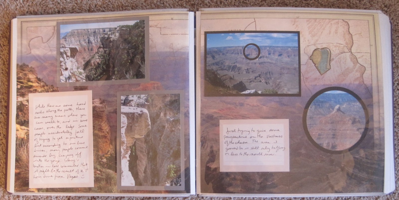
Sketch inspiration. You can see that I moved the decorative elements, mostly because my photo was vertically oriented. The circles were actually laying around in  the "extras" pile. Love when that happens.

Our lunch stop was at Great Falls park. Although I don't have pictures of the lunch, I chose the "Picnic in the Park" as the theme for the page. These falls are just across the river from our canal boat ride so we got to see them from 2 directions.

This layout was made as part of a Creative Memories virtual crop. If you look at this page Challenge page and scroll down a little you will see the 2-page sketch. I chose the colors from the photos--blue from the water and orange from the visitor center sign. A quick way to make the banners seen on this page is to cut a rectangle of the approximate length and width you want. On the side you want to make into a banner, fold the paper in half (you don't need to crease the paper) and cut from the open end corner toward the fold. When you open the paper you will have a symmetrical banner end. If you want a pointed banner instead of the "flags" seen here, just cut from the fold up toward the open end.

One of our last stops was the Clara Barton house. I was very excited to visit here given my medical background.

The left page was another virtual crop challenge (Challenge page). The 4 blocks along the middle aren't exactly the same size as they are in the sketch. Part of that is due to the fact that I cut the photos before I realized what I was going to do with the page. Then again, a sketch is a starting point, not a mandatory layout. What I remember about the house most is her use of gauze to create a ceiling (which is still in place). For that reason, I picked bandages from my medical stickers folder to decorate the page. The border below the unigrid is the Creative Memories Medallion Frame Chain border. I toyed with the idea of keeping the middle pieces to decorate the opposite page but decided against it. The bottom right corner is a die cut from the EN DC Scrapbook kit (similar to the Great Falls Tavern I used previously).

The right page is wall paper. The paper is from an old Creative Memories package called Reminisce Birthday. I liked the red and white stripe and the antique feel to the paper. I ended up using all memorabilia on this page--the left 2 items are postcards and the right is the brochure for the house. I think they really told the story better than my photos did.

That ends this convention. Next week we move to the southeast region and our beach trip for the year!

Friday, February 23, 2018

Convention in the Capital--part 4: Canal Boat Ride

Jim and I joined a group trip out to Great Falls Tavern where we prepared to take a ride on an authentic canal boat. The trip is staffed by re-enactors in period garb who perform all the same tasks as the original canal workers--handling the mules, opening the locks, and running the boats.
This is another example of when I work on the right page and then make the left page fit the style. I wanted something that would have a little nautical feel to it but also would work well with the historic feel of the photos. This is the inspiration for the right page: Scraplifted from here. I certainly added more photos, but kept the basic elements. Once that page was done, the left fell into place. The rope stickers were from the Creative Memories National Scrapbook Day kit. Since I had that out, I found the background paper on the left that resembled wood from a boardwalk. That worked out for the "land based" part of the photos. I did mat the unigrid because it was getting lost in all the grey and white of the page. The die cut with the description of the tavern is from the Eastern National scrapbook kit.

Once on the boat we had a great view of the locks as we traveled through. It was really amazing how much water flowed through the lock as it took us up and down the canal.
I returned to wall paper for these pages. I believe these are from an older Creative Memories travel pack, though I don't remember the name of the pack. I liked the gear because it reminded me of a ship's wheel. I only matted a couple of the photos because they were so close in color to the page that I didn't want them to be lost. The journal boxes are from a Club Scrap farm kit.

We ended our trip with a group photo. Since group photos look better at 8x10, they need a full page to themselves. Again, I found a ship's wheel to accent the page with a small journal box from club scrap.