Google

Friday, July 14, 2017

Once again to Philadelphia

We've arrived at my pages for spring 2009 and even though I feel like I just posted about Philadelphia, it's time for the trip to the city with my students again. This time after we finished the museum and I ate lunch at City Tavern, I walked further south to Gloria Dei Church, also called Old Swede's church. Like the Franklin Memorial, this isn't one of the NPS units--it's an affiliated unit and run in conjunction with Independence National Historical Park. However, since it's the only pictures I took of this visit, I include it here.

This structure is one of the earliest churches built in America and it is still in use. I did take the photos on the outside of the structure and the one of the organ. The view of the main seating area is actually a card I bought while on site.  It's a self-guided tour and I recommend looking through the old graveyard next to the church.


I love the colors I chose on this layout. I don't know that I really matched them to anything in the photos but it just flows. I used 2 sheets of paper and tore them with a wavy tearing tool at about 6 inches. Then I reversed one set of pages and made the 2 complimentary backgrounds. Just enough room for journaling and I didn't really need any more embellishments.

Friday, July 7, 2017

Boston's Freedom Trail

The day after the NPTC convention Jim and I walked the Freedom Trail--a 2 1/2 mile path of history through downtown Boston. It was a good walk and we saw LOTS of great historical buildings. We had to take shelter at one point from a thunderstorm but otherwise had no difficulty getting around. Dedicate an entire day to the event if you attempt it and plan a place for lunch along the route.


Here is my kick-off page for the park. Notice the return of the walking feet! I told you they would be back. I purchased a sheet of stickers from Paper Source that had stickers specifically for Boston and the right border is their sticker of the beginning of the trail. You can see that I also photographed one of the markers. They get a little harder to find as you travel through the city.


The left page of the layout is Boston Commons, the 54th Regiment Memorial (we loved the movie Glory). Not sure if you can see that Colonel Shaw's sword was broken off. That seems to happen frequently. The left border is a design I copied from Creative Memories. The stars page is torn using their tearing tool and then layered on striped paper. Gives a good sense of patriotism. On the right is a burial ground with some very famous people buried in it. In trying to use up the sticker letters, I chose only a B and G sticker then hand wrote the remainder of the word. A good use for random leftover letters! The bottom border on the right is from the Creative Memories Border Maker System. I punched the fence in black to emulate the wrought iron around the burial ground and to give a sense of death for the page. But to keep the patriotic elements, I have a couple more embellishments in the stars and stripes motif.


Our next stops were at the Old South Meeting House and Faneuil Hall.  I hadn't mastered indoor photos at this point so the lovely interior of the Meeting House is actually one that I found online and printed on my home printer. The building exteriors also gave me a challenge and so I had to build them with multiple images.

I created the left border with a Creative Memories short cuts strip adding the punched stars and a small title strip from the Boston sticker pack. Just a simple mat on the very white interior photo and a couple other embellishments finish the page. On the right I feature the photo I made Jim take of me getting a stamp. The stripes on my shirt are echoed in the striped banner on the bottom. The paper and banners came from a new patriotic themed paper pad that Creative Memories produced. There are 2 pages of die cuts to add to the papers.


Further along the trail is the Paul Revere House and the Old North Church. I thought it was perfect to scrapbook them together. For the left border I used the shortcuts that framed the border from the previous layout! I loved how on the bottom it mimics rolling hills so all I needed was a sticker of Paul Revere on his midnight ride. The right border was an old sticker of a brick pathway. Putting the Revere statue sticker at the end reflected our progress along the trail.


My final pages are the Navy Yard and Bunker Hill. We were getting tired so I admit we didn't actually step foot on the Constitution. The sailor was controlling the flow of people onto the ship and I liked his costume. The photo of the ship is also one that I downloaded from the internet as I didn't get a good shot of my own. Interestingly, that photo is much more clear when I photograph the layout than in person. I think it turned out rather dark.

The journal box on the left is from a scrapbook calendar I got for Christmas. It is actually the center of a photo mat. On the right I chose a mat for the Bunker Hill Monument that had fireworks. I thought that would symbolize the finale pretty well. The border is part of a pack I bought that has different colored backgrounds and small white stars printed in white. Matches my blue nautical paper on the left fairly well.

Friday, June 30, 2017

My first NPTC convention

Although I had been on the club message boards for quite a while, I had never attended a convention. For 2008 the location was Lowell in Massachusetts, and I thought Jim and I could take a drive to attend. I received a GPS unit for my birthday and purchased my EZ Pass transponder for the tolls so we were set!

We left Thursday night and drove to a hotel in Connecticut then completed the drive on Friday. We went into Boston first and took a whale watching cruise which was fabulous! On Saturday morning we drove into Lowell to see the park. I loved the trolley at the visitor center. Because it was our first time we didn't really know about all the club events. I could have joined a group taking the trolleys as a tour of the city, but didn't know enough to register for it. Still, we had a good time looking at the various buildings and we had lunch at a nearby restaurant. Jim returned to the hotel and I went to register for the meeting.


On the left page I used  an 8 1/2 x 11 page from the Eastern National scrapbook pack as a giant photo mat for the picture of me at the park sign. I didn't realize when I created the page that I had pulled that paper from the DC pack. Still, you have to look very closely to see the error. With the park unigrid and copies of the passport stamps I got at the meeting, that page filled up quickly. On the right page I found a yellow stripe print that helped bring out the colors of the trolleys. I actually pieced together a couple of scraps to cover the page but you have to look very closely to see it. I matted the photos in white to help them pop from the page.

At the meeting, I was greeted by Craig Bailey (I think) who had not only the stamp commemorating this convention, but a new stamp called a "Member Stamp". That's one of the stamps on the page above and it shows me as a member since March 31, 2008.
For some reason I also got a copy dated for the convention, but again I don't really think I knew what I was doing at the time. I was wowed by the meeting. There were speakers from the park and acknowledgement of people who had visited all of the national park units available.


I believe I made the right hand page first and then based the left page off of the color scheme of the right. The right hand page is my interpretation of a page sketch. There are various people and organizations who create sketches. You pick one that matches what you are looking for. Here is the sketch I used for this page. View sketch here. You can see that I went fairly literal on this interpretation, even using circles for the design elements. When you interpret a sketch not only do you get to choose a set of papers to match your photos, you can choose whatever embellishments work for you. I could just as easily have used stars, hexagons, or even stickers there. I also used the sketch in its original direction. You can always tilt the sketch 90 or 180 degrees to make it fit your photos for the layout.

During the meeting, the break was scheduled so that people could walk over to the Boott Cotton Mills to get the stamp available there. I joined a couple of people and took a quick tour before heading back to the meeting.


This became a 1-page layout to finish Lowell. Because it was a vintage set of rooms I chose a paper that reminded me of old-fashioned wall paper. A few sewing notions on the journal box helped with the story of the girls' jobs. Again, all photos were matted in white to help set them apart from the busy background.

Friday, June 23, 2017

Mommy's little helper

If you have cats you will understand that you cannot do ANYTHING without their help. And so it is with photographing my scrapbook albums. Suddenly they are the BEST place to be:

But this post is about the actual pages and we are returning to Philadelphia. Seems like it's been a while though, so a good time to make another visit. Again, this visit takes place just after I've finished a visit to the Mutter museum with my students. My new tradition is to go to City Tavern for lunch. This restaurant is run by the National Park Service and the servers all wear 18th century clothing. The food is served in pewter cups and plates and the food recipes are supposedly all authentic to the time period as well. It's a little pricey, but well worth a trip.After City Tavern I walked over to the Edgar Allan Poe house. That's a pretty good hike, but I was looking forward to visiting the house.


On the left page, I commemorated my visit with a postcard and brochure from the restaurant. No food photos yet, but that will happen later. Very simple decorations including my paper piecing Uncle Sam. He is from an 8 1/2 x 11 paper pad that featured patriotic designs. I had to cut out all the pieces and assemble them. I don't really like "fussy cutting", though I do it when I have to, but I think he turned out fairly well. The yellow background piece is also from that paper pad. I needed something to make the brochure pop from the white page and the yellow ties in the food on the brochure with the orange tones from the Poe page.

The right page is a wall paper technique. The paper is from the Creative Memories heritage papers--nice and dark with swirly designs. Very creepy, just like you would expect from Poe. The corners are a new punch I bought called a tag maker. On the right it does resemble the tombstone and works well. I think I should have trimmed the left one to get rid of the "bump" but it frames the fence nicely. This is a play on the fence around the grounds which you can see in the photo with the raven. As it's my first visit there are not a lot of photos of the inside. I was rather disappointed in the house because it is just a bunch of rooms of peeling paint. Rangers describe Poe's life in the house and city and illustrate with some hand held drawings. Unfortunately this part of Independence NHS doesn't get a large share of the funding and repairs have been put off for many years.

The next layout is not technically part of the National Park. Carpenter's Hall is still held in private hands, but it is such a part of the patriotic theme that I'm going to include it here. This is the site of the FIRST continental congress which brought the grievances together to present to the king. I think I probably visited here BEFORE going to the Poe house as it is in between there and City Tavern but since it made a nice 2-page spread I wanted to keep the 2 pages together.


I bought the title as a die-cut. I seem to have had difficulty placing it in a straight line however. Very simple page highlights. I do like the double mat on the brochure on the left page. Those colors are duplicated in the corners (and truthfully I think they are cut from the same photo mat). The plain stars are punched from red and blue paper. The remaining pieces are stickers from the Eastern National scrapbook kit I've mentioned before. They do a good job of filling up the dead space on the right.

Friday, June 16, 2017

Hampton House

No, we didn't go to the Hamptons, Hampton House is a National Park unit just north of Baltimore, so very close to home. It commemorates plantation life in the area from the late 18th century through the early 20th century.

In spring 2008 Jim and I made a day trip during my Spring Break at college (yes, even professors enjoy having that week off!) This was March so still very chilly. Even though there is a great number of farm buildings to look at we mainly viewed the house and immediate surrounding grounds before heading home.

The technique I used on this page is called Window Pane technique. Given that I'm inside the house on most photos I think this works well because you feel like you are looking at a window in time. I also chose antique stickers for the decoration.

To make the window panes, identify your largest sticker and create a square on white cardstock. Layer your stickers but do try to get at least one to cross over into a second section (look at the lamp on the left and the trunk on the right). fill the other corners with smaller stickers. Next, choose a contrasting color cardstock and cut it 1/2" wider than your white block. For example, if you cut a 3" square of white cardstock, cut a 3 1/2" square of the colored cardstock. Cut the white square into 4 equal pieces and mount with  a bit of space between on the contrast block. Then mount to your page.

Friday, June 9, 2017

Repositioning Cruise Part 2--Puerto Rico

Jumping to the end of our journey, our cruise ship docked in San Juan, Puerto Rico. Our flight was not leaving until the evening and we had to exit the ship in the morning so we booked one final excursion of a city tour. Unfortunately Jim and I got separated from our parents. While we were searching for the last piece of luggage they boarded a bus being told that all the buses went to the same places. They did but it turned out in a different order. While we went downtown our parents went to the Bacardi Rum Factory. When we arrived there they were leaving for downtown.

I was a bit disconcerted on the tour but pleasantly surprised to see our bus pulling in to Castillo San Cristobal.  I hadn't realized it was included and was happy to be able to check another national park off my list.


This layout is fairly straightforward. Similar to the 2nd set of layouts from Eisenhower farm, I took 6" squares and mounted them in opposite corners as a background decoration. These are actually from the Creative Memories Fluffy and Fido stack pack, but the print reminds me of the stonework found in an old structure. The only difference here is that there is white in the remaining 2 corners.

I created the border by taking a sticker from the National Parks Scrapbook kit. I have mentioned it a few times so here is the link for anyone who wants to purchase one: Scrapbook Kit (many times they are also available in gift shops at the national parks). I was using some red elements from another Creative Memories Kit (I think it is called Tiki and was a thank you gift from a consultant) so I mounted the sticker on red cardstock then trimmed around it by hand. The orange border and journal box was also part of the tropical feel.

As I mentioned above, we ended our tour at the Bacardi Rum factory  and the free mojito helped to settle my nerves a bit!

Friday, June 2, 2017

Repositioning Cruise Part 1--the Virgin Islands

For a family vacation, Jim and I booked a 10-day cruise which left from Philadelphia and ended in Puerto Rico. This is called a repositioning cruise because the ship is changing routes from the summer Philly to Bermuda route to the fall/winter Caribbean route. Both pairs of parents joined us for the adventure which was a tour of Bermuda, the US Virgin Islands, St. Martin/St. Maarten, and Puerto Rico. This entry covers our first national park visit in the US Virgin Islands.

I have to share our funny story first. At dinner only the 6 of our family showed up for several days. On the 4th or 5th night the last couple assigned to our table showed up which is apparently when they realized the ship was NOT returning to Philadelphia. I'm not sure what they had thought was going to happen after we got to Puerto Rico but they had to make emergency plans while on board to get flights to return to Philly.

Although the ship docked at St. Thomas in Red Hook Bay, we took a ferry to St. John where we met up with our tour guide "Thunderhawk". I am not making that up. He is one of the most interesting men you'll ever meet and if you can tour with him, by all means do so. He led our group along the Lind Point trail and down to Honeymoon Beach. If you do take the excursion through the cruise ship, remember to wear a swimsuit under your clothes as there is nowhere to change at the beach and he'll want to take you out into the water to show you some more interesting things. Only 2 people knew to do this on our tour (and it wasn't Jim and I) so we all missed out on this part of the tour.

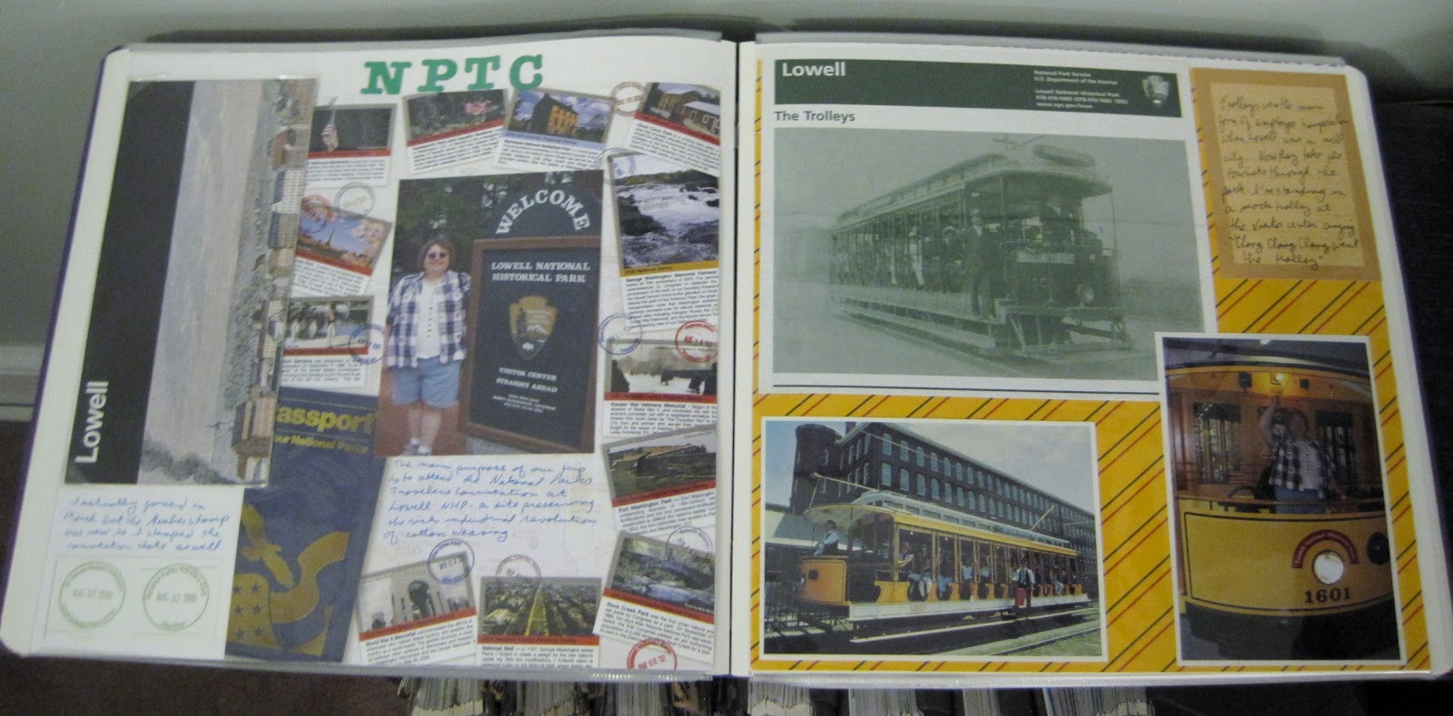
Below are 3 photos of essentially the same layouts. I wanted to show them all to give you an idea of how I arrange my materials. When on a cruise I always save the daily calendars delivered to the staterooms and place them in page protectors within the day to day photos. That caused a problem showing the layout, though.

Photo 1: left layout page and front of Cruise compass
 Photo 2: right layout page and back of Cruise compass


A little more about the storage of the Cruise papers. Creative Memories made 8x10 portrait sleeves and while they are great in 8x10 albums, the straps also fit the 12x12 albums (the only size I work in currently). The sleeves come in black or white which is the colored edge along the left. I've found that the color generally doesn't matter so even a black edge will look OK in a set of white pages. Each also comes with a piece of cardstock inside. If you have a very thin paper or want to use these for mounting additional photos I would suggest leaving it in place. I normally remove them and slide the Cruise Compass into the slot and then mount between the pages. I've used these for other materials as well.

When you have a large item that would take up most of a page, sliding it into one of these sleeves helps with space issues. Since Creative Memories doesn't make them any longer you may be able to find them on other sites such as Ebay or on some of the Facebook sell groups. Creative Memories is currently making a 12x12 sleeve which might work in a pinch but will leave a lot of white space along the edge and will totally obscure the opposite page of the layout.

Photo 3: I digitally edited the photos to create a seamless (or nearly so) look at the pages.


This is a fairly simple layout. other than the 2 borders there is just a little matting. The left border is modified (or "scraplifted") from a pattern I liked. I filled the squares with hiking paraphernalia and a "passport" sticker that is to resemble to Park Stamp passport. The ranger sticker on this page and the arrowhead sticker on the right page are both from the National Parks scrapbook kit.

On the right page the border is from the Creative Memories "Done with One" die cut pack. I just had to add the title sticker to complete the theme. I also added some tropical flowers around the photo mat to bring in the essence of our hike. The journal square came pre-printed with the remaining hiking icons and looked fairly close to the border on the left page that I thought it tied the 2 together nicely.


My final 2 pages of this hike definitely include the tropical notes begun on the previous page. The border on the left page is another die cut from the Done with One kit, and augmented with stickers and a few triangles almost gives a nautical feel.

On the right I fussy cut some images from an 8 1/2 x 11 page from the National Parks scrapbook kit as well as the flowers (from a Creative Memories decorative paper). That creates a nice anchor in the middle of the page. Although it is a little odd to end the layout with the trail head, it is in fact the order in which we took the photos as Thunderhawk wanted to get moving as soon as we disembarked from the ferry. We caught this photo before returning to the ship.