Google

Showing posts with label Affiliated National Park Unit. Show all posts

Friday, March 8, 2024

The Last Stamp Standing

My next park visit happened in October 2018 when I decided to participate in the New Jersey Lighthouse Challenge. This event happens every year on the 2nd weekend in October. The challenge involves visiting 13 different lighthouses and life-saving stations in New Jersey over 2 days. Most of those buildings have nothing to do with the National Park Service (except the last one which I'll show you next week). The lighthouses start along the Delaware River (a fact I hadn't known before starting the challenge) and along the way, the route gets very close to Fort Mott which is a stamping point for the New Jersey Coastal Heritage Trail. However, as their website will tell you: "Since September 30, 2011, as a result of a sunset clause, the National Park Service is no longer the legislative authority to be involved in the management of the Trail. At this time there is no single authority responsible for the management of the trail, although there are legislative efforts to reinstate the NPS as the legislative authority."

While the rest of the sites have relinquished their Passport Stamp, the Fort has not (and as of 2023, still hasn't!) So I decided to make a little detour and visit the Fort, get my stamp, and then finish the lighthouses.


I worked on this album while at a crop. Planning to attend a crop means figuring out what papers to take without taking my entire crop room. I knew that this fort was on the tour so I took military pages. Yet when I got to this layout I didn't really feel the military essence (also it was a single right-hand page given the prior layout). I had also brought my "Fall" themed papers with me and this paper and embellishments are from that group, specifically from the Harvest Delight CM papers (circa 2019).  The layout is loosely based on a sketch or rather one of a series of sketches from Creative Memories. Noreen Smith developed a set of formulas. By cutting one pack of paper (generally 12 double-sided pages for CM) as the formula indicates, you can create an entire album by arranging the strips in various ways. I didn't need to do all of the cuts, I just figured out which strips were used and what the widths were.


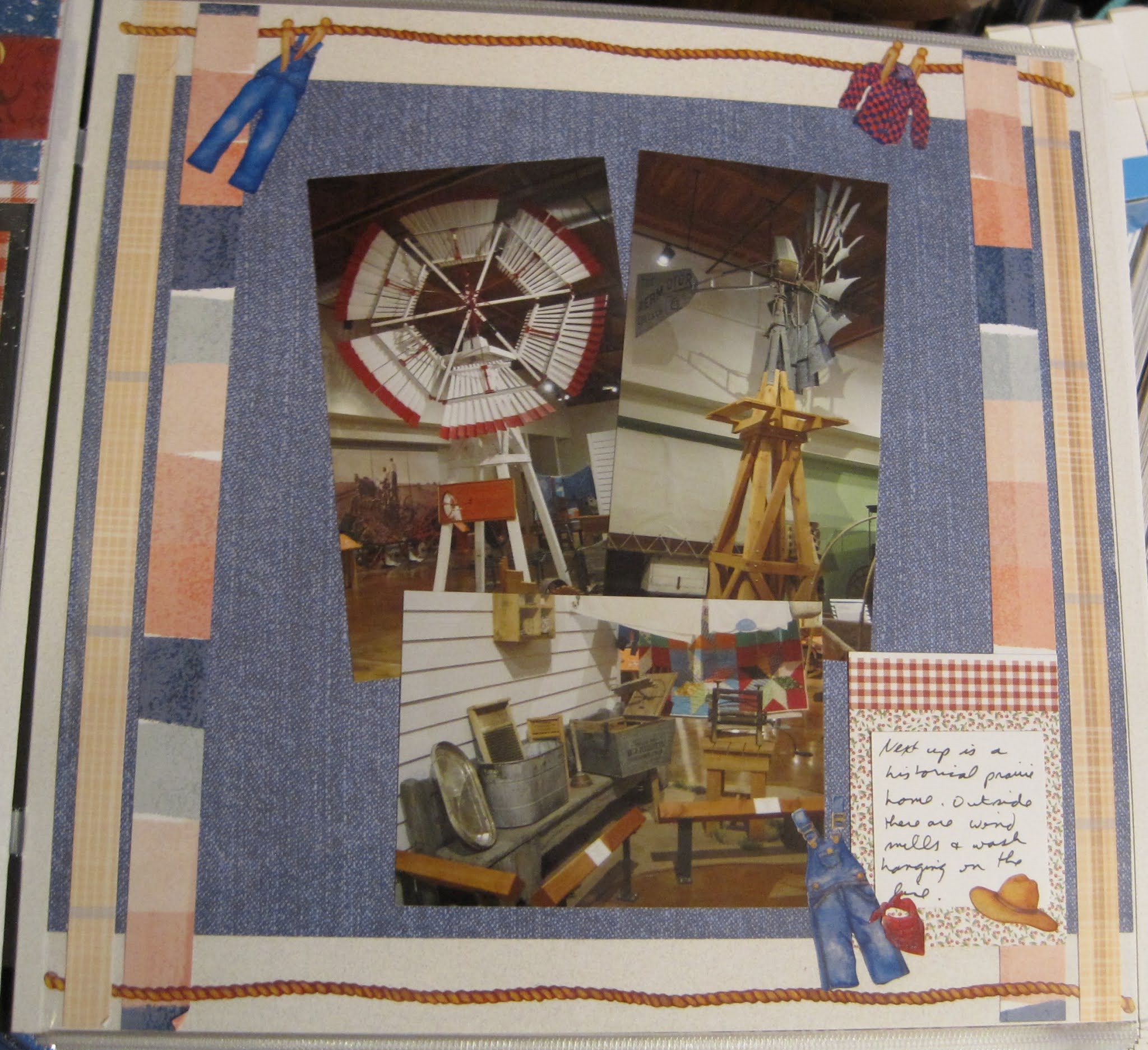
The Fort hosts a small museum detailing life during its active years. The large gun below is the correct size but is actually painted on the wall. A few buildings are remaining and some batteries are falling down. As I wanted to keep moving to the lighthouses I didn't spend too much time on site here.


This was a fairly easy layout as it is technically the "Wallpaper" technique. I bought those 2 papers at the Lancaster Scrapbook Convention. The yellow house was blending a bit into the tan background so I matted them on black cardstock. I added a few stickers from the new CM sticker pack "Called to Serve" to add a little more eye movement around the page but this one came together quickly.

Friday, November 3, 2023

2018 Convention Part 6--Religious Freedom

Touro Synagogue in Newport was the next stop on the bus trip. This is designated as a National Historic Site but is not one of the NPS units, most likely because it is still an active congregation. The history of the community is one of perseverance and faith. I do recommend taking the guided tour to hear the entire story. The most notable occurrence in the congregation's history is their concern for religious persecution after the colonies won their independence. Their letter to Washington and his reply is reprinted today to demonstrate what religious tolerance should be for everyone. Copies are available in the visitor center. When I visit active houses of worship, regardless of the faith, I tend not to take a lot of interior photos as it can be considered disrespectful. In this temple, they did ask us to refrain from photos until the end and to take photos only from the rear of the building. The vertical photo on the left page is my photo. The remaining images are all postcards that I bought in the gift shop.


This layout is based on one of the CM Virtual Crop sketches that I saved. The paper and stickers are from a Judaic pack that I purchased from CM a few years ago. When it was first sold, two of my fellow advisors held a class to help those unfamiliar with the Jewish faith to understand what the designs were and why they were included in the pack. I'm very glad I took that class as I felt much better choosing the papers and stickers to correspond to the sketch. Now the red matches the photos but is really supposed to represent pomegranates for one of the holidays. You don't see the fruit on the tonal paper so I think it worked well for a non-holiday layout. A special thanks to the Rabois (friends of mine from the NPTC) who also looked over this after I completed it and assured me that I did not inadvertently make a faux pas on any religious icon usage.

Friday, October 6, 2023

2018 Convention Part 2--Back to School

Our first stop was in Norwich, CT. I had not heard of the Last Green Valley Heritage Corridor until I started planning this trip. The agency protects cultural, historical, and natural heritage in the Connecticut and Massachusetts areas. Our stop at the visitor center was brief. I did enjoy their displays of the historic school furniture but much of it had been turned into a visitor center with racks of brochures of the area. 


It doesn't happen often, but this is a page of my own creation! This uses Graphic 45 papers. I had purchased a sheet and cut it apart to rearrange it onto a base cardstock. I didn't plan this ahead and in hindsight, I wish I had not cut every object from the sheet individually as I could have used more of the larger sections for matting. I did get a little of the yellow/red by turning over a few of the items I wouldn't use on the page. Of course, that means I can't use them on a future page so I'll have to be on the lookout for more of this paper. I've seen a number of old schoolhouses in my travels.

Friday, April 14, 2023

A Bridge Not Too Far

 In the summer of 2017, I took a new job that took me from central PA to the north of Philadelphia. Before leaving the area I wanted to collect any of the stamps that had appeared. When they are so close you tend not to think of them but when they were about to be 2 hours away, it seemed a good idea to get them while I could! The Susquehanna River National Heritage Area is a relatively new system and my guess is that it will eventually rival the Hudson River Valley in the preponderance of stamps! For now, this bridge between Columbia and Wrightsville was a nice day trip. The art deco pillars were interesting to me. It's a bridge I've been over several times, it was nice to stop and see it for the inherent design.


I based this layout on a saved sketch from Sketch-N-Scrap's blog. When I originally saved it I was just looking for things to pin. I'm now following their blog and plan on entering their various sketch challenges. Hopefully, you'll be seeing some of those posts soon. This page was created using some of the Neutral and Green Tonal paper packs from Creative Memories. The colors of the papers matched the colors of the photos nicely. Again you can see that the 3 patterned papers do not clash with each other. There is a medium and 2 smaller prints, so not overwhelming to the eye.

Friday, December 9, 2022

End of the Line

Our tour stepped into an alley next to the courthouse--one I never realized existed! We heard stories of the free blacks who were entrepreneurs in the area. I took some time to marvel at the architecture of the courthouse but that wasn't a part of the tour's discussion.


This page is based on a CM Sketch from the August 2021 virtual crop. I did not include the circle in the upper right corner but did combine 2 sheets of paper and a border sticker to decorate the page. If you open the CM page you'll see that you can also take this sketch in a "fancier" direction if you want to. I used a very subdued palette as well as a touch on the page due to the theme.

We stopped at another cemetery. There were monuments to people extending over several hundred years. I enjoy cemetery art so photographed some of the monuments that really have nothing to do with the UGRR experience. 


This layout is from a sketch from another blogger that I follow--Cheryl Even. She makes sketches for her albums and posts them for others to use, so she's one of my inspirations. She also posts on the Scrapbook.com forums and I've followed her on there for a time. I turned the sketch so that the paper remnants (and this page is REALLY scrap booking) were across the top. I used a remnant of a sticker across the bottom and a few random sticker embellishments as well.

The last stop on our tour was most unusual--it was in the parking garage entryway. This building was originally a train depot and was a transition place for those moving on toward Canada on the UGRR.


This page is one half of a layout I made in a Paper Loft class. The kit had many mats included and we arranged them across the middle of the page. I thought the "Unexpected Directions" title was perfect given the odd location for the talk. The 2 blue squares on the right were to be for photos, but I chose to use them as journal boxes. Again, not much other decoration on the page given the theme.

Friday, December 2, 2022

Above Ground on the UGRR

Our tour group assembled and we started walking down the hill away from the square. Our first stop is the Thaddeus Stevens house (he helped ensure the passage of the Emancipation Proclamation). This is preserved in the middle of the Lancaster Convention center. The original door and markers are on the outside. We didn't get to go in. Around the corner, you can see the excavated cisterns. They believe they were used not for water, but to hide enslaved people on the UGRR.


This layout is based on a layout that CM posted using Countryside Comfort (the first layout on the page). I did not have the exact paper pack but found that the Croptoberfest papers from that year worked just as well. I did not originally save this design to my Pinterest board though. I saved the borders on the layout below. But as that didn't work with this configuration of photos, I scrolled up the page and realized that the fence would be a perfect addition to this home story. 

Another stop on our tour was a church that I had passed every day going from work to home. This church allowed enslaved people to worship with the rest of the congregation and for the times, that was quite progressive. Numerous historical markers adorn the church walls.


This page lent itself to the original borders that I saved (second on the page from the link above). The tones of the Croptoberfest paper match the brick quite well and the rest of the colors accent the deep red tones. While there is a third layout on the CM site, I'm not sure I have enough materials left to complete it. However, it's saved on Pinterest so there's always a possibility!

Friday, November 25, 2022

Hometown Tourist

I hope you all had a great Thanksgiving! I want to say how thankful I am that you read my blog. If you have any comments or suggestions, please drop me a line!

I know a couple of ladies from the Park Travelers Club that live close to me so we decided to have an outing together and chose a walking tour of Lancaster focusing on the Underground Railroad. Before we got started I took the opportunity to photograph some places I've been to frequently such as the Penn Square statue of soldiers and the Central Market. 


This page was a kit from Scrapbook Concierge. It's another example of pages that I am glad to have completed, and that I will NEVER do again. It took a while to figure out which photos would easily (not sure that's the right adjective but we'll stick with it for now) morph into the letters in "Lancaster". It took quite a while to fussy cut and apply the photos to the letters. I did get lucky in that one photo could spread across up to 2 letters if positioned correctly.

Friday, November 12, 2021

The Devil Went Down to Jersey?

 In New Jersey, there is a National Reserve (an affiliated area, not a true national park) called the Pinelands. If you grew up in New Jersey you likely heard tales of the "Jersey Devil" -a creature that flies around the Pine Barrens creating havoc. It's their version of Sasquatch apparently. The story was told in this display but they also highlighted the various crops like berries and vegetables grown in the area.


This layout is based on a border sketch from Creative Memories. Our CM Advisor group was given the challenge to use one of the sketches from the weekend and I made this border from pumpkin and apple border maker cartridges. I used paper and stickers from the "Locally Grown" pack due to the gardening nature of the display. The pumpkins and apples are a little too close to the same shape and I didn't get the variety of colors I was looking for to make them stand out, but it's a cute border and just needed a backdrop for the photos and journaling box. 

Friday, October 29, 2021

The OTHER big trail

The next display covers another immense trail in the National Park System--the Pacific Coast Trail. Unlike the Appalachian trail, this is not an official unit. The trail extends from the Mexican to the Canadian borders and so crosses a wide variety of environments. The designers condensed all of that to just a few square feet of floor space! 


This layout is from the same class as the last 3 entries--so again, no sketch. The design focused on building those borders on the left and bottom right. My cuts were supposed to be through the middle of a chain punched with the Border Maker System. But the cuts are not quite perfect so I had to use other items to hide the imperfections (like the John Muir quote mat). The tree border was punched directly onto the background paper (that particular punch is not a chain) and I mounted a bit of cardstock underneath to bring out the tree design. I finished it off with a couple of clusters of stickers from my assorted packs.


This layout is from a DIFFERENT class--but alas I still cannot show you the sketch. I like splitting paper across a 2-page layout and that happened twice here (the light blue and the green forest designs). That technique helps the eye move from one side of the layout to the other. The sketch called for borders under the photos and instead of a punch, I used some strips from a cut-apart sheet. The left border (Adventure) was a bit smaller than the right so I mounted it on a wider piece of paper. But that was TOO pale so I added some rope borders at the top and bottom. A lot more stickers on this one to fill in some of the dead spaces (and honestly to use up some of those sheets!)

Friday, October 8, 2021

It's more than Atlantic City

When most people think of the Jersey Coast, they think of the casinos and not much else. But just inside that commercialized zone is a series of small protected zones like the Pine Barrens and the Maurice River. These were temporarily combined to form the New Jersey Coastal Heritage route--an affiliated unit for the National Park Service. I'm surprised that this was the topic of one of the displays as in reality there is no organizational body overseeing that designation. There is one stamp left in Southern Jersey. However, the areas are protected by private foundations like the various lighthouse agencies. 


The inspiration for this layout was from a class I took and I cannot share the sketch. It was pretty straightforward though--3 pairs of patterned papers cut with the Decorative Trimmer and separated just a bit to create a "river" through the middle. I used more of the Woodland Whimsy papers for this layout as well as a few animal stickers from the pack. It was originally a baby pack so it can be difficult to use some of the titles from the kit. The title across the bottom is a mixture of mini ABC-123 letter packs. The yellow didn't show up well so I outlined them in dark pen. The title isn't SUPPOSED to be another river on the page but I won't argue if you think it matches that layout. I'm just bad at making things straight sometimes!

Friday, September 24, 2021

How Green Was the Inn?

 The next display covered one of the affiliated units of the NPS (as if the choice of the more than 400 parks wasn't enough!) The Schuylkill River NHA runs through Philadelphia but goes up into the Pottsville area. They have yearly paddle events along the length. Of course in Philly, this runs right into the Boathouse Row area. This mid-19th century site still runs as a restaurant today in the Wissahickon area.Creative Memories wanted to honor Australia Day which occurs in late January. They posted a blog featuring a cute layout and then turned that into a sketch for us to follow. I used that sketch for this layout--the main feature of which is the circle on the bottom with the 3 tails. I used paper from the Woodland Whimsy pack (the girl's pack I think). That's the background and the darker orange papers. For the circle, I chose one of the circle punches. By starting with a 6" square of paper, you end up with a lacy-trimmed circle. This one had a tulip pattern that I thought went well with the page. I added 2 strips of paper for the tails and then added a border sticker in the middle. A few sticker embellishments from the same collection finished the page.

Friday, January 8, 2021

Happy Trails Part 18--San Elizario chapel

 My last stop in San Elizario was to the chapel. I couldn't go inside but I had picked up a photo/postcard in one of the gift shops so I could show the detail. The chapel is still in use and has a lovely mission style facade. 


I based this layout on a sketch but also wanted to use it for a challenge in my summer camp class. Our challenge was to use texture. The bottom strips are paper that has a textured look to them, but to up the ante a bit I also decided to add some 3D materials. I had some jute string and tied several knots along its length. Then I tied the ends together to make a loop and pasted it to the page. I drew a small cross (it's in the bottom left if you look closely) and is to simulate an old-fashioned rosary.

Friday, January 1, 2021

Happy Trails Part 17--San Elizario Law

First let me say HAPPY NEW YEAR! I've enjoyed the process of posting and describing my pages and I hope you have enjoyed the posts. Let me know if you want to see anything new this year or any way to improve the blog!


Now, back to San Elizario. There are still historic buildings in the town though many have been repurposed. The outsides still show the traditional stucco and wooden porticos. I apparently like to photograph the tunnel-like passageways. I didn't realize how many of them I had taken until I put this page together!


I based this layout on a sketch from my year-long scrapbook class. In March we were challenged to use banners on our pages and this certainly takes advantage of that challenge! I used up some older paper for the banners. The borders on top were left from a ranch/farm pack from Club Scrap. A couple of stickers on the first banner and some journaling was all that was needed to finalize this one.


One of the more intriguing stops in town is the old jail. This has been kept as a museum not because of who was confined here, but because one of those prisoners was sprung by Billy the Kid. If you ever are in the area, I do recommend stopping by for a few minutes to take it all in.


My pages were based on this layout on Pinterest. It enabled me to use up a bunch of scrap pieces. Everything is in the same brown-ish tones. The frame on the upper right is also a left-over from a project that I worked on. I originally thought I would use three of those frames on one page but they were too big. So I held on to this one and with a little cropping of the corners, it filled in nicely on the page. 

Friday, December 25, 2020

Happy Trails part 16--San Elizario Moseying

I wanted to take a moment to say Happy Holidays to all of my readers. This will post on Christmas night (prepared ahead of time of course) so I hope you are all celebrating in a safe and meaningful way with your friends and family. 

Saturday morning I had some free time so I decided to continue my exploration of the El Camino Real de Tierra Adentro by driving to a small town called San Elizario. There is a self-guided walking tour of the town showing some of the historic structures. It's a very small town but they are quite proud of their history and I stopped at just about all of the sites along their route. The first stop had to be for the stamp of course. It's in a small visitor center/museum and also had a small video to watch.


 This layout is based on a sketch from one of my classes that can't be shared. It is the same structure as the 1-2-3 layouts I've shared previously though. I used brown cardstock as a base and the barbed wire paper had the red/white stars on the back. Very quick cuts. I added a few embellishments from my western sticker stash--mostly little button type stickers.

Friday, December 4, 2020

Happy Trails part 13--Fort Selden

 After leaving the Farm and Ranch Museum, I headed to my next stop on the El Camino Real stamp path: Fort Selden. It was built around the time of the Civil War to provide safety and peace in the area. It must have worked because by 1895 it was no longer needed and was abandoned. Only remnants of the buildings remain.


The impetus for this layout is the border at the top of the left page. It was a pin I had saved on Pinterest. The paper is from an older CM line called "Reminisce"--one of my favorite lines. The tones and background designs work for so much of my travels. The letter block in the top left is supposed to say "US"--something I cut from my heritage Paper Loft word sheets. But I decided that a couple of judiciously placed dots would create U. S. and it worked perfectly!

Friday, November 27, 2020

Happy Trails Part 12--Blacksmithing

 The last entry for the Farm and Ranch Museum is the Blacksmith Shop. I also added the photos of the horses I took on my barn tour. 

Add caption


The layout is based on an older 1-2-3 sketch by Noreen Smith (May 2013). The concept is simple--use 4x6 blocks alternating with photos across the bottom and a title at the top. I varied that by making the left bottom all photos (evenly spaced). For the top row on the left, I had a photo paper with the horse face on it and I was able to cut it to 6x4--of course it's in the wrong direction but really--sketches are idea starters, so don't feel like you can't make an adjustment. I added a journal box and again spaced it so that there wasn't too much empty space on either side. The top is another photo paper from a farm/western pad I picked up. I cut it in half and placed the horseshoes across the top. The only thing left to fill was the cardstock fillers on the right. I cut a border sticker in half and layered it across the middle. That tied it all together. 

Friday, November 20, 2020

Happy Trails Part 11--Down on the Farm

After touring the main building I headed outside. There was another building specifically for the dairy industry and I took the opportunity to take a selfie of myself "milking" a cow.


The inspiration for this layout is from a sketch from my online scrapbook class so I can't show you. The theme was to use up the smaller cards/mats that are leftover from Project Life or from some of the mat packs that come with the Creative Memories kits. I did get to use 3 on this one: Top left was a mat from a farming page I bought. The "Dairy Barn" below it is actually a photo trimmed to the right size. On the right page, I used a piece of red gingham paper and added stickers to resemble a mat. Finally, I used a journaling box bottom right.

One of the highlights of visiting is a guided tour (in a golf cart!) of the outdoor exhibits. After the tour though you can walk back and look closer at the animals. Which I of course did!


This layout is from the same class as the first, but a different sketch. In this one, I did use one mat, but because of how I took my photos, I was able to cut them down to the mat size. The background papers are some that I've had for a while and never thought I'd find the right photos for a layout. The bright blue sky and fencing just seemed to pull this together though. I added the ribbon of bandana paper across the middle as an accent to break up the busy pattern. A few button stickers and cow stickers and the page was done quickly!

One more layout of the barnyard. There were so many different sheep, they got their own pages! I'm not completely sure I have them all labeled correctly but I tried!


This layout is based on the monthly 1-2-3 sketch from Noreen Smith which you can see on her blog. I used a piece of paper from the Painted Prairie pack (the special advisor-only pack I mentioned a few weeks ago). When I make the cuts for this page, I do it a little differently. Her first cut says to fold the paper in half and use scissors to cut along the fold. If you, like me, don't make the best free-hand cuts, and you don't mind a remnant fold in the paper, fold in half and then use your trimmer to cut from the long side through the point. You'll still get a 1/2 page triangle, it just has a crease in the middle. I'm ok with that though. 

For the sheep, I used an older CM punch that is a scalloped circle and another micro-flower punch to make the fluffy white components of the lambs. The faces are small ovals cut from black cardstock. The legs are using a Stampin' Up punch called "Word Window". I like that punch for so much more than title bars! The idea came from this Pinterest link. Sometimes it's fun to make objects from punches. Sometimes it's easier to just cut them from the Cricut though!

Friday, November 13, 2020

Happy Trails part 10--Back in the Saddle

 Another display in the museum focused on a local saddle maker who was quite famous for his intricate leather work. His tools were all arranged as if he were coming in to work on a piece. Several saddles were on display as well. One area was set aside for children to practice during supervised classes.


This layout was part of the Club Scrap Western kit. I bought that pack knowing that I had quite a few western theme trips to cover and the paisley background worked perfectly with the intricate saddle designs.

Friday, November 6, 2020

Happy Trails Part 9--At the Store

Continuing through the historic displays, I came to the General Store. I cannot imagine shopping by telling people what you wanted from behind the counter. I'm always impressed with the variety of every-day items that these displays are able to present: everything from kids' toys to food to weapons.


This layout was modeled after a page on my Pinterest Heritage site. The background paper is from a pack I purchased that had the historic theme to it. I added the clock, pram and teddy bear stickers from an old Creative Memories heritage sticker pack. The key and compass (as well as the word "Time") were already printed on the page. So don't forget--wallpaper can be augmented to achieve the look you want!

Friday, October 30, 2020

Happy Trails part 8--There's No Place Like Home

The next display continued with "everyday life" but switched to windmills and farmhouses. The display included both the inside and outside of the house which is rather unique. 


I made this layout during the CM Virtual Crop in June. You can see the sketch here. I used several papers in this layout. The denim blue is from a pack called Outdoor Blues. The plaid tan along the left and right sides are from some 10x12 CM paper (which tells you how old it is) and I don't remember the line. The inner stripes are from Painted Prairie (which seemed appropriate given the theme). The Painted Prairie paper is a special pack of just 6 sheets. CM makes them available to consultants 4 times a year. You can use them as incentives for your customers. Other decorations on this page are from the old "Day at the Farm" sticker pack from CM.


The next layout is more about the inside of the house. I liked the kitchen the best (as I usually do) and loved that this one included the canning jars. That brings back memories of helping my mom can tomatoes every summer.


I scraplifted this layout from an old CM blog post. While that blog page disappeared with the Old CM, I had pinned the image and understood the idea of using the tag punch to make the frill around a canning jar lid. The jar itself is just a rectangle of paper (this one from the old Earthy line) and a contrasting piece as the "label". The rim of the jar was a piece of a roll of decorative tape (the precursor to Washi tape) and I finally used it up! It really looks like a canning lid doesn't it? The gray doily was made using a special punch that will create circles with decorative edges. Two have been made so far--this one and a tulip border. They take 6" squares of paper and turn them into decorative mats. The "Home Cooking" and borders are from the Made with Love pack. Put all together, it's an historic kitchen from post to pictures!